What does recovery from COVID-19 look like?
Recovery in this analysis is defined as the period immediately following the usual 10 to 14 infection from COVID-19 during which the person has fought off the virus and is no longer contagious. Initial recovery from teh virus takes place in the two weeks following the infection. Longer “recovery periods” of more than 4 weeks mean that the patient is suffereing from post-COVID conditions or is a “long hauler”. In order to examine the recovery from the coronavirus I will look primarily at two things. First I will compare recovery rates in the top 10 most populous countries in the world. The recovery rate is the number of people who contracted COVID-19 and recovered compared to the total number of people who contracted COVID-19. Second, I will use an anatogram, a visual depiction of the male human body and organs, to visualize the organs effected by the virus before, duing, and after infection.
Libraries
Below I will load all of the libraries needed to run the code.
Recovery Rates
Gathering Data:
The dataset below is scraped from the web. There are a variety of factors that make this data potentially inaccurate. While Wikipedia is a great source of easily digestible information, it’s also compiled from potentially unreliable sources and and crucially in this case, at unreliable times. Most, but not all, countries update COVID-19 cases and deaths daily meaning that the numbers change often. For example, lets look at three countries: Country A, Country B, and Country C. Let Country A update their COVID-19 cases on an unreliable basis so the last time they reported was three days ago. Countries B and C update their information daily but they are in different time zones so when a grad student at university logs on to update the page, their is only current information on Country B. This website is then scraped 8 hours later without any other information being altered. Thus the dataset does not have the most current or accurate information for two out of the the three countries.
Another challenge to an accurate analysis is that countries may be motivated to misrepresent the number of COVID-19 cases, deaths, or recovery rates for any number of reasons. On a individual level, people may be asymptomatic, simply brush it off as a cold, or be unable to access medial care that would help to identify them as a COVID-19 patient. Hopefully, misrepresentations of cases and inability to access healthcare are not widespread problems.
Here I’m web scraping data from the COVID-19 Pandemic:
Show code
#Store url
url <- "https://en.wikipedia.org/wiki/COVID-19_pandemic_by_country_and_territory"

# Ask first
robotstxt::paths_allowed(url)
[1] TRUEShow code
# Displayed the result TRUE, marked as comment for easy reading

#Grab the table
tables <- url %>%
  read_html() %>%
  html_nodes(css = "table")

#Grab the second table
statistics <- html_table(tables[[3]], fill = TRUE)
Dataset Wrangling
For the most part, the dataset was already in tidy format. There were some issues with the data as a whole as mentioned above in data scraping. However, there were several things that could be done to make the dataset more efficient. The major things that are down below include renaming columns, getting rid of commas, and turning the numbers from characters to numbers.
colnames(statistics) <- c("GR", "Location", "Positive_Cases", "Deaths", "Recovered", "GR2")

statistics <- statistics %>%
  separate(col = Location, into = c("Location", "Garbage"),
           sep = "\\[") %>%
   mutate(Recovered = case_when(
            Location == "United States" ~ "32208044",
            TRUE ~ as.character(Recovered))) %>%
  select("Location", "Positive_Cases", "Deaths", "Recovered") %>%
  filter(row_number() %in% 1:240)

statistics$Positive_Cases <- as.numeric(gsub(",","",statistics$Positive_Cases))

statistics$Recovered <- as.numeric(gsub(",","",statistics$Recovered))

statistics$Deaths <- as.numeric(gsub(",","",statistics$Deaths))

statistics$Percent_Recovered <- (statistics$Recovered / statistics$Positive_Case) * 100
In this graphic we are going to look at the top 10 most populous countries top 10 most populous countries in the world. These countries in order from greatest are China (1,397,897,720), India (1,339,330,514), United States (330,425,184), Indonesia (275,122,131), Pakistan (238,181,034), Nigeria (219,463,862), Brazil (213,445,417), Bangladesh (164,098,818), Russia (142,320,790), and Mexico (130,207,371). Looking at these countries allows us to understand COVID recovery in the countries with the most people. While it is false to assume that just because a country has a high population it will have a high rate of COVID-19 spread. However, it is representative of the world population as so many people live in these countries.
So what’s potentially problematic at just looking at the top 10 most populous countries in the world? Well, there are no countries in Europe or Oceania on the list for one thing. This means that there are significant social groups left out of this study. Additionally, most of these countries have emerging markets or in some other way are not considered “fully developed”. However looking at these countries still provides an understanding of how the majority of the worlds population can expect their recovery to look like.
Plot
Show code
# Plot
stats <- statistics %>%
  filter(Location %in% c("China", "India", "United States",
                         "Indonesia", "Pakistan", "Nigeria",
                         "Brazil", "Bangladesh", "Russia",
                         "Mexico"))

ggplot(stats, aes(x = reorder(Location, -Percent_Recovered), y = Percent_Recovered)) +
  geom_segment(mapping = aes(xend = Location),
               yend = 0) +
  geom_point(size = 3, color = "dark green") +
  labs(x = "Top 10 Most Populous Countries", y = "% of People Who Recovered",
      title = "COVID-19 Recovery",
      caption = "Figure 1") +
  theme(axis.text.x = element_text(angle = 90, vjust = 0.5, hjust=1)) +
  ylim(0,100)
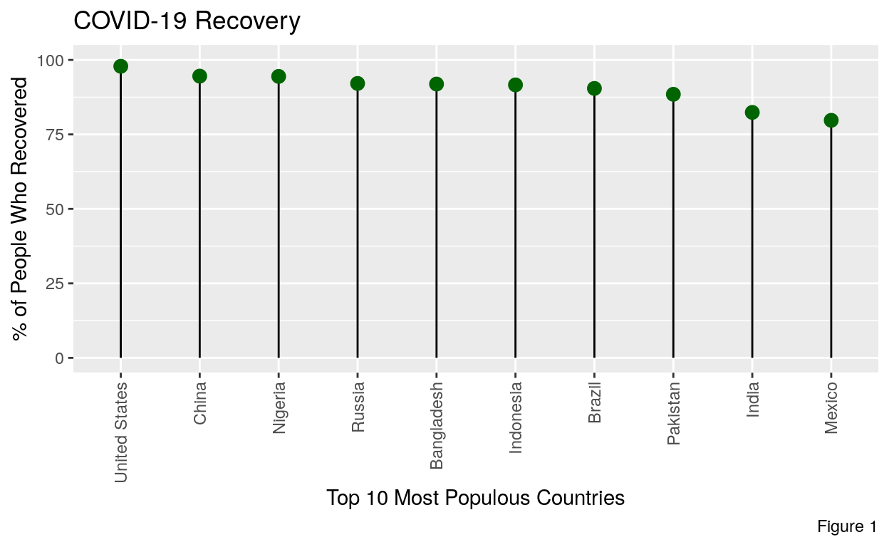
From this plot we can see that overall recovery rates are greater than 75%. Here we have to account for a margin of error for our recovery rate. However, even with hefty margins, it’s still clear that the majority of people recover from COVID-19. Since this is the outcome that at least 3/4 people face, studying the effects of COVID-19 during the period of recovery become very interesting.
COVID-19 Effect the Bodies Organs
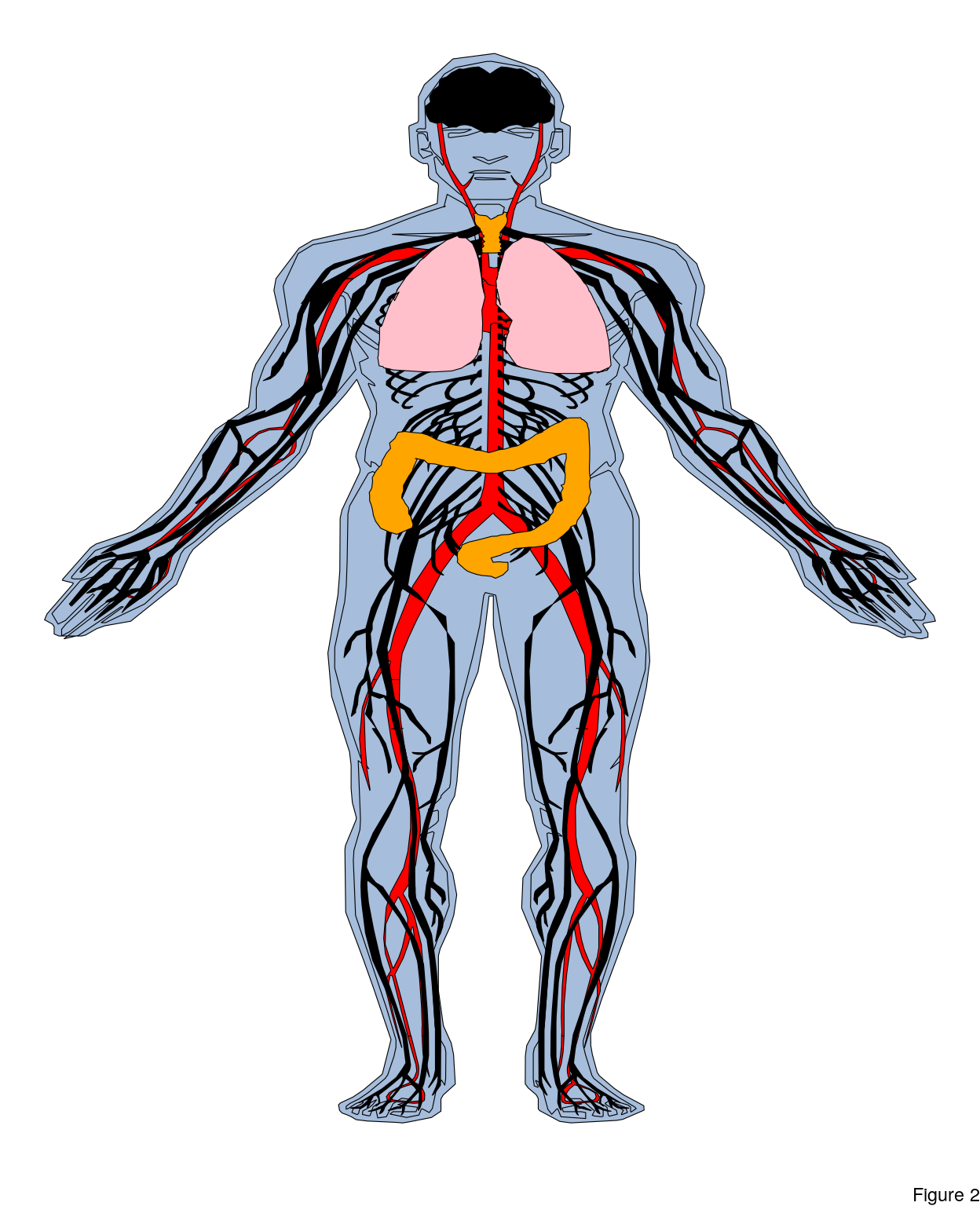
Basic Anatogram
This is a basic anatogram used for the purposes of illustrating their most basic form. Many aspects of the anatogram’s body are personalizable from the types of organs to their color and the value of their emphasis. The data in the table will all be used in creating the anatogram below.
Show code
organPlot <- data.frame(organ = c("heart", "leukocyte", "nerve", "brain", "lung", "throat", "colon"),
 system = c("circulation", "circulation",  "nervous", "nervous", "circulation", "digestion", "digestion"),
 colour = c("red", "red", "black", "black", "pink", "orange", "orange"),
 value = c(2, 2, 2, 2, 2, 2, 2),
 stringsAsFactors = F)

organPlot
      organ      system colour value
1     heart circulation    red     2
2 leukocyte circulation    red     2
3     nerve     nervous  black     2
4     brain     nervous  black     2
5      lung circulation   pink     2
6    throat   digestion orange     2
7     colon   digestion orange     2
In this base model I have the organs that are important to my later analysis of COVID-19. The highlights for the organs are the lungs, heart, brain, throat, and colon. I’ve also added some nerves and veins so as to make the anatogram seem more human.
Show code
gganatogram(data = organPlot, fillOutline = '#a6bddb', organism = 'human', sex = 'male', fill = "colour") +
  theme_void() +
  labs(caption = "Figure 2")
Anatogram of COVID-19 Effects on Organs
The following code is the creation of an anatogram that represents the effects of COVID-19 on the human body before, during, and after infection. The more red an organ is, the more it’s being effected by the virus. Please not that the value assigned to different organs is just an attempt to highlight affected organs based on symptoms not on data or any dataset.
compare_groups <- rbind(
  data.frame(organ = c("heart", "leukocyte", "nerve", "brain", "lung", "throat", "colon"),
             colour = c("red", "red", "purple", "purple", "orange", "orange", "orange"),
             value = c(6, 2, 2, 7, 6, 3, 2),
             type = rep('Post Covid-19: Recovery', 7),
             stringsAsFactors=F),
  data.frame(organ = c("heart", "leukocyte", "nerve", "brain", "lung", "throat", "colon"),
             colour = c("red", "red", "purple", "purple", "orange", "orange", "orange"),
             value = c(2, 2, 2, 2, 2, 2, 2),
             type = rep('Normal State', 7),
             stringsAsFactors=F),
  data.frame(organ = c("heart", "leukocyte", "nerve", "brain", "lung", "throat", "colon"),
             colour = c("red", "red", "purple", "purple", "orange", "orange", "orange"),
             value = c(10, 4, 4, 10, 10, 8, 8),
             type = rep('During Covid-19 Infection', 7),
             stringsAsFactors=F)
  )

gganatogram(data = compare_groups, fillOutline = '#a6bddb', organism = 'human', sex = 'female', fill = "value") +
  theme_void() +
  facet_wrap(~type) +
  scale_fill_gradient(low = "white", high = "red") +
  labs(caption = "Figure 3")
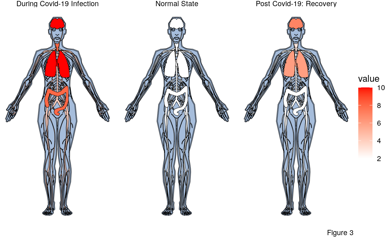
The pre COVID-19 body shows no red because the virus has not yet caused harm. Note that the patient could have any number of other medical issues but they are not represented in the form.
There are many symptoms of a COVID-19 infection including a cough, shortness of breath or difficulty breathing, headache, loss of taste or smell, and diarrhea. In the worst of the infections, the patient is unable to breath on their own and needs to be put on a ventilator. From the list of symptoms of COVID-19 and the worst case examples, the most effected organs are marked by higher levels of red to signify the harm done to them.
As mentioned in the beginning, recovery from COVID-19 takes place primarily in the two week immediately following the roughly 10-14 day infection period. During this time the patient is regaining old strength and has successfully fought off the virus. However the patent could still be suffering from long term effects of the virus including but not limited too fatigue, brain fog, headache, loss of smell or taste, dizziness, heart palpitations, chest pain, cough and shortness of breath. Given the list of symptoms there is still consiterable harm in the lungs, brain, heart, and throat to say the least. The middle anatogram illustrates these long term effects after the virus as cleared.
So what does recovery from COVID-19 look like? The results from the Figure 1 show that recovery is the most likely expected outcome in at least 75% of COVID-19 cases. Figure 3 shows us that COVID recovery is arduous and that the effects of the virus are still very much present in the organs. The unsatisfying reality is that we don’t yet fully know what recovery from COVID-19 looks like. COVID-19 infections are experienced very differently between people. Mild or asymptomatic people may not ever experience anything like what is depicted in the anatogram above.
Citation
Maag JLV. gganatogram: An R package for modular visualisation of anatograms and tissues based on ggplot2 [version 1; referees: 1 approved]. F1000Research 2018, 7:1576 (doi: 10.12688/f1000research.16409.1