The Story
Maina et al. (2019)
Spatial data has become an increasingly popular and pertinent in recent years, from mapping remote areas for access to resources or tracking climate conditions for disease prevalence (Richardson et al. 2013; Maina et al. 2019). With this boon in spatial data, finding ways to accessibly visualize this data has become a mission for many. To better understand the limitations and usefulness of two R packages for 3D data visualization, we investigate spatial data with rgl and ggrgl.
rgl utilizes base R functions and syntax to generate interactive 3D plots that allow users to explore their data in multiple dimensions and has been around over a decade with improvements made over the last several years.
ggrgl is a relatively newly minted R packages that builds on the ggplot functions in the tidyverse to bring a ggplot themed plot to life in 3D.
I chose to compare these two packages to compare and contrast the limitations of data visualization in the two very polarizing R styles many user frequent.
The data
The Study of Northern Alaskan Coastal System (SNACS) is an NSF-funded research program of six distinct projects investigating human and natural Alaskan coastal systems for their vulnerability to climate change. To work with rgl and ggrgl 3D visualization, I decided to explore the SNACS dataset from the National Science Foundation’s Arctic Data Center, collected over the course of two separate roves aboard the R/V Annika Marie, from August-September 2005 and again from August-September 2006 (source).
The specific project I analyzed data from was: Environmental Variability, Bowhead Whale Distributions, and Iñupiat Subsistence Whaling— Whaling Linkages and Resilience of an Alaskan Coastal System. This project focused on the interconnectedness of the atmosphere, indigenous populations, and the ocean in coast of Barrow, Alaska. In the metadata for this project, they outline four approaches for understanding this complex ecosystem via:
Biological and physical ocean modeling to identify mechanisms of frontal and eddy formation and plankton aggregation, to describe the effects of environmental forcing from outside on the local ocean, and to understand longer term, past and future variability in outside forcing on whaling success
High resolution field sampling to demonstrate presence of physical features and associated biological concentrations and to validate modeling
Assessment of the resilience and vulnerability of the subsistence hunting economy and culture in Barrow
Retrospective analysis synthesizing modeled ocean and climate conditions with available information on whale location, feeding, and harvest success to assess the resilience and vulnerability of the whale-ocean-human system to environmental change (SNACS Metadata)
I chose to look at their measurements of micro-organism prevalence across latitude, longitude, and depth (inline with first approach). I chose to look at this particular subset of data because understanding where algae, bacteria, and diatoms co-occur is important to the health of an ecosystem (Amin, Parker, and Armbrust 2012; Cirri and Pohnert 2019). Beyond the biological importance of this data, the high resolution latitudinal and longitudinal data coupled with depth information from the two field years (2005 and 2006) made this data a great candidate for 3D spatial visualization and to understand whether {rg} or {ggrgl} provided better aesthetics and interfaces for users interested in 3D visualization.
Data wrangling
First, I loaded all necessary packages and libraries from CRAN.
I then loaded all packages that were unavailable on CRAN from their Github repositories.
Show code
#loading necessary packages
remotes::install_github('coolbutuseless/devout')
remotes::install_github('coolbutuseless/devoutrgl')
remotes::install_github('coolbutuseless/triangular')
remotes::install_github('coolbutuseless/snowcrash')
remotes::install_github('coolbutuseless/cryogenic')
remotes::install_github('coolbutuseless/ggrgl', ref='main')
Since these datasets came from spreadsheets, I had to do some tidying to rename rows and columns. I first worked with the spreadsheet from 2005. I decided to transform this dataset from a wider form to longer form to better visualize the micro-organism metrics I was interested in looking at: bacteria, Chl-a (as a proxy for algae abundance), and diatoms. I also removed NA values from the dataframe, which the authors of this dataset kindly noted in a key as values of -999. I also added in a new column for the year that this dataset was from: 2005. Lastly, since this data was imported as an excel file, all of the columns were classified as character classes, so I changed the micro-organisms to factors before then changing the rest of columns to numeric classes.
Show code
#remember that -999 are missing values here
snacs_2005<- read_xls("data/SNACS05_FCM_Nutrients.xls") %>%
  slice(-c(1:8, 10:11)) %>%
  row_to_names(row_number = 1) %>%
  rename(temp = "T",
         salinity = "S",
         longitude = "Lon",
         latitude = "Lat",
         total_bacteria = "Total bacteria",
         total_diatom = "Large diatoms",
         phosphate = "PO4",
         ammonium = "NH4",
         n_dioxide = "NO2",
         silicate = "Silicate",
         total_chla = "Total chl-a",
         sample_depth = "Depth, m") %>%
  pivot_longer(cols = c("total_bacteria", "total_diatom", "total_chla"),
               names_to = "micro_org", values_to = "abundance") %>%
  select(temp, salinity, sample_depth, longitude, latitude, micro_org, abundance) %>%
  filter(abundance != c(-999),
         temp != c(-999),
         salinity != c(-999)) %>%
  mutate(year = "2005",
         micro_org = as.factor(micro_org))%>%
  mutate(across(where(is.character), as.numeric))
I repeated the same procedure for the dataset from 2006. Though the original spreadsheets differ slightly in their naming of columns, the units and general set up were very similar. I was able to use and select the same columns for both 2005 and 2006.
Show code
snacs_2006<- read_xls("data/SNACS06_FCM_Nutrients.xls")%>%
  slice(-c(1:7)) %>%
  row_to_names(row_number = 1) %>%
  rename(temp = "Temp. (deg.C)",
         salinity = "Salinity (ppt)",
         sample_depth = "Sample Depth (m)",
         longitude = "Decimal Longitude (deg)",
         latitude = "Decimal Latitude (deg)",
         date = "Date:Time",
         total_bacteria = "Total bacteria 10^6/ml",
         total_diatom = "Large diatoms 10^3/ml",
         phosphate = "PO4  (umoles/L)",
         ammonium = "NH4 (umoles/L)",
         n_dioxide = "NO2 (umoles/L)",
         silicate = "Silicate (umoles/L)",
         total_chla = "Total  chl-a (ug/L)") %>%
  pivot_longer(cols = c("total_bacteria", "total_diatom", "total_chla"),
               names_to = "micro_org", values_to = "abundance") %>%
  select(temp, salinity, sample_depth, longitude, latitude, micro_org, abundance) %>%
  filter(abundance != c(-999),
         temp != c(-999),
         salinity != c(-999)) %>%
  mutate(year = "2006",
         micro_org = as.factor(micro_org)) %>%
  mutate(across(where(is.character), as.numeric))%>%
  drop_na(salinity, abundance)
I then bound the 2005 and 2006 datasets together for subsequent comparison.
Show code
all_years<- rbind(snacs_2005, snacs_2006)
Data vis
The rgl scatterplot of the three micro-organism metrics (total bacteria [pink], total diatoms [blue], and total Chl-a [green] as a proxy for algal abundance) shows that most of the samples drawn from the 2005 tow were mainly collected at the surface of the water as relatively similar abundances. Plotting in descending depths allows for viewers to better visualize the spatial orientation accurately as opposed to typically ascending axes. Important to note is that this tow had a wide range of sample depths (0-140.5 m).
Show code
#2005
#color by micro-organism
cols <-c("total_bactiera"= "mediumvioletred","total_diatom"= "lightseagreen", "total_chla" = "limegreen")
with(snacs_2005, plot3d(longitude, latitude, desc(sample_depth),
                  type="s", col = cols, size = abundance, alpha=0.6, xlab="Longitude",
                  ylab="Latitude", zlab = "Depth (m)"))
The rgl scatterplot of the three micro-organism metrics (total bacteria [pink], total diatoms [blue], and total Chl-a [green] as a proxy for algal abundance) shows that most of the samples drawn from the 2006 tow were mainly collected at the surface of the water but that is hard to see as these abundances were much higher than the 2005 tow. Diatoms appear to be drastically more abundant in certain samples compared to Chl-a or bacteria, though, this tow had a drastically lower depth range (0-25) than the 2005 tow.
Important to note is that rgl doesn’t allow for legends to appear in interactive 3D plots, only 2D static plots. This makes comparing relative abundances and knowing which color corresponds to which micro-organism metric difficult.
ggrgl does show a legend for the abundance by grouping into sizes as well as the colors corresponding to micro-organism metrics. This appears to be a more a balanced representation of relative abundances across micro-organism metrics in the 2005 tow.
Show code
library(rgl)
library(ggrgl)

#2005
#colored by micro-organism
p <- ggplot(snacs_2005) +
  geom_sphere_3d(aes(longitude, latitude, z = desc(sample_depth), color = micro_org, size = abundance),
                 alpha=0.5) +
  labs(
    title = "2005",
    subtitle = "SNACS",
    color = "Metric",
    size = "Abundance"
  ) +
  theme_ggrgl() +
  theme(legend.position = 'right') +
  coord_equal()+
  scale_color_manual(values= c("mediumvioletred", "limegreen", "lightseagreen"))+
  xlab("Longitude")+
  ylab("Latitude")

devoutrgl::rgldev(fov = 30, view_angle = -30, zscale = 2)
p
invisible(dev.off())
However, a downside to ggrgl aesthetics is that the z-axis is not labeled. I do think even without the axis, the use can gauge that most of the points are occurring at the surface. Though, the ggrgl plots don’t show a reference point for the wide range of sample depths between the 2005 and 2006 tows referenced above, making it hard to make comparisons.
Show code
library(rgl)
library(ggrgl)
#2006
#colored by micro-organism
p <- ggplot(snacs_2006) +
  geom_sphere_3d(aes(longitude, latitude, z = desc(sample_depth), color = micro_org, size = abundance), alpha = 0.5) +
  labs(
    title = "2006",
    color = "Metric",
    size = "Abundance"
  ) +
  theme_ggrgl() +
  theme(legend.position = 'right') +
  coord_equal()+
  scale_color_manual(values= c("mediumvioletred", "limegreen", "lightseagreen"))+
  xlab("Longitude")+
  ylab("Latitude")

devoutrgl::rgldev(fov = 30, view_angle = -30, zscale = 2)
p
invisible(dev.off())
To summarize the spatial trends above, I used the mean for different environmental conditions as well as the abundances to understand the clear trends and differences between 2005 and 2006. I added in color and formatting to more easily compare the micro-organism metrics across years. Seeing the big differences in temperature (nearly 2C) and depths (nearly 12 m), is surprising, given the data was collected by the same group and vessel. I wonder whether or not there were different interested in gathering shallower samples in 2005 compared to 2005.
I mainly wanted to include this table to demonstrate how much important information is lost without the x-y-z visualization of this dataset. The co-occurrence of micro-organisms in space is completely lost and demonstrates why visualizing ecological datasets in 3D space is important for asking complex questions of ecosystem health.
Show code
#table comparing micro-organisms across years
table <- all_years %>%
  drop_na(salinity) %>%
  mutate(organism = case_when(micro_org == "total_bacteria" ~ "Total Bacteria",
                              micro_org == "total_chla" ~ "Total Chl-a",
                              TRUE ~ "Total Diatoms")) %>%
  group_by(year, organism) %>%
  summarise(mean_temp = mean(temp),
            mean_salinity = mean(salinity),
            mean_depth = mean(sample_depth),
            mean_abundance = mean(abundance)) %>%
  mutate(units = case_when(organism == "Total Bacteria" ~ "10^6/ml",
                              organism == "Total Chl-a" ~ "ug/L",
                              TRUE ~ "10^3/ml"))
#nicely formatted kable
table %>%
  kable(caption = "Comparing abiotic and biotic conditions from SNACS voyages during 2005-2006", col.names = c("Year","Metric", "Mean Temperature (C)", "Mean Salinity (ppt)", "Mean depth (m)", "Mean abundance", "")) %>%
  kable_styling() %>%
  row_spec(c(1, 4), color = "white", background = "mediumvioletred")%>%
  row_spec(c(2, 5), color = "white", background = "limegreen")%>%
  row_spec(c(3, 6), color = "white", background = "lightseagreen")
| Year | Metric | Mean Temperature (C) | Mean Salinity (ppt) | Mean depth (m) | Mean abundance | |
|---|---|---|---|---|---|---|
| 2005 | Total Bacteria | 3.976216 | 30.66528 | 17.456716 | 0.7636434 | 10^6/ml |
| 2005 | Total Chl-a | 3.938700 | 30.69489 | 17.747541 | 0.7358309 | ug/L |
| 2005 | Total Diatoms | 3.976216 | 30.66528 | 17.456716 | 1.3729587 | 10^3/ml |
| 2006 | Total Bacteria | 1.763079 | 27.03477 | 5.208738 | 1.0311065 | 10^6/ml |
| 2006 | Total Chl-a | 1.762168 | 26.88315 | 5.165094 | 1.0228514 | ug/L |
| 2006 | Total Diatoms | 1.762168 | 26.88315 | 5.165094 | 1.7511323 | 10^3/ml |
Final thoughts
In summary, I think that rgl and ggrgl have both pros and cons for 3D visualization. I think rgl is better at technically and precisely representing this spatial dataset. However, as is often the case with base R aesthetics, the tidyverse compatible ggrgl has a cleaner interface and allows for a key to appear within interactive plots unlike rgl. I think ggrgl needs improvements in allowing the z-axis to be labeled but I have no doubt that once it gets to be of toddler age (since it’s only a few months old), those improvements will be made.
Amin, S. A., M. S. Parker, and E. V. Armbrust. 2012. “Interactions Between Diatoms and Bacteria.” Microbiology and Molecular Biology Reviews 76 (3): 667–84. https://doi.org/10.1128/MMBR.00007-12.
Cirri, Emilio, and Georg Pohnert. 2019. “Algae−bacteria Interactions That Balance the Planktonic Microbiome.” New Phytol 223 (1): 100–106. https://doi.org/10.1111/nph.15765.
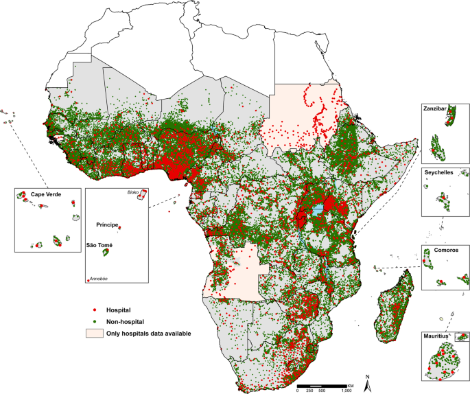
Maina, Joseph, Paul O. Ouma, Peter M. Macharia, Victor A. Alegana, Benard Mitto, Ibrahima Socé Fall, Abdisalan M. Noor, Robert W. Snow, and Emelda A. Okiro. 2019. “A Spatial Database of Health Facilities Managed by the Public Health Sector in Sub Saharan Africa.” Sci Data 6 (1): 134. https://doi.org/10.1038/s41597-019-0142-2.
Richardson, D. B., N. D. Volkow, M.-P. Kwan, R. M. Kaplan, M. F. Goodchild, and R. T. Croyle. 2013. “Spatial Turn in Health Research.” Science 339 (6126): 1390–2. https://doi.org/10.1126/science.1232257.