OpenLitter: Citizen Science-Driven Global Pollution Mapping
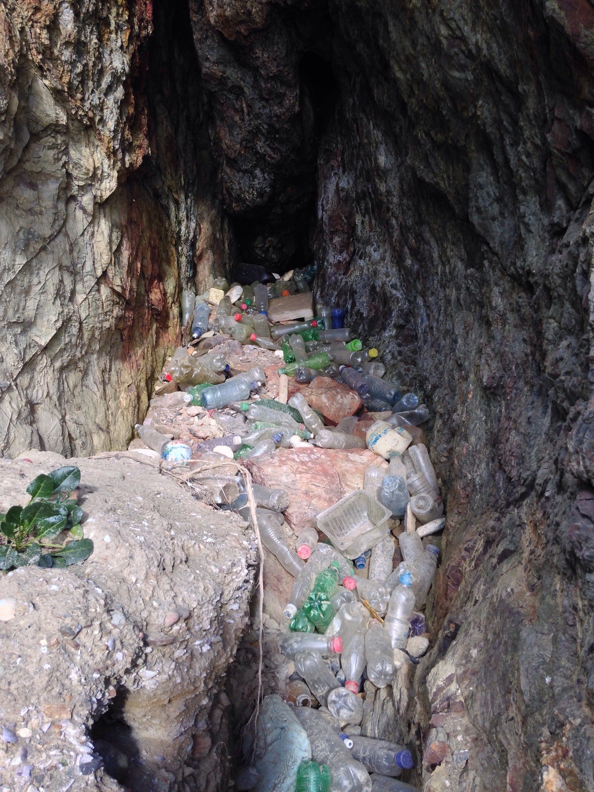
Look on the side of any highway, overpass, or park trail: it’s likely you’ll find litter. While data on industrial pollution is pretty available, it’s harder to track the worldwide distribution of the everyday soda cans and bottles that don’t make it into recycling bins. Because any non-degrading objects may impact the environment and contribute to the millions of tons of refuse that ends up in the ocean, there is a need to survey the global spread of litter. In 2015, OpenLitterMap launched as an open-source database with a citizen-driven plan to dynamically track litter across the world through the use of mobile applications (Lynch 2018). Users can take pictures of litter they find which are then manually verified and categorized according to brand and type. As of May 6th, their website reported 254,282 pieces of verified litter.
Here we’ve visualized the unique locations where litter has been reported in the US; a single reporting may actually record more than one piece of litter. Note that there is a button on the interactive map that allows for toggling the freezing the clusters at the current zoom level
Show code
usLitter <- read_csv(here("_posts/2021-05-10-mapping-litter/data/United States of America_OpenLitterMap.csv"))

# Leaflet cluster map of the entire US, note that a point indicates one report, report can contain multiple pieces of litter
leaflet() %>%
  addTiles() %>%
  addCircleMarkers(lng = ~lon, lat = ~lat,
                   data = usLitter, radius = 3,
                   stroke = FALSE, fillOpacity = 0.5,
                   clusterOptions = markerClusterOptions(),
                   clusterId = "litterCluster") %>%
  addProviderTiles(providers$Esri.NatGeoWorldMap) %>%
  addEasyButton(easyButton(
    states = list(
      easyButtonState(
        stateName="unfrozen-markers",
        icon="ion-toggle",
        title="Freeze Clusters",
        onClick = JS("
          function(btn, map) {
            var clusterManager =
              map.layerManager.getLayer('cluster', 'litterCluster');
            clusterManager.freezeAtZoom();
            btn.state('frozen-markers');
          }")
      ),
      easyButtonState(
        stateName="frozen-markers",
        icon="ion-toggle-filled",
        title="UnFreeze Clusters",
        onClick = JS("
          function(btn, map) {
            var clusterManager =
              map.layerManager.getLayer('cluster', 'litterCluster');
            clusterManager.unfreeze();
            btn.state('unfrozen-markers');
          }")
      )
    )
  ))
Litter in Miami vs. the Bay Area
We chose to investigate the differences in pollution between two metropolitan areas: Miami-Dade County in Florida and the Bay Area of California. We also chose to look at plastic pollution specifically as consumer plastics released into the environment tend to come from a set of specific industries like the food and beverage industries and retail. Additionally, plastic pollution poses an imminent risk to the environment as it degrades very slowly and tends to be incorporated well into biological systems. We chose these two urban areas for several reasons. For one, their states tend to differ significantly in their larger political leanings, which we expect to impact climate policy such as the control of pollution. They are also exposed to two different oceans and ecosystems, and we would like to see if those variables impact the amount of litter that is present in the cities. For example, a focus of recent environmental advocacy is the Pacific Garbage Patch which is suspected to be a large gyre or trash (predominantly plastic) in the middle of the Pacific Ocean. 1 We suspected that exposure to such a large accumulation of trash might increase the amounts of litter found in the Bay Area as plastic waste commonly washes ashore and accumulates on beaches.
Show code
# San Francisco Plastic Litter
sanfran <- usLitter %>%
  filter(lat >= 37, lat <= 39, lon <= -121, lon >= -123)
# Categorize by the indicated litter type (column names in sanfran are the types)
sanfranlong <- pivot_longer(sanfran, cols = 10:231, names_to = "littertype") %>%
  filter(littertype %in% c("plastic_water_bottle", "plastic_fizzy_drink_bottle",
                           "softdrink_bottle_top", "softdrink_plastic_cup", "softdrink_other",
                           "plastic_smoking_packaging", "plastic_food_packaging", "plastic_cutlery",
                           "plastic_alcohol_packaging", "plastic_cup_top", "plastic_bag")) %>%
  mutate(datetime = ymd_hms(datetime),
         month = month(datetime),
         season = case_when(month %in% 1:2 ~ "Winter",
                            month %in% 3:5 ~ "Spring",
                            month %in% 6:8 ~ "Summer",
                            month %in% 9:11 ~ "Fall",
                            month == 12 ~ "Winter"))

leaflet() %>%
  addTiles() %>%
  addCircleMarkers(lng = ~lon, lat = ~lat,
                   data = sanfranlong, radius = 3,
                   stroke = FALSE, fillOpacity = 0.5,
                   clusterOptions = markerClusterOptions()) %>%
  addProviderTiles(providers$Esri.NatGeoWorldMap)
Show code
miami <- usLitter %>%
  filter(lat >= 25, lat <= 27, lon <= -80, lon >= -81)
miamilong <- pivot_longer(miami, cols = 10:231, names_to = "littertype") %>%
  filter(littertype %in% c("plastic_water_bottle", "plastic_fizzy_drink_bottle",
                           "softdrink_bottle_top", "softdrink_plastic_cup", "softdrink_other",
                           "plastic_smoking_packaging", "plastic_food_packaging", "plastic_cutlery",
                           "plastic_alcohol_packaging", "plastic_cup_top", "plastic_bag")) %>%
  mutate(datetime = ymd_hms(datetime),
         month = month(datetime),
         season = case_when(month %in% 1:2 ~ "Winter",
                            month %in% 3:5 ~ "Spring",
                            month %in% 6:8 ~ "Summer",
                            month %in% 9:11 ~ "Fall",
                            month == 12 ~ "Winter"))
leaflet() %>%
  addTiles() %>%
  addCircleMarkers(lng = ~lon, lat = ~lat,
                   data = miami, radius = 3,
                   stroke = FALSE, fillOpacity = 0.5,
                   clusterOptions = markerClusterOptions()) %>%
  addProviderTiles(providers$Esri.NatGeoWorldMap)
We have provided these interactive maps for the reader to explore at their pleasure. At first glance it would seem evident that the Bay Area has both a much larger population and land mass compared to Miami-Dade County. Therefore, we chose to normalize the data by both the population and the size of the municipality of the metropolitan area in question.
Show code
# Compute summary stats on normalized litter in san fran
bayareaPop <- 1153526+1671329+1927852+766573+881549
avgBayAreaPopDensity <- (1465.2 + 2043.6 + 1381.0 +  1602.2 + 17179.1)/5
#People/sq. mi
bayareaLand <- 715.94  + 739.02  + 1290.10  + 448.41  + 46.87
#in square miles
#Census data from 2019 https://www.census.gov/quickfacts/fact/table/contracostacountycalifornia,alamedacountycalifornia,santaclaracountycalifornia,sanmateocountycalifornia,sanfranciscocountycalifornia,miamidadecountyflorida/POP060210
#These measurements are for the counties: Contra Costa, Alameda, Santa Clara, San Mateo, and San Francisco
bayareaNormalizedTrash <- sanfranlong %>%
  mutate(count = n()) %>%
  summarize(perArea = count/bayareaLand,
            perPop = count/bayareaPop,
            perDensity = count/avgBayAreaPopDensity) %>%
  distinct() %>%
  mutate(MetroArea = "Bay Area")
Show code
# Compute summary stats on normalized litter in Miami
miamiLand <- 1897.72
#in sq. mi
miamiPop <- 2716940
miamiPopDensity <- 1315.5
#in People/sq. mi
#From 2019 US census https://www.census.gov/quickfacts/fact/table/contracostacountycalifornia,alamedacountycalifornia,santaclaracountycalifornia,sanmateocountycalifornia,sanfranciscocountycalifornia,miamidadecountyflorida/POP060210
miamiNormalizedTrash <- miamilong %>%
  mutate(count = n()) %>%
  summarize(perArea = count/miamiLand, perPop = count/miamiPop, perDensity = count/miamiPopDensity) %>%
  distinct() %>%
  mutate(MetroArea = "Miami")
Show code
summaryStats <- rbind(bayareaNormalizedTrash, miamiNormalizedTrash)
summaryStats <- summaryStats[,c(4,1,2,3)]

summaryStats_table <- summaryStats %>%
  rename(`Per Square Mile` = perArea) %>%
  rename(`Per Capita` = perPop) %>%
  rename(`Adjusted for Population Density` = perDensity) %>%
  rename(`Metro Area` = MetroArea) %>%
  gt() %>%
  tab_header(title = md("Plastic Pollution in Metro Areas Adjusted by Population and Land Area")) %>%
  tab_spanner(label = "Summary Statistics of Plastic Pollution Instances", columns = vars(`Per Square Mile`, `Per Capita`, `Adjusted for Population Density`)) %>%
  data_color(
    columns = vars(`Per Square Mile`),
    colors = scales::col_numeric(
      as.character(paletteer::paletteer_d("ggsci::orange_material",n = 10)),
      domain = c(.9, 11)
))%>%
  data_color(
    columns = vars(`Per Capita`),
    colors = scales::col_numeric(
      as.character(paletteer::paletteer_d("ggsci::orange_material",n = 10)),
      domain = c(0.00003, 0.008)
))%>%
  data_color(
    columns = vars(`Adjusted for Population Density`),
    colors = scales::col_numeric(
      as.character(paletteer::paletteer_d("ggsci::orange_material",n = 10)),
      domain = c(0.6, 16)
)) %>%
  tab_source_note(
    source_note = "Source: US Census, 2019."
  )
summaryStats_table
| Plastic Pollution in Metro Areas Adjusted by Population and Land Area | |||
|---|---|---|---|
| Metro Area | Summary Statistics of Plastic Pollution Instances | ||
| Per Square Mile | Per Capita | Adjusted for Population Density | |
| Bay Area | 3.791886 | 0.001919595 | 2.595359 |
| Miami | 10.653837 | 0.007441460 | 15.369061 |
| Source: US Census, 2019. | |||
What we can see is that once adjusted for several metrics of city population density and area, Miami-Dade County has anywhere from approximately three to six times as much plastic pollution as the Bay Area. We do have to discuss however, that these numbers are based off of user-entered data. The data that is provided by the Open Litter Project does not include any kind of anonymized user ID; it only includes the type of litter along with its precise geographic location. This means that we cannot account for the number of users in each area, so we decided that the best metric to use would be both population and the land area in question and to assume that the number of users of the service is proportional to population. Additionally, it looks like there might be some reporting bias or error in how the data was collected. By looking at graphs of when throughout the year the reports of pollution come in, we can see that in the Miami metro area that the large majority of cases are reported in the spring. This could be due to a large movement to use the app during a short amount of time or a reporting error by the app; however, we must understand that these results are probably not representative of the entire year. Now that we known that the Miami metro area is on average more polluted with plastic, we must ask the question of why?
Seasonal Breakdown of Litter Reportage
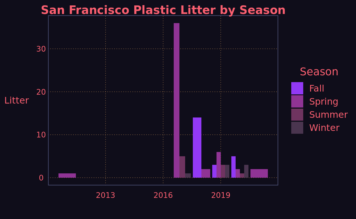
Comparing the times that litter is reported on OpenLitter in these two cities shows that there are stark differences. The vast majority of Miami’s plastic litter gets reported in the spring while San Francisco shows a more even spread across the seasons of the year.
Show code
# Barplot showing San Francisco litter reportage seasonally
ggplot(data = sanfranlong, mapping = aes(x = year(datetime), y = total_litter, fill = season)) +
  geom_col(position = "dodge") +
  new_retro() +
  scale_fill_newRetro() +
  labs(title = "San Francisco Plastic Litter by Season",
       x = "",
       y = "Litter",
       fill = "Season")
Show code
# Miami barplot of seasonal litter
ggplot(data = miamilong, mapping = aes(x = year(datetime), y = total_litter, fill = season)) +
  geom_col(position = "dodge") +
  new_retro() +
  scale_fill_newRetro() +
  labs(title = "Miami Plastic Litter by Season",
       x = "",
       y = "Litter",
       fill = "Season")
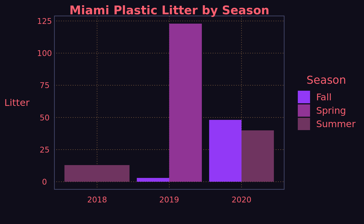
There are many different variables that could be responsible for the increased levels of plastic pollution in the Miami metro area. We argue that the cause is most likely not oceanic plastic contributing to beach pollution as if that were the case the Bay Area would be more likely to have more pollution. With the tools we currently have, it would also be difficult to determine if these differences are caused by the behavior of inhabitants of either area. However, the difference might be caused by municipal programs and environmental policy that make it harder for plastic to enter the waste stream or encourage activities like recycling.
San Francisco in particular has a long history of progressive environmental policies that might explain its reduced plastic pollution frequency. San Francisco became the center of a nationwide spotlight when in 2007 it introduced the controversial ‘bag tax’. 2 This disincentivizes the use of plastic bags by banning particularly thing ones and instituting a tax on thicker plastic bags. Additionally, San Francisco in particular has made a large number of grants and funds available to NGOs and grassroots organizations to create programs to reduce waste and emissions. 3 One other possible solution to why the pollution rates are lower in the Bay Area is the presence of robust recycling programs. San Francisco specifically allows the recycling of a wide variety of plastics from plastic jugs and bottles to bags and other containers. 4 Miami-Dade on the other hand only recycles plastics in the shape of bottles (regardless of the chemical content which makes no sense). 5 Recycling systems that can take a variety of inputs are important because they can reduce the amount of plastic in the waste stream overall. Plastics that end up in landfills have a tendency to become fugitive and contribute to environmental pollution, as in the cases of plastic bags or microplastics (or the even more nebulous nanoplastics). 6 All of these initiatives are likely to lead to less plastic pollution present to users of the app in San Francisco relative to Miami. This data shows us that the types of policies that environmental groups have been championing for decades might be having an appreciable effect on the amount of plastic in the environment. More studies need to be done in order to control for things such as the general behavior of the public and how funds for programs like the ones discussed in this blog are distributed to different neighborhoods based on socioeconomic status and racial distributions. Controlling the amount of plastic in the environment is imperative to both the health of the environment and the citizens affected by these policies. The health affects of plastic are not well understood, but ingestion of them can’t be great for you. 7 Apps like the Open Litter Project should be promoted and more widely used by inhabitants of cities if we truly want to curb pollution; however, we would suggest adding an anonymized user ID feature in order to standardize the number of users.
Lynch, Seán. 2018. “OpenLitterMap.Com – Open Data on Plastic Pollution with Blockchain Rewards (Littercoin).” Open Geospatial Data, Software and Standards 3(1): 6.