Introduction
This blog post will focus give an overview of how to use the TDA package in R to identify holes in a data set. The TDA package is designed to perform topological data analysis in R. This post will focus on the ripsFiltration and ripsDiag functions which can be used to find holes in a data set using techniques from topology. This post will go over some basic elements of topology to give a better background of what the functions do and how to interpret the results.
What is Topological Data Analysis?
Topological data analysis (TDA) studies the underlying geometric structures of data. Although this works as a snappy one sentence definition, it doesn’t provide that much of an insight into what TDA can tell us about a data set. To start off, we should learn more about what topology is. Topology is a branch of math that studies what features of geometric objects stay the same when they undergo \(\textit{continuous deformations}\).
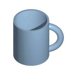
Continuous deformations are changes in shape such as stretching and twisting the object without tearing it or creating any new connections. The above gif shows why a donut is a continuous deformation of a coffee cup (be sure not to send a topologist on a coffee run). For another example consider taking a rubber band and twisting and stretching it in any way you want without it breaking. Geometric properties of the rubber band that are shared by all different shapes created in this manner would be topological properties of the rubber band. Here, the hole in the rubber band’s center would be a topological property.
It is important to remember that TDA is almost always used for higher dimensional data sets so while most of these examples will use two dimensional data, TDA is most useful when working with data where it is harder to visualize relationships in the data. Although it may seem counterintuitive that we can learn more about data by losing most of what we know about its spacial structure, TDA allows us to find features that originally would have not been apparent in noisy data or higher dimensional data. Furthermore, it can be used to find data with similar shapes even if the size and orientation are significantly different, since topological features will remain the same.
TDA can be used to study data on practically any topic and has been applied everywhere from biostatistics to hockey. One group of researchers was able to identify a new type of breast cancer with a much higher chance of survival by finding a subgrouping in data using TDA. Another interesting application of TDA is for identifying 3D objects. If you are given a 3D image of a dog, it is hard to identify other 3D images of dogs since they will come in a wide variety of shapes and size. However, it is much more likely that all 3D images of dogs will share a number of topological features that can be used to identify them as such.
Rips Filtration and Complexes
To start, we will want to install the TDA package and load it into our R session.
library(TDA)
TDA serves as an interface between R and the C++ libraries GUDHI, Dionysus, and PHAT. This allows us to use the more efficient algorithms of C++ without learning a new coding language.
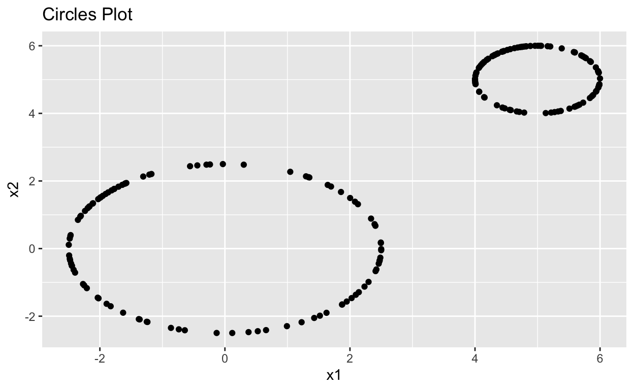
Lets start with one of the simpler function in TDA, circleUnif. This function allows us to quickly create a matrix of \(m\) randomly generated points from a circle centered at the origin with a given radius. The following code generates two random circles, one centered at the origin with radius 2.5 and another centered at (5, 5) with a radius of 1, and then combines them in a new matrix.
set.seed(102)

Circle1 <- circleUnif(n = 100, r = 2.5)
Circle2 <- circleUnif(n = 100, r = 1) + 5
Circles <- rbind(Circle1, Circle2)
Show code
Circles %>%
  head(5) %>%
  kbl() %>%
  kable_styling(c("striped"), full_width = F) %>%
  add_header_above(c("First 5 Rows of Circles" = 2))
| x1 | x2 |
|---|---|
| -2.2510546 | -1.0875445 |
| -2.4975005 | 0.1117632 |
| 0.5253384 | -2.4441807 |
| -2.4201214 | -0.6269069 |
| 2.1274736 | 1.3129571 |
Lets plot these points in ggplot to see what the data looks like. We can easily see the holes in the data but is there a way to find these holes with out seeing them on a plot?
Show code
Circles_plot <- ggplot(data.frame(Circles), aes(x = x1, y = x2)) +
  geom_point() +
  labs(title = "Circles Plot")

Circles_plot
To find holes in data, we will want to use the TDA package. First, lets do a quick overview of what’s going on behind the scenes.
Show code
Circles_df <- data.frame(Circles)
Circles_ripsComplex <- Circles_plot  +
  geom_point(size = 20, color = "red")

for(i in 1:nrow(Circles_df)){
  for(j in i:nrow(Circles_df)){
    if(sqrt((Circles_df$x1[i] - Circles_df$x1[j])^2 + (Circles_df$x2[i] - Circles_df$x2[j])^2) < 0.8){
      Circles_ripsComplex <- Circles_ripsComplex + geom_segment(x = Circles_df$x1[i],
                           y = Circles_df$x2[i],
                           xend = Circles_df$x1[j],
                           yend = Circles_df$x2[j])
    }
  }
}
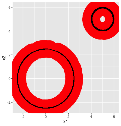
You’ll notice the red circles and lines that have been added to the data, this is an important step as these are used to form the \(\textit{Simplicial Complex}\). In order to perform topological analysis, we need to impose a continuous structure on our point cloud.Think back to our definition of continuous deformation, if we were to continuously deform a cloud of unconnected points there would be no geometric features of the point cloud that would remain constant between all deformations.
To avoid this, we choose a distance, \(\epsilon\) and then create an edge between all points with distance \(\epsilon\) of each other. One way to visualize this is to draw a ball with radius \(\frac{\epsilon}{2}\) around each point and then connect all points with intersecting balls. Luckily, the TDA package will create a sequence of \(\textit{Rips Complexes}\), called the \(\textit{Rips Filtration}\), for us by gradually increasing \(\epsilon\) so we don’t have to worry about finding a reasonable value for \(\epsilon\). The above plot gives us an idea of what the simplicial complex for the Circles data looks like when \(\epsilon \approx 0.4\).
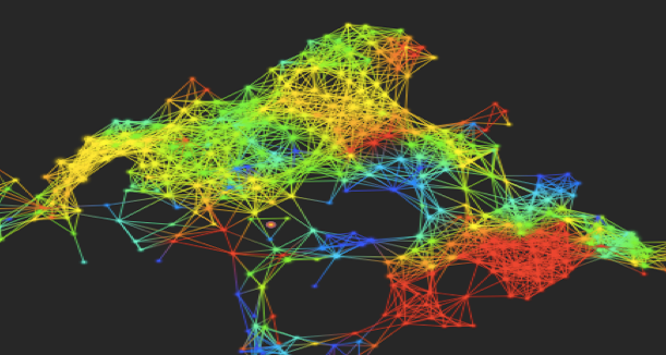
This diagram created by Elizabeth Munch1 using a smaller data set more clearly illustrates what is happening when the Rips Filtration is created, showing the simplicial complex on a data set when the radius increases.
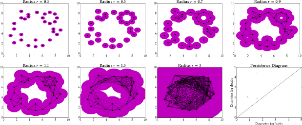
A Rips complex is very similar to a simplicial complex but has added \(\textit{simplexes}\) between connected points instead of just edges. A simplex is a \(n\)-dimensional triangle and one of the basic shapes used in topology. It might seem odd to use simplex, but they have the great property of being able to add another dimension by adding one more vertice meaning their is a one-to-one relationship between the dimension of a simplex and the number of vertices. In order to create a Rips complex we will just add a \(n\)-dimensional simplex between any \(n\) points that are all connected. So two connected points are the end points of a line, three connected points are the vertices of a triangle, four connected points are the vertices of an tetrahedron and so on.
Now we can use the function ripsFiltration from the TDA package to find the Rips Filtration for the Circles data. The function ripsDiag will create a diagram that will show us key features of the Rips Filtration.
maxdim <- 1
maxscl <- 5

Circles_ripsFilt <- ripsFiltration(X = Circles,
                                   maxdimension = maxdim,
                                   maxscale = maxscl,
                                   dist = "euclidean")

Circles_ripsDiag <- ripsDiag(X = Circles,
                             maxdim,
                             maxscl,
                             dist = "euclidean")
The variable X must be a matrix, not a data frame. This can be a bit annoying but data frames containing numeric data can easily be coerced to a matrix.
The variable maxdimension selects what topological feature you want to look for. It can take the values 0, 1, or 2. If maxdimension = 0, ripsDiag will look for connected components in the data (running the function with maxdimension = 0 has caused my Rstudio to crash. I’ve submitted an issue on Github but would advise against using it at the moment). If maxdimension = 1, it will look for holes. If maxdimension = 2 it will look for voids. What’s the difference between all of these? Consider a hollow torus. This torus will have 1 connected component as the torus is made of a single closed surface. It will have two holes, one in the center and one inside its surface (if the torus was solid, it would only have one hole). Finally, it will have one void, the hollow interior of the torus. These values are called the \(\textit{Betti numbers}\) of a space and continue beyond three dimensions however, the TDA package only supports searching for up to three dimensional features at the moment.
The variable maxscale sets a limit to the value of \(\epsilon\) used to create the Rips Filtration. Choosing too small of a value can prevent the function from identifying topological features of the data while choosing too large of a value can be computationally expensive when working with a larger data set.
The variable dist defaults to euclidean, which means the euclidean distance between points is used to form the simplicial complex. This can be changed to find a non-Euclidean distance(e.g. the simplicial complex is built using cubes around points instead of balls), however you will have to define the measurement of distance you want to use in another code chunk. A more detailed description of how to do this can be found here.
The ripsFiltration function returns a list of \(\textit{simplexes}\), the associated value of \(\epsilon\), whether \(\epsilon\), and the coordinates for the vertices of the simplex. This process creates what is called a \(\textit{persistent homology}\). In the next section we will go over how to visualize the persistent homology for a data set.
Barcode and Persistence Diagrams
The function ripsDiag returns a list with one element; diagram. Using the plot function, we can create a plot called a \(\textit{persistence diagram}\) that will show us topological features of our data. These can easily be plotted as shown below.
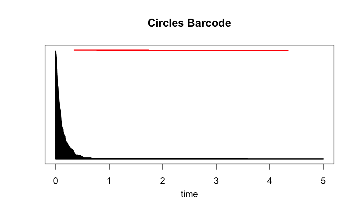
plot(Circles_ripsDiag$diagram, barcode = TRUE, main = "Circles Barcode")
This text is indented.
This plot shows the \(\textit{persistence barcode}\) for the Circles data. The \(\textit{time}\) variable on the \(x\)-axis is the same as \(\epsilon\), so at time 2, \(\epsilon = 2\). There is no variable associated with the \(y\)-axis. The black barcodes correspond to groupings of points and the red barcodes correspond to holes in the data.
This text is indented.
How do we read this? Let’s start with the groupings. At time 0, there will be no edges between so no subgroups will have formed in the data. As the time increases, more connections will form causing the number of subgroups to decrease. Given a time, we can find the number of unconnected subgroups by counting the number of barcodes above that value on the \(x\)-axis. When time\(=2\), we can see there are only 2 distinct subgroups in the Rips Complex. These will be the two circles.
This text is indented.
The red barcodes correspond to holes in the data. These holes first appear in the Rips Complex at the time when the barcode starts and then disappear when the barcode ends. So when time\(=1\), both the Rips Complex will have holes at the center of both circles.
plot(Circles_ripsDiag$diagram, main = "Circles Persistence Diagram")
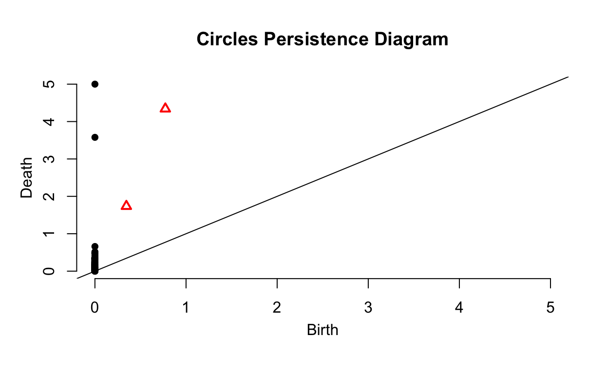
There is another way to display the same information called a \(\textit{persistence diagram}\). These tend to be slightly more interpretable. The \(x\)-axis, Birth, is the time at which a barcode in the previous plot starts. The \(y\)-axis, Deaths, is the time at which a barcode in the previous plot ends. Given this, all points will fall above the plotted line with slope of 1 since Birth\(>\)Death. As you may have guessed, the black points show subgroupings while the red triangles show holes. Points near the plotted line are noise in the data, topological features that only appear for a small interval of values of \(\epsilon\) and are due to randomness. The two points and two triangles are the distinct circles and their holes, the important topological features of the data.
More Persistence Diagrams
What will these diagrams look like for more complex data? The following code samples points from a three-dimensional tube with a height and diameter of 1. Using the Plotly library, we can easily visualize this data.
Show code
Tube %>%
  head(5) %>%
  kbl() %>%
  kable_styling(c("striped"), full_width = F) %>%
  add_header_above(c("First 5 Rows of Tube" = 3))
| x | y | z |
|---|---|---|
| 0.3304080 | -0.3752740 | 0.4800319 |
| -0.1543315 | 0.4755857 | 0.5817233 |
| 0.3381166 | -0.3683438 | 0.9003207 |
| -0.2985080 | -0.4011147 | 0.5407285 |
| 0.4882822 | 0.1076126 | 0.3091733 |
Show code
plot_ly(x = Tube[,"x"], y = Tube[,"y"], z = Tube[,"z"])
Now now lets plot the persistence diagram for the tube.
Tube_ripsDiag <- ripsDiag(X = Tube, maxdimension = 1, maxscale = 1)
plot(Tube_ripsDiag$diagram, main = "Tube Persistence Diagram")
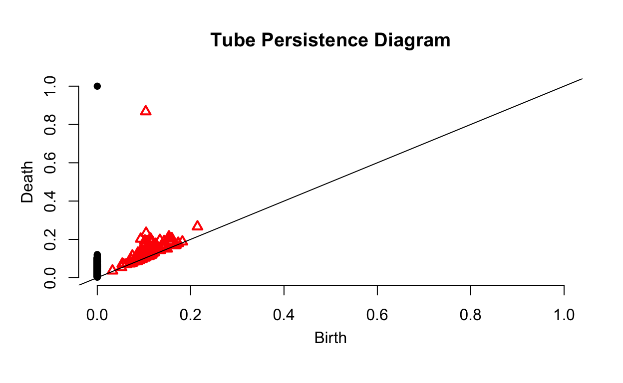
As we can see, there is much more noise in this data. Looking at the sides of the tube, we can see a number of gaps that create this noise. However, we can see that the data is sampled from one surface with one hole based on the fact that there is only one point and one triangle a significant distance from the plotted line. This is what we would expect from a tube.
The large amount of empty space on the right side of the diagram seems to suggest that we chose an unnecessarily large value for maxscale. However, both axes will have the same scale. We can see that the hole disappears around the time 0.88. Given this, we will want to make sure that no important features appear at largest value of Death since this means the diagram won’t tell us when the hole disappears. There should always be one point at \((0,\text{max}(\epsilon))\) since a single surface will continue to persist as the time increases without limit.
Lets build a persistence diagram one more time but for a more complex data set. The following code creates the shape by scaling and twisting a sample from a tube similar to the one in the last example. We also add a little bit of error to the points to make it more similar to a real data set.
set.seed(1982)
Weird_Tube <- circleUnif(200)
Weird_Tube <- cbind(Weird_Tube, runif(200))
colnames(Weird_Tube) <- c("x", "y", "z")

Weird_Tube[,"x"] <- 2*Weird_Tube[,"x"]
Weird_Tube[,"y"] <- Weird_Tube[,"y"] + 2*cos(Weird_Tube[,"x"])
Weird_Tube[,"z"] <- Weird_Tube[,"z"] + 2*sin(Weird_Tube[,"x"])

error <- replicate(200, runif(3, -0.25, 0.25))
Weird_Tube <- Weird_Tube + t(error)
Show code
Weird_Tube  %>%
  head(5) %>%
  kbl() %>%
  kable_styling(c("striped"), full_width = F) %>%
  add_header_above(c("First 5 Rows of Weird Tube" = 3))
| x | y | z |
|---|---|---|
| -0.1818601 | 0.8501689 | 0.8958391 |
| -1.6364713 | -0.7271264 | -1.5929272 |
| -1.9034865 | -0.9645630 | -1.4335110 |
| -1.3819372 | 0.0522947 | -1.3825646 |
| 0.3222861 | 2.7314390 | 1.8439901 |
Show code
plot_ly(x = Weird_Tube[,"x"], y = Weird_Tube[,"y"], z = Weird_Tube[,"z"])
Show code
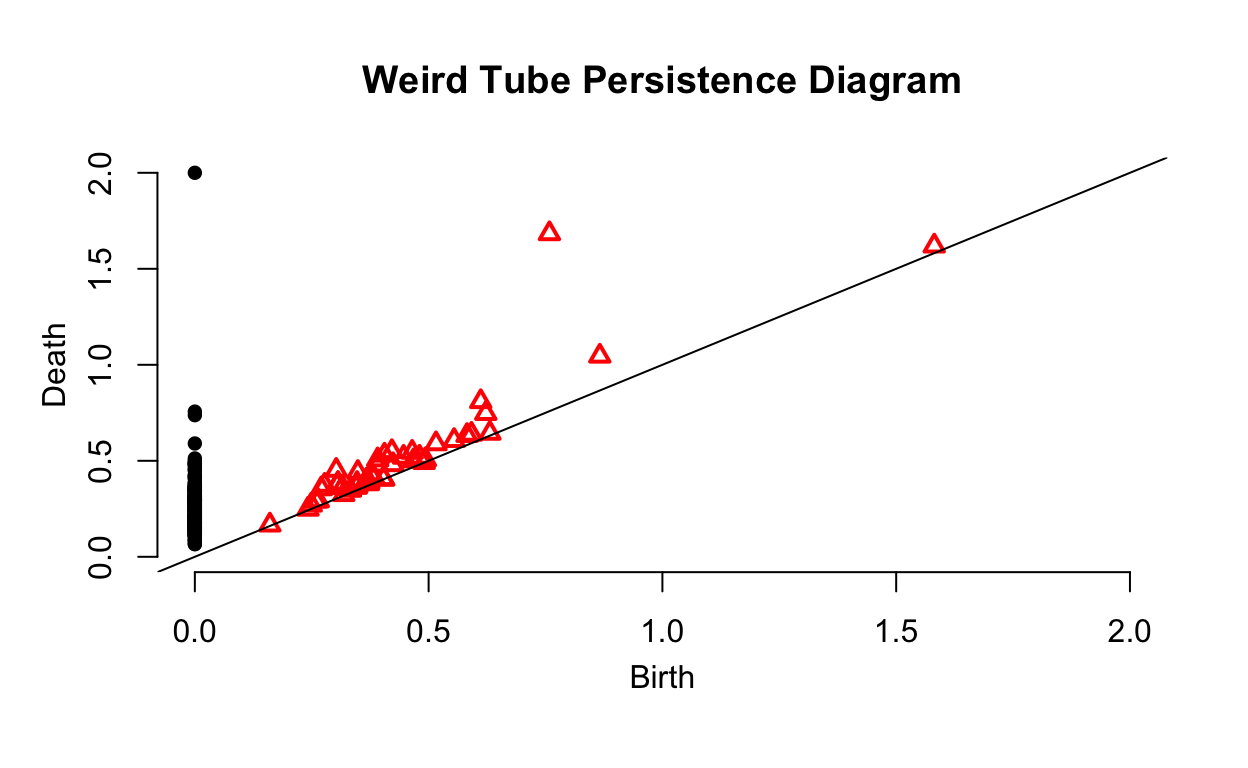
As we can see, this persistence diagram has significantly more noise but still identifies the important topological features of the data as we can clearly see the hole in the data has been identified.
Higher Dimensional Data
All of the previous examples have used data in two or three dimension, allowing us to visualize the data. Lets generate a 6-dimensional data set.
Show code
set.seed(99)

high_dim1 <- circleUnif(n = 100, r = 0.5)
high_dim2 <- t(replicate(100, runif(2)))
high_dim3 <- circleUnif(100) + 1
high_dim <- cbind(high_dim1, high_dim2)
high_dim <- cbind(high_dim, high_dim3)
colnames(high_dim) <- c("x1", "x2", "x3", "x4", "x5", "x6")

high_dim  %>%
  head(5) %>%
  kbl() %>%
  kable_styling(c("striped"), full_width = F) %>%
  add_header_above(c("First 5 Rows of 6-Dimensional Data" = 6))
| x1 | x2 | x3 | x4 | x5 | x6 |
|---|---|---|---|---|---|
| -0.4308311 | -0.2537411 | 0.0574493 | 0.8094394 | 1.9588803 | 1.2838109 |
| 0.3775757 | 0.3277752 | 0.7337133 | 0.0902656 | 1.9937493 | 0.8883653 |
| -0.2006917 | -0.4579551 | 0.6293834 | 0.6877161 | 0.7572284 | 1.9700835 |
| 0.4994462 | -0.0235257 | 0.3452700 | 0.5900884 | 1.9944005 | 1.1056774 |
| -0.4879628 | -0.1090520 | 0.1397603 | 0.1577528 | 1.8545067 | 0.4805596 |
Since we can’t visualize this data, we can’t just plot it and look for holes in the data. Instead, we will have to rely on topological data analysis to find if there are holes in the data.
high_dim_ripsDiag <- ripsDiag(high_dim, 1, 1.5)
plot(high_dim_ripsDiag$diagram, main = "Persistence Diagram for 6-Dimensional Data")
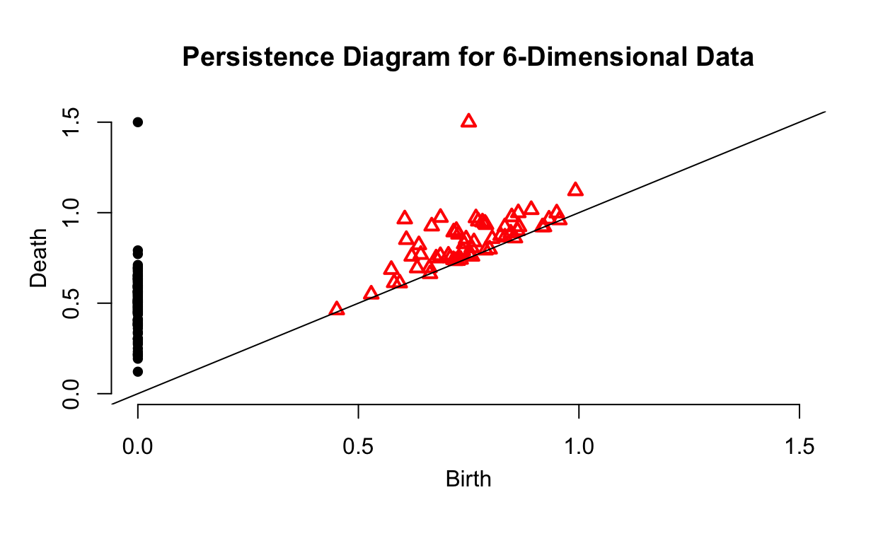
The persistence diagram gives us a better idea of the data’s geometry. We can see that the data seems to be sampled from a single surface. Furthermore, the persistence diagram tells us that the data has one hole that is a key feature in its structure.
Comparing Persistence Diagrams
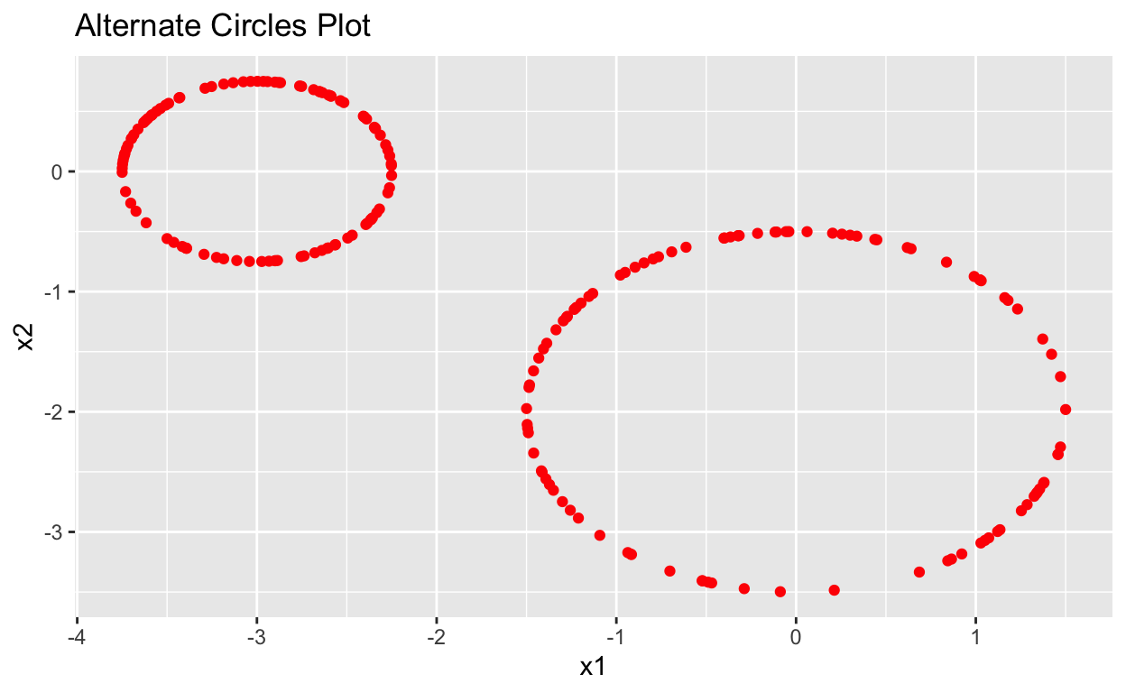
Lets return to our first example that found the persistence diagram for two circles in two dimensions. What will the persistence diagram look like for a similar pair of circles with a different size and orientation? We will create an alternate pair of circles and then compare the two persistence diagrams.
Show code
set.seed(1996)
Circles_alt1 <- circleUnif(100, r = 0.75)
Circles_alt2 <- circleUnif(100, r = 1.5)

Circles_alt1[,"x1"] <- Circles_alt1[,"x1"] - 3
Circles_alt2[,"x2"] <- Circles_alt2[,"x2"] - 2

Circles_alt <- rbind(Circles_alt1, Circles_alt2)
Show code
data.frame(Circles_alt) %>%
  ggplot(aes(x = x1, y = x2)) +
  geom_point(color = "red") +
  labs(title = "Alternate Circles Plot")
Show code
Circles_plot +
  geom_point(data = data.frame(Circles_alt),
             aes(x = x1, y = x2), color = "red") +
  labs(title = "Circles + Alternate Circles")
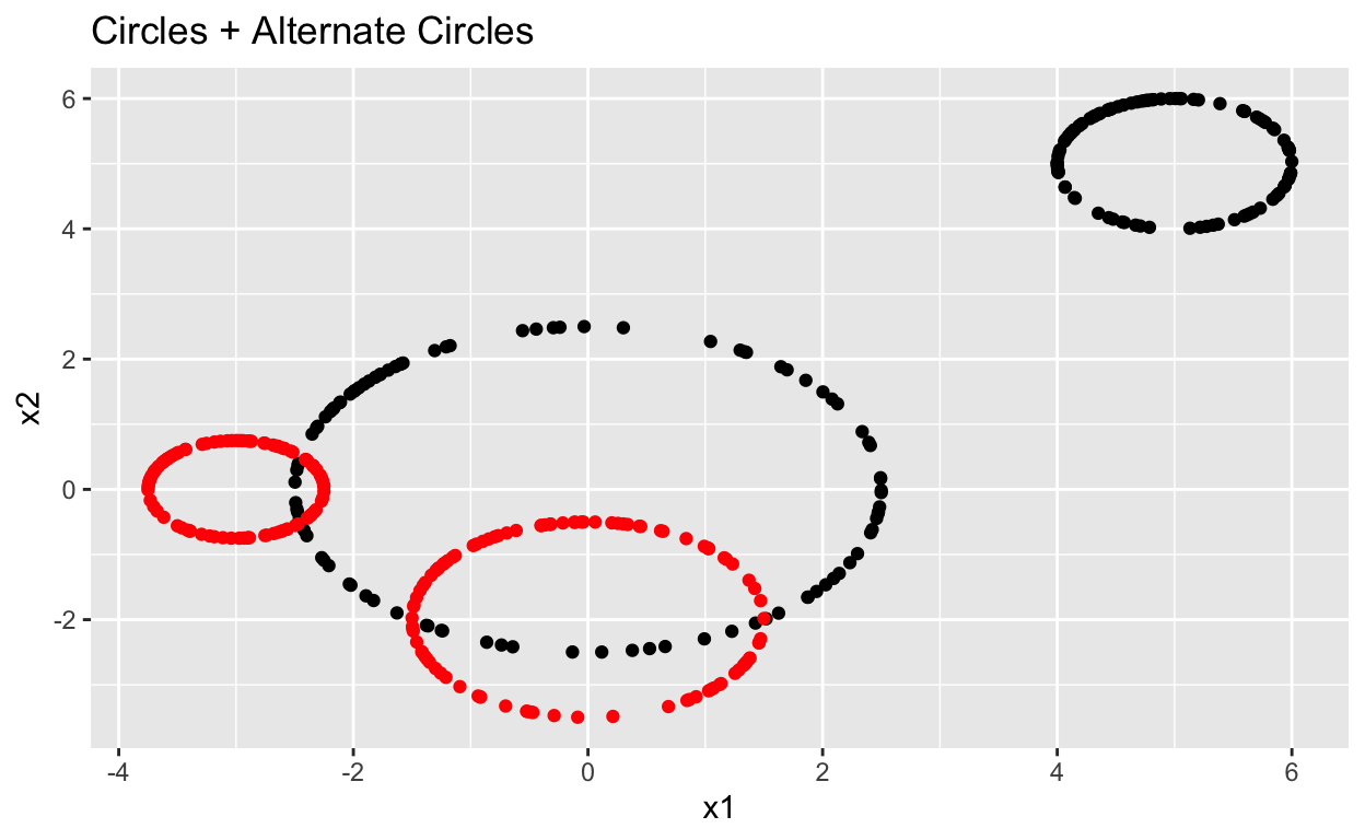
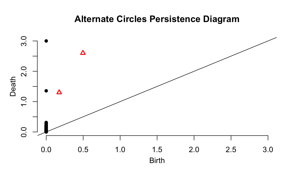

The two persistence diagrams are very similar other. The scale is different and the alternate circles have a small amount of noise but all key features are similar. We can tell the two data sets have two significant surfaces and holes, one of which is larger than the other. Persistence diagrams can be used to identify data with similar structures even as orientation and size changes. This can be useful for identifying objects in images as the topologic features of an object will remain the same across images where the object is scaled and viewed from different perspectives.
Sources and Further Reading
Topology is a huge field within mathematics and this post has only scratched the surface of it. Included is a list of sources that I consulted in writing this blog post. I highly recommend exploring some of them if you want to go deeper into the material covered.
Introduction to the R TDA Package - Brittany T. Fasy, Jisu Kim, Fabrizio Lecci, Cl´ement Maria, David L. Millman, and Vincent Rouvreau
Documentation for the TDA package.
Tutorial on the R package TDA - Brittany T. Fasy, Jisu Kim, Fabrizio Lecci, Cl´ement Maria, Vincent Rouvreau
Tutorial by the creators of the TDA package. This is less detailed than the documentation but more accessible.
R-TDA Package Tutorial - Mathieu Carrière and Steve Oudot
Tutorial that covers more functions in the TDA package.
Rips Filtration Tutorial for the R-TDA Package - Ben Holmgren
Covers the ripsFiltration and ripsDiag functions, covers more ways these functions can be used.
A Users Guide to Topological Data Analysis - Elizabeth Munch
Gives a more general overview of the basics of topological data analysis.
Studying the Shape of Data Using Topology - Michael Lesnick
Good simple overview of topological data analysis.
Introduction to Persistent Homology - Matthew Wright
Short video covering the basics of persistent homology.
Applied Topology - David Damiano
Series of lectures about topological data analysis.