Have you ever wondered about what animals and plants live in a National Park? The National Park Service publishes data about all recorded species. These data are collected by the NPS and we downloaded the dataset for use in this blog from kaggle. While these data are from a reliable source, there are some caveats. There are some duplicate observations because of rapidly changing taxonomic (species) naming trends and some species are actually extinct (observations have been made of their remains). Data on some threatened or endangered species is removed from this dataset if it could contribute to their decline or threaten them in any way.
In this post we are interested in asking the question: “How does species diversity differ between National Parks?” In other words, we are interested in finding out how the number of species changes from park to park. We will explore this question using the ggplot2, treemap, fmsb, and igraph packages. While all of these packages will be useful in determining the species diversity in different National Parks, some may be more useful than others. Ggplot2 is a commonly used graphing package with broad applications. However, it does not have the specific capabilities of treemap, fmsb, or igraph. The purpose of this post is to compare these packages in the context of examining species diversity to determine which ones are most useful and how their functionalities complement one another.
Show code
#csv read ins and column renameing
park_dat <- read_csv("~/Fun_graphs/_posts/2021-03-07-mini-project-2-instructions/data/parks.csv")
species_dat <- read_csv("~/Fun_graphs/_posts/2021-03-07-mini-project-2-instructions/data/species.csv")

#lol species is HUGE
park_dat <- park_dat%>%
  rename(
    Park_name = 'Park Name',
    Park_code = 'Park Code'
    )

species_dat <- species_dat %>%
  rename(
    Park_name = 'Park Name',
    Sci_name = 'Scientific Name',
    Record_status = 'Record Status',
    Common_name = 'Common Names',
    Conservation_status = 'Conservation Status',
    Species_ID = 'Species ID'
    )
Show code
# A tibble: 0 x 19
# … with 19 variables: Species_ID <chr>, Park_name <chr>,
#   Category <chr>, Order <chr>, Family <chr>, Sci_name <chr>,
#   Common_name <chr>, Record_status <chr>, Occurrence <chr>,
#   Nativeness <chr>, Abundance <chr>, Seasonality <chr>,
#   Conservation_status <chr>, X14 <lgl>, Park_code <chr>,
#   State <chr>, Acres <dbl>, Latitude <dbl>, Longitude <dbl>
Show code
#nice
Show code
count_park <- full_dat_1 %>% count(Park_name)
#okay now I'm going to make a dataset that tells you how many different spieces each park has. I'm sure it'll be nifty
park_count <- left_join(park_dat, count_park, by = c("Park_name" = "Park_name"))
#renaming
park_count <- rename(park_count, n_species = "n")
Show code
Show code
# A tibble: 14 x 2
   Category                n
   <chr>               <int>
 1 Algae                 976
 2 Amphibian             743
 3 Bird                14601
 4 Crab/Lobster/Shrimp   582
 5 Fish                 3956
 6 Fungi                6203
 7 Insect              14349
 8 Invertebrate         1566
 9 Mammal               3867
10 Nonvascular Plant    4278
11 Reptile              1343
12 Slug/Snail            787
13 Spider/Scorpion       776
14 Vascular Plant      65221
Show code
#Graph 1: Number of Species per Park
ggplot(data = current_species_counts, mapping = aes(x = reorder(Park_name, -n), y = n)) +
  geom_col(fill = "skyblue") +
  ylab("Number of Species") +
  ggtitle("Number of Species in Each National Park") +
  theme(axis.text.x=element_text(angle=90,hjust=1,vjust=0.5),
        axis.title.x = element_blank())
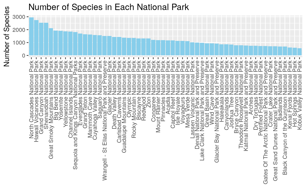
This graph is a very simple way to look at the number of species in each national park. We can see that North Cascades and Hawaii Volcanoes National Parks have the most species. Notice also that there aren’t any obvious groupings into high species number parks or low species number parks. Instead we see a wide range of species numbers.
Show code
#Adding regions to the data
dat_regions_approved <- full_dat_1 %>%
  filter(Occurrence == "Present") %>%
  filter(Record_status == "Approved") %>%
  mutate(Region = fct_collapse(State,
                               Northeast = c("ME"),
                               Southeast = c("FL", "KY", "AR", "TN, NC", "SC", "VA"),
                               Midwest = c("MI", "ND", "SD", "OH", "MN"),
                               Southwest = c("AZ", "NM", "TX"),
                               Mountain = c("UT", "CO", "MT", "WY", "NV", "WY, MT, ID"),
                               Pacific = c("WA", "OR", "CA", "CA, NV"),
                               Noncontiguous = c("AK", "HI")))
Show code
#Region counts for graphs
regions_counts <- full_dat_1 %>%
  filter(Occurrence == "Present") %>%
  filter(Record_status == "Approved") %>%
  mutate(Region = fct_collapse(State,
                               Northeast = c("ME"),
                               Southeast = c("FL", "KY", "AR", "TN, NC", "SC", "VA"),
                               Midwest = c("MI", "ND", "SD", "OH", "MN"),
                               Southwest = c("AZ", "NM", "TX"),
                               Mountain = c("UT", "CO", "MT", "WY", "NV", "WY, MT, ID"),
                               Pacific = c("WA", "OR", "CA", "CA, NV"),
                               Noncontiguous = c("AK", "HI"))) %>%
  count(Region)
Show code
#Graph 2: Regions graph with colors
ggplot(data = regions_counts, mapping = aes(x = Region, y = n, fill = Region)) +
  geom_col() +
  scale_fill_manual(values=c("cyan3", "darkorchid4", "darkgoldenrod1", "deeppink2", "coral", "chocolate4", "darkseagreen")) +
  ylab("Number of Species") +
  ggtitle("Number of Species per Region") +
  theme(axis.text.x=element_text(angle=90,hjust=1,vjust=0.5),
        axis.title.x = element_blank(),
        axis.ticks.x = element_blank())
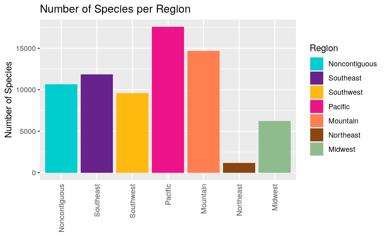
Next we used the dplyr wrangling package to make a “region” category which tells us about species diversity in national parks in different areas of the country. This shows us that national parks in the Pacific Region have the most species. We have to keep in mind however that while the Pacific Region has many parks, the Northeast Region only has one. This means that the Pacific Region is likely to have more species just because Pacific Region Parks cover more area.
Show code
#Graph 3: Graph with all parks and region colors

dat_regions_approved$Park_name = factor(dat_regions_approved$Park_name, levels = c("Arches National Park", "Black Canyon of the Gunnison National Park", "Bryce Canyon National Park", "Canyonlands National Park", "Capitol Reef National Park", "Glacier National Park", "Grand Teton National Park", "Great Basin National Park", "Great Sand Dunes National Park and Preserve", "Mesa Verde National Park", "Rocky Mountain National Park", "Yellowstone National Park", "Zion National Park", "Acadia National Park", "Badlands National Park", "Cuyahoga Valley National Park", "Isle Royale National Park", "Theodore Roosevelt National Park", "Voyageurs National Park", "Wind Cave National Park", "Big Bend National Park", "Carlsbad Caverns National Park", "Grand Canyon National Park", "Guadalupe Mountains National Park", "Petrified Forest National Park", "Saguaro National Park", "Denali National Park and Preserve", "Gates of the Arctic National Park and Preserve", "Glacier Bay National Park and Preserve", "Haleakala National Park", "Hawaii Volcanoes National Park", "Katmai National Park and Preserve", "Kenai National Park", "Kobuk Valley National Park", "Lake Clark National Park and Preserve", "Wrangell - St Elias National Park and Preserve", "Biscayne National Park", "Congaree National Park", "Dry Tortugas National Park", "Everglades National Park", "Great Smoky Mountains National Park", "Hot Springs National Park", "Mammoth Cave National Park", "Shenandoah National Park", "Channel Islands National Park", "Crater Lake National Park", "Death Valley National Park", "Joshua Tree National Park", "Lassen Volcanic National Park", "Mount Ranier National Park", "North Cascades National Park", "Olympic National Park", "Pinnacles National Park", "Redwood National Park", "Sequoia and Kings Canyon National Parks", "Yosemite National Park"), ordered = TRUE)
ggplot(data = dat_regions_approved, mapping = aes(x = Park_name, fill = Region)) +
  geom_bar() +
  scale_fill_manual(values=c("cyan3", "darkorchid4", "darkgoldenrod1", "deeppink2", "coral", "chocolate4", "darkseagreen")) +
  ylab("Number of Species") +
  ggtitle("Species Diversity in National Parks by Geographic Region") +
  theme(axis.text.x=element_text(angle=90,hjust=1,vjust=0.5),
        axis.title.x = element_blank())
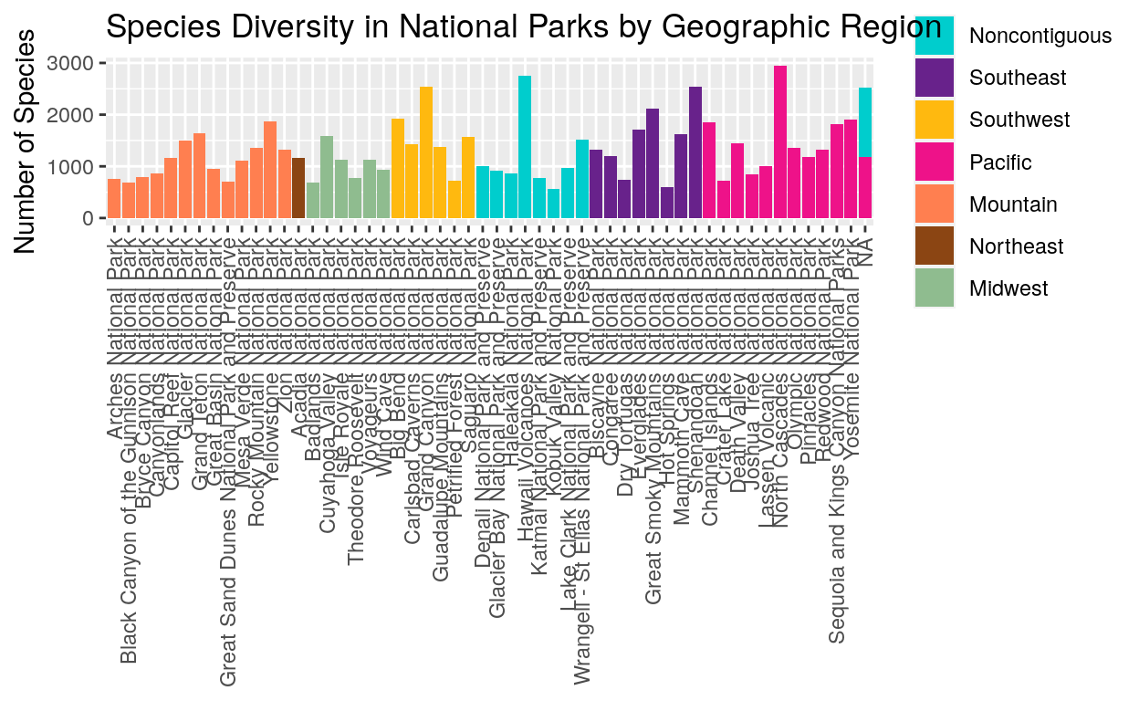
This graph combines the ideas from graphs one and two to show the species numbers for each park and also indicate where each park is located by Region. This is less misleading than the previous graph because we can see the individual parks. There’s a lot of variety in species numbers within each region!
Show code
#Graph 4: Compare 2 parks and species break down
graph4_dat <- dat_regions_approved %>%
  filter(Park_name == c("Glacier National Park", "Zion National Park"))

graph4_palette <- c("darkgoldenrod1", "coral", "navy", "cyan3", "deeppink2", "darkorchid3")

ggplot(data = graph4_dat, mapping = aes(x = Category, fill = Category)) +
  geom_bar() +
  facet_wrap(~Park_name) +
  scale_fill_manual(values = graph4_palette) +
  ylab("Number of Species") +
  ggtitle("Distribution of Species in Two Parks") +
  theme(axis.title.x = element_blank(),
        axis.ticks.x=element_blank())
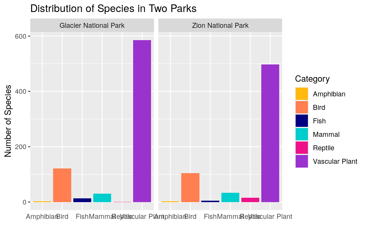
This graph helps us compare two parks in more detail. We can see that vascular plants make up a huge amount of the species diversity in both parks. We can see that Zion National Park has fewer vascular plant and bird species than Glacier, but more reptile species.
Show code
#Graph 5: Compare parks within one Category
graph5_dat <- dat_regions_approved %>%
  filter(Category == "Mammal") %>%
  filter(Park_name == c("Glacier National Park", "Zion National Park", "Lassen Volcanic National Park"))

ggplot(data = graph5_dat, mapping = aes(x = Park_name, fill = Park_name)) +
  geom_bar() +
  ylab("Number of Mammal Species") +
  ggtitle("Number of Mammal Species in Three Parks") +
  theme(axis.title.x = element_blank(),
        axis.text.x=element_blank(),
        axis.ticks.x=element_blank())
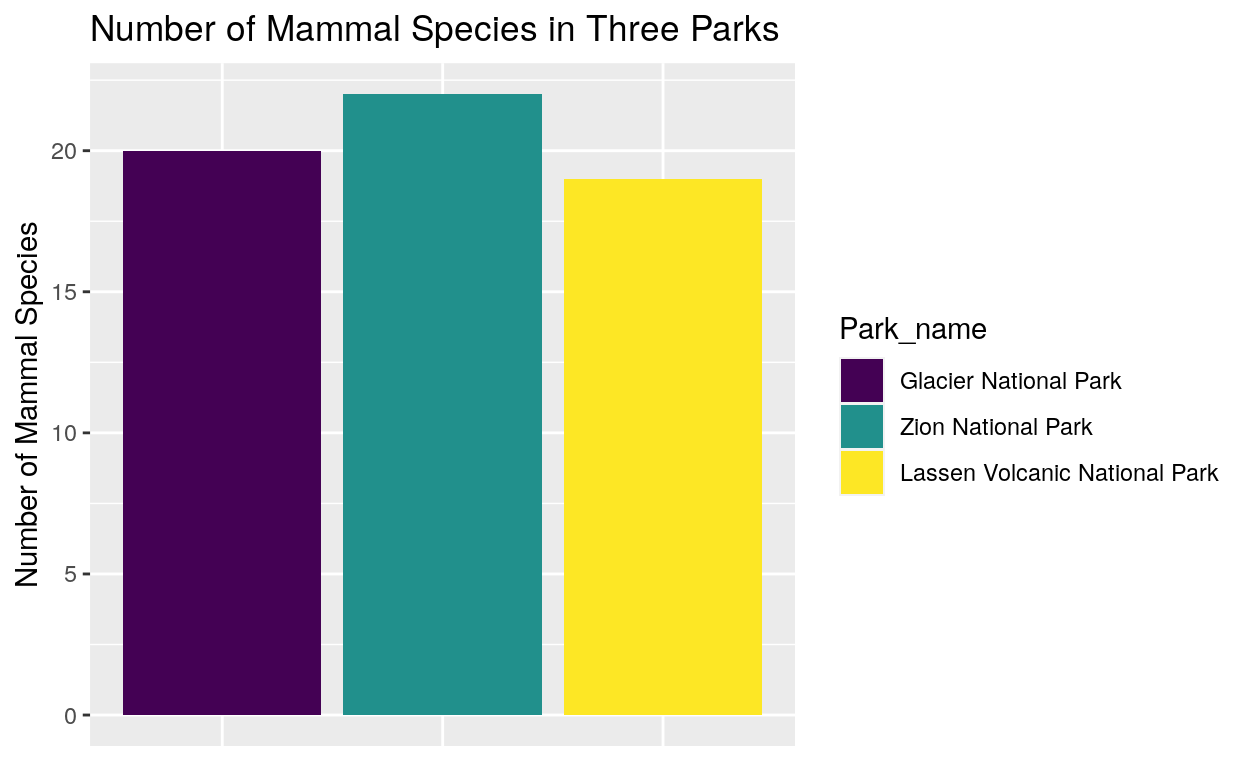
The mammals bar was hard to see in the previous graph so we can focus in on mammals and compare the number of mammal species in Glacier, Zion, and Lassen Volcanic National Park. We can see that Zion has the largest number of mammal species while Lassen Volcanic has the smallest number.
Show code
install.packages("treemap")
library(treemap)
This is an example of the first new package we worked with, the tree map package. It makes a ‘tile’ like graph.
Show code
treemap(park_dat,
            index="State", "Park_name",
            vSize="Acres",
            type="index"
            )
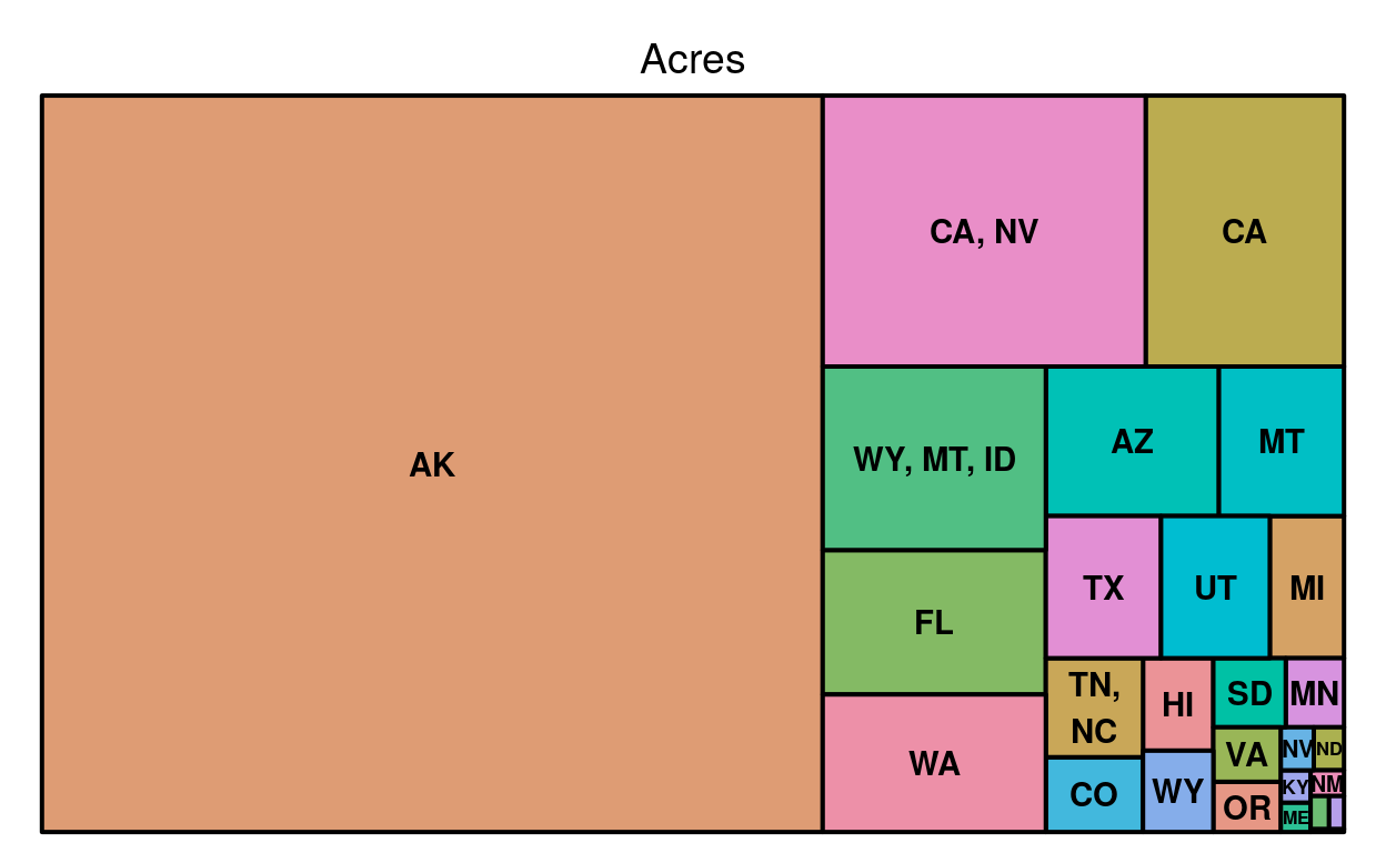
This is a ‘one-layer’ tree map, it’s one layer because the tiles aren’t subdivided. For this map square changes size based on how many acres of National Park each state has.
Show code
treemap(park_count_nonatl,
            index=c("State", "Park_name"),
            vSize="n_species",
            type="index",
        fontsize.labels=c(8,10),
    fontcolor.labels=c("black","black"),
    fontface.labels=c(2,1),
    bg.labels=c("transparent"),
    align.labels=list(
        c("left", "top"),
        c("right", "bottom")
        ),
    overlap.labels= 1 ,
    inflate.labels=F,
    palette = "Set2",
    title="Number of Distinct Species",
    fontsize.title=12,
            )
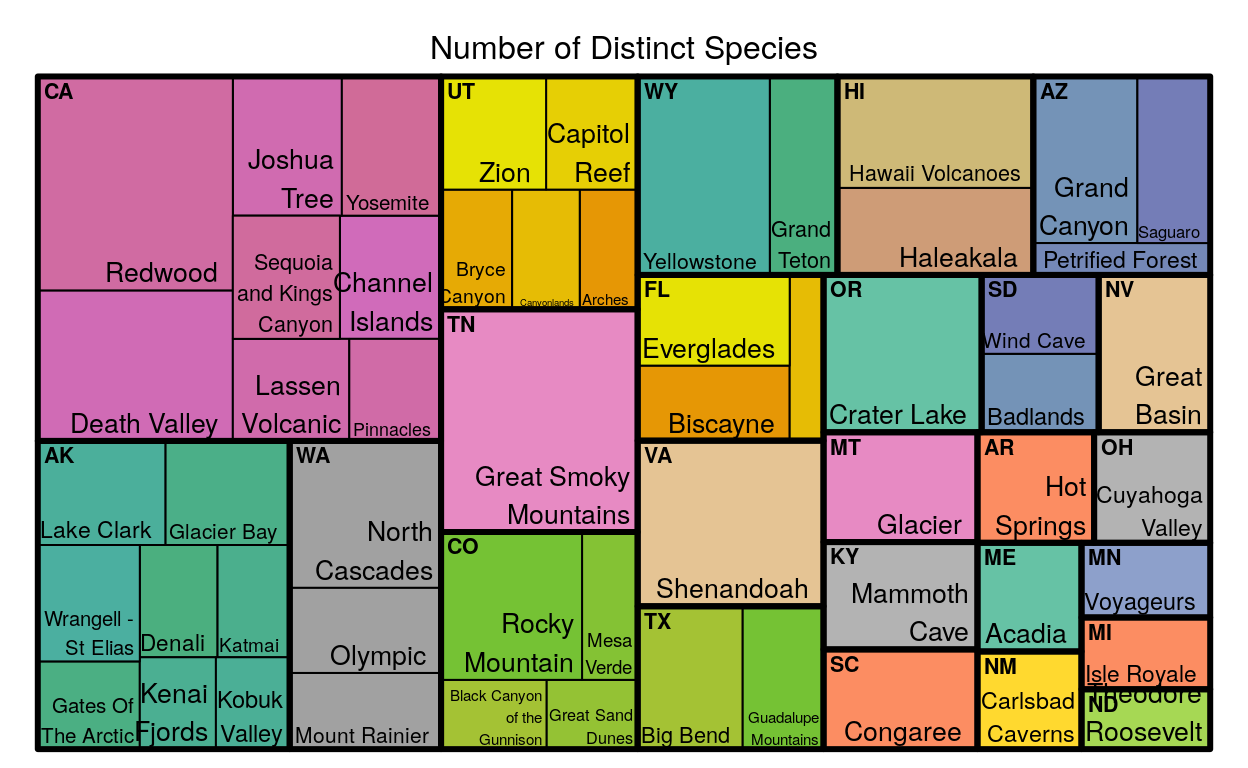
This is a two level tree map; it’s two levels because each square is divided once, making two levels of tiles that are different sizes. In the map above, the tiles change size based on the number of different species each park or state has.
Show code
tree_2_dat <- park_count_nonatl %>%
  filter(State == "CA")

treemap(tree_2_dat,
            index=c("Park_name"),
            vSize="n_species",
            type="index",
        fontsize.labels=c(10),
    fontcolor.labels=c("black"),
    fontface.labels=c(2,1),
    bg.labels=c("transparent"),
    align.labels=list(
        c("left", "top"),
        c("right", "bottom")
        ),
    overlap.labels= 1 ,
    inflate.labels=F,
    palette = "Blues",
    title="Number of Distinct Species in CA parks",
    fontsize.title=12,
            )
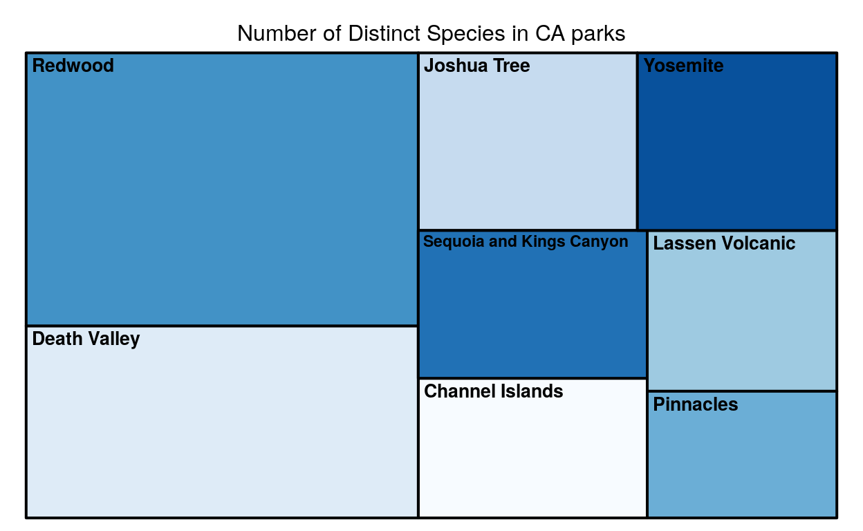
This is a zoom in veiw of the map above. Since California is the state had the largest tile, and since it had the largest tile it had the largest number of unique species, this graph zooms in so we can see how the parks in California compare to each other.
Radar graphs! The second package we looked at is the fmsb package, which makes radar graphs!Show code
install.packages("fmsb")
library(fmsb)
This is an example of a radar graph which compares the unique species count of three different parks from across the country.
Show code
radar_dat_1  <- data.frame(
  mammals= c(96, 59, 26),
  birds = c(252, 205, 261),
  reptiles = c(20, 20 , 5),
  amphibians = c(20, 8, 13),
  acres = c(183224, 76519, 571790),
  species = c (3760, 1048, 1397))
  rownames(radar_dat_1) <- c("Crater Lake National Park", "Arches National Park",
            "Isle Royale National Park")
radar_1 <- rbind(rep(100,000,6) , rep(0,6) , radar_dat_1)
library(RColorBrewer)
coul <- brewer.pal(3, "BuPu")
colors_border <- coul
library(scales)
colors_in <- alpha(coul,0.3)

radar_1_vis <- radarchart( radar_1[-c(1,2),]  , axistype=0 , maxmin=F,
    #custom polygon
    pcol=colors_border , pfcol=colors_in , plwd=4 , plty=1,
    cglcol="grey", cglty=1, axislabcol="black", cglwd=0.8,
    #custom labels
    vlcex=0.8
    )
legend(x= .9, y=.5, legend = rownames(radar_dat_1), bty = "n", pch=15 , col=colors_in , text.col = "black", cex=.8, pt.cex=2)
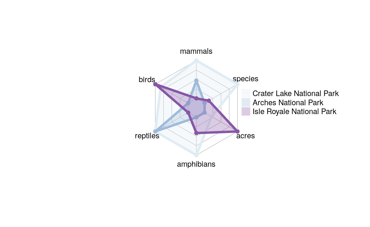
The sections of this graph (acres, species, birds, mammlas, reptiles, and amphibians) each respond to the unique number of species of each category, and the color matches to a different park. This graph is cool to look at, but it is a little misleading because the scales aren’t all the same. Acres and species had much larger values than the other variables (~100,000 and 2000), so if we want to compare them we have to remove the labels. This means we cannot compare between different variables, since halfway up acres and halfway up birds are actually very different numbers. The next graph we’ll look at deals with this problem.
Show code
radar_dat_2  <- data.frame(
  mammals= c(96, 59, 26),
  birds = c(252, 205, 261),
  reptiles = c(20, 20 , 5),
  amphibians = c(20, 8, 13))
  rownames(radar_dat_2) <- c("Crater Lake National Park", "Arches National Park",
            "Isle Royale National Park")
radar_2 <- rbind(rep(252,4) , rep(0,4) , radar_dat_2)
library(RColorBrewer)
coul <- brewer.pal(3, "BuPu")
colors_border <- coul
library(scales)
colors_in <- alpha(coul,0.3)

radar_vis_2<- radarchart(radar_2[-c(1,2),]  , axistype=0 , maxmin=F,
    #custom polygon
    pcol=colors_border , pfcol=colors_in , plwd=4 , plty=1,
    cglcol="grey", cglty=1, axislabcol="black", cglwd=0.8,
    #custom labels
    vlcex=0.8
    )
legend(x= .9, y=.8, legend = rownames(radar_dat_2), bty = "n", pch=15 , col=colors_in , text.col = "black", cex=.8, pt.cex=2)
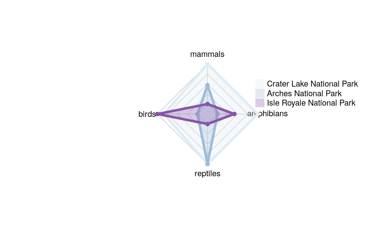
This is the same graph as the one above, just without acres and species, and now we can compare across sections.
Show code
radar_dat_3  <- data.frame(
  mammals= c(39, 54, 55),
  birds = c(134, 222, 235),
  pine = c(3, 3, 6),
  amphibians = c(1, 1, 1))
  rownames(radar_dat_3) <- c("Gates of the Arctic ", "Katmai National Park",
            "Kenai Fjords National Park")

radar_3 <- rbind(rep(235,4) , rep(0,4) , radar_dat_3)


radar_vis_3 <- radarchart( radar_3, axistype=0 , maxmin=F,
    #custom polygon
    pcol=colors_border , pfcol=colors_in , plwd=4 , plty=1,
    cglcol="grey", cglty=1, axislabcol="black", cglwd=0.8,
    #custom labels
    vlcex=0.8
    )
legend(x= .9, y=.6, legend = rownames(radar_dat_3), bty = "n", pch=15 , col=colors_in , text.col = "black", cex=.8, pt.cex=2)
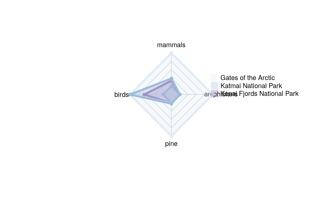
This graph is also one where everything is on the same scale, but these are parks that are all close to each other, they’re all in Alaska. Fun fact: Each of these parks has one species of amphibian, a tree frog, Rana sylvatica; the only species of amphibian in the western hemisphere that occurs north of the arctic circle
These are the last two packages we used, ggraph and igraph. You can use these packages to make network graphs, we used them to make dendrograms.
Show code
just_mammals <- full_dat_1 %>%
  filter(Category == "Mammal")
drop_na(just_mammals)
# A tibble: 0 x 19
# … with 19 variables: Species_ID <chr>, Park_name <chr>,
#   Category <chr>, Order <chr>, Family <chr>, Sci_name <chr>,
#   Common_name <chr>, Record_status <chr>, Occurrence <chr>,
#   Nativeness <chr>, Abundance <chr>, Seasonality <chr>,
#   Conservation_status <chr>, X14 <lgl>, Park_code <chr>,
#   State <chr>, Acres <dbl>, Latitude <dbl>, Longitude <dbl>
Show code
edges_Cate_Ord <- just_mammals %>% select(Category, Order) %>% unique %>% rename (from=Category, to=Order)

edges_Ord_Fam <- just_mammals %>% select(Order, Family) %>% unique %>% rename (from=Order, to=Family)

edges_Fam_Name <- just_mammals %>% select(Family, Sci_name) %>% unique %>% rename (from=Family, to=Sci_name)

edge_list_2=rbind(edges_Cate_Ord, edges_Ord_Fam, edges_Fam_Name)

just_mam_graph <- graph_from_data_frame( edge_list_2 )

ggraph(just_mam_graph, layout = 'dendrogram', circular = FALSE) +
  geom_edge_diagonal() +
  geom_node_point() +
  theme_void()
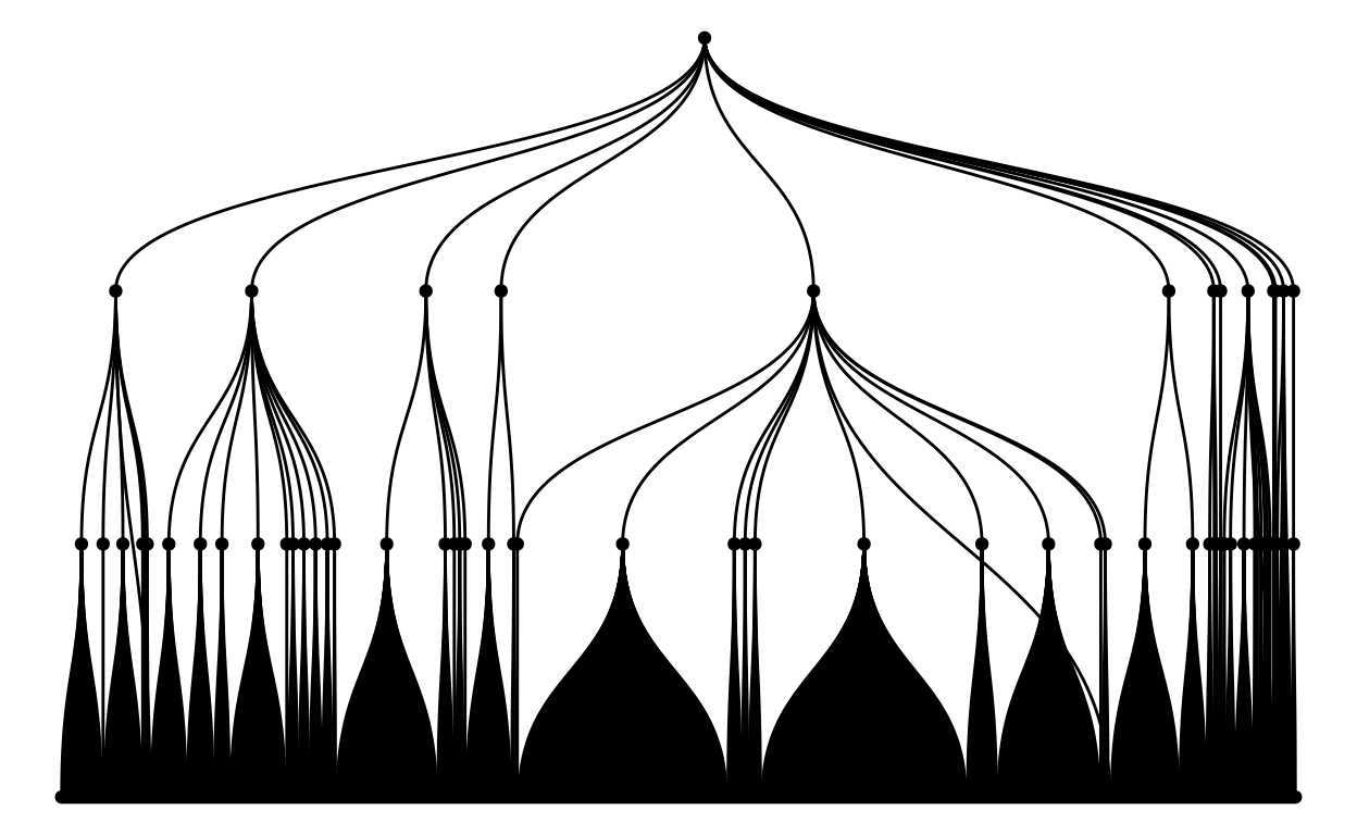
This is a tree graph of all of the mammal species from all of the parks! As you can see, there are a huge number of species, to the point where you can’t even distinguish one point from another!
This next graph is also a tree graph, but this one has only rabbit and hare species in the national parks (the Lagomorpha family),so we can see what a tree graph might look like where we can see the labels!
Show code
just_carn <- full_dat_1 %>%
  filter(Order == "Lagomorpha")
drop_na(just_mammals)
# A tibble: 0 x 19
# … with 19 variables: Species_ID <chr>, Park_name <chr>,
#   Category <chr>, Order <chr>, Family <chr>, Sci_name <chr>,
#   Common_name <chr>, Record_status <chr>, Occurrence <chr>,
#   Nativeness <chr>, Abundance <chr>, Seasonality <chr>,
#   Conservation_status <chr>, X14 <lgl>, Park_code <chr>,
#   State <chr>, Acres <dbl>, Latitude <dbl>, Longitude <dbl>
Show code
edges_Ord_Fam_3 <- just_carn %>% select(Order, Family) %>% unique %>% rename (from=Order, to=Family)

edges_Fam_Name_3 <- just_carn %>% select(Family, Sci_name) %>% unique %>% rename (from=Family, to=Sci_name)

edge_list_3=rbind(edges_Ord_Fam_3, edges_Fam_Name_3)

just_carn_graph <- graph_from_data_frame( edge_list_3 )

ggraph(just_carn_graph, layout = 'dendrogram', circular = FALSE) +
  geom_edge_diagonal() +
  geom_node_point() +
  theme_void() +
  geom_edge_diagonal() +
  geom_node_text(aes( label=name, filter=leaf) , angle=90 , hjust=1, nudge_y = -0.04) +
  geom_node_point(aes(filter=leaf) , alpha=0.6) +
  ylim(-.5, NA) +
  theme(legend.position="none")
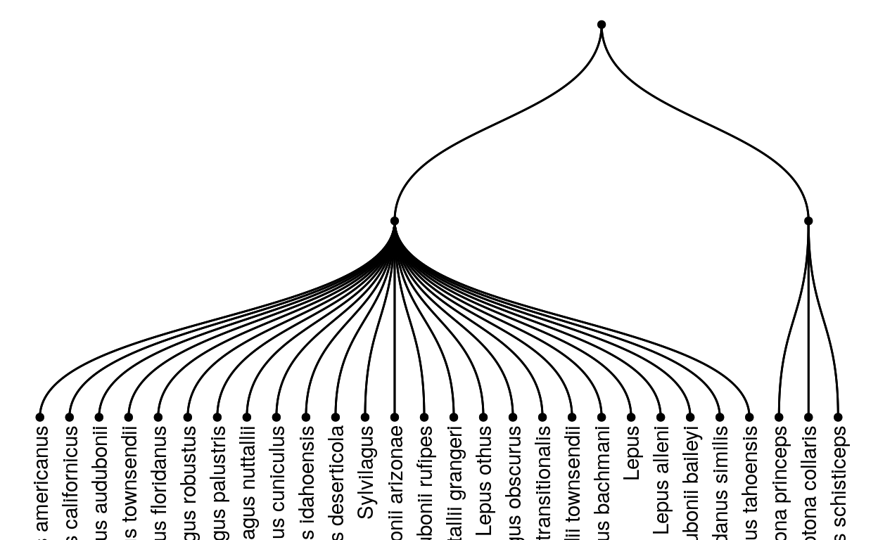
This is interesting to look at but doesn’t really tell us about the different species in the different parks, so we’re going to make two more graphs that we can use to compare two different parks.
Show code
just_acadia <- full_dat_1 %>%
  filter(Park_name == "Acadia National Park")
just_acad <- just_acadia %>%
  filter(Category == "Mammal")
#now make edgessssss ig

edges_Cate_Ord <- just_acad %>% select(Category, Order) %>% unique %>% rename (from=Category, to=Order)

edges_Ord_Fam <- just_acad %>% select(Order, Family) %>% unique %>% rename (from=Order, to=Family)

edges_Fam_Name <- just_acad %>% select(Family, Common_name) %>% unique %>% rename (from=Family, to=Common_name)

edge_list_acadia = rbind(edges_Cate_Ord, edges_Ord_Fam, edges_Fam_Name)

just_acadia_graph <- graph_from_data_frame(edge_list_acadia)
label <- "Acadia Mammals"
ggraph(just_acadia_graph, layout = 'dendrogram', circular = FALSE) +
  geom_edge_diagonal() +
  theme_void() +
geom_edge_diagonal() +
  geom_node_text(aes(label=name, filter=leaf ) , angle=90 , hjust=1, nudge_y = -0.04) +
  geom_node_point(aes(filter=leaf ) , alpha=0.6) +
  ylim(-.5, NA) +
  theme(legend.position="none") +
  ggtitle(label)
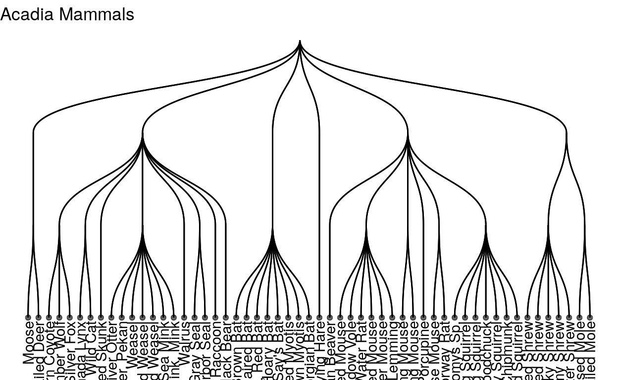
These are all the mammals in acadia national park! Acadia is in maine so it’s pretty temperate, and has a lot of coast line, so it has a lot of marine mammals. Let’s try a park that is in a different climate, like Zion national park, a national park in Utah that is much drier and has a warmer climate
Show code
just_zion <- full_dat_1 %>%
  filter(Park_name == "Zion National Park")
just_zion <- just_zion %>%
  filter(Category == "Mammal")


edges_Cate_Ord_z<- just_zion %>% select(Category, Order) %>% unique %>% rename (from=Category, to=Order)

edges_Ord_Fam_z <- just_zion %>% select(Order, Family) %>% unique %>% rename (from=Order, to=Family)

edges_Fam_Name_z <- just_zion %>% select(Family, Common_name) %>% unique %>% rename (from=Family, to=Common_name)

edge_list_zion = rbind(edges_Cate_Ord_z, edges_Ord_Fam_z, edges_Fam_Name_z)

just_zion_graph <- graph_from_data_frame(edge_list_zion)
label_z <- "Zion Mammals"
ggraph(just_zion_graph, layout = 'dendrogram', circular = FALSE) +
  geom_edge_diagonal() +
  theme_void() +
geom_edge_diagonal() +
  geom_node_text(aes(label=name, filter=leaf ) , angle=90 , hjust=1, nudge_y = -0.04) +
  geom_node_point(aes(filter=leaf ) , alpha=0.6) +
  ylim(-.5, NA) +
  theme(legend.position="none") +
  ggtitle(label_z)
as we can see, Zion national park actually has many more species of mammals, to the point where it’s getting hard to read again!
We have explored several different packages with useful characteristics that can help us answer the question: “How does species diversity differ between National Parks?” We started off with some traditional bar graphs from the ggplot2 package and then explored tree maps from treemap, radio graphs from fmsb, and dendrograms from igraph (with ggraph). We found that all of these packages are useful in their own way but that each has positives and negatives. Let’s review the positives and negatives of treemap, fmsb, and igraph in relation to the standard: ggplot2. Tree graphs appeared to be a useful and interesting substitute for ggplot2 bar plots. The bar plot may be easier to read since people are better able to discriminate between the different lengths of bars than the different areas of boxes. However, the tree maps that used area are very useful in visualizing the area of national parks since the two dimensional variable is being represented in two dimensional space. The tree map is probably most useful at its simplest because it can become hard to interpret as it gets more complicated. Radar graphs were visually engaging and interesting but we found them to be misleading at times compared with a straightforward bar graph. They are less intuitive and take more time to dissect and understand. If the variables do not have the same scale the graph can easily misrepresent the data. We think these graphs can be useful, especially in how the overlapping polygons assist viewers in comparing quantities, but they should be handled carefully. Our final graphs were dendrograms. These graphs provide a lot of detail and helped us visualize the taxonomic breakdown of species in a park. They can get overwhelming but they provide detail that is hard to represent in a simple bar graph. A major downside of the igraph and ggraph packages is that there is little documentation and few good examples available to help users learn about them. We hope this blog can provide a few helpful examples but we recognize that these aren’t very accessible tools. Finally, it’s important to be careful when using dendrograms to represent taxonomic relationships. While taxonomy often correlates with genealogic relatedness, they do not always completely match. Viewers may assume that a taxonomic tree directly represents evolutionary pathways but this would be incorrect.