There’s a fairly common idiom across many languages that is almost guaranteed to be brought up whenever a comparison is drawn between two things that share so few qualities that the comparison cannot be considered valid. In Romanian the saying alleges that the comparison would be like comparing a grandmother to a machine gun, and Dutch uses gingerbread and windmills in its comparison, but the version used in the English language is… strange.
“You can’t compare apples to oranges.”
Very few similarities exist between grandmothers and machine guns or gingerbread and a windmill, but apples and oranges? Both types of fruit grow on trees, contain seeds, can be juiced, and are edible. A venn diagram comparing the two would have nearly as many characteristics in the middle as a comparison between navel and mandarin oranges.
When we found a few datasets from the United States Department of Agriculture detailing the production and consumption of various commodities across the world, we immediately thought it would be entertaining to compare apples to oranges (which had some of their data split off into a second file), in order to see if, in the context of this data, apples and oranges really are as incomparable as the idiom would lead us to believe.
In order to import, wrangle, and visualize this data and we are using the following libraries:
In order to find an answer to our ponderings, the first thing we’ll do is import the data into individual data frames. As noted earlier, the orange data was stored in multiple data frames, but we can combine them later. Some initial cleanup upon import will save us a bit of trouble during our next step.
Show code
apples <- read_csv(here("_posts/2021-03-28-comparing-apples-to-oranges/data/apples.csv"), skip = 1) %>%
  mutate(fruit = "apples") %>%
  rename("2020/21" = "Dec 2020/21")

oranges <- read_csv(here("_posts/2021-03-28-comparing-apples-to-oranges/data/oranges.csv"), skip = 1) %>%
  mutate(fruit = "oranges") %>%
  rename("2020/21" = "Jan 2020/21") %>%
  mutate(X1 = case_when(
    str_detect(X1, "Fresh") ~ "Domestic Consumption",
    TRUE ~ X1
  ))

oranges_2 <- read_csv(here("_posts/2021-03-28-comparing-apples-to-oranges/data/oranges_2.csv"), skip = 1) %>%
  mutate(fruit = "oranges") %>%
  rename("2020/21" = "Jan 2020/21")
The next step is wrangling. This involves combining the data using appropriate joins, as well as converting section headers to rows.
fruity_data <- apples %>%
  full_join(oranges) %>%
  full_join(oranges_2) %>%
  rename(country = "X1") %>%
  select(!"X8") %>%
  mutate(stat = case_when(is.na(.[2]) ~ country)) %>%
  fill(stat) %>%
  filter(!is.na(.[7])) %>%
  select(country, fruit, stat, everything()) %>%
  mutate_at(1:3, as.factor) %>%
  mutate_at(4:9, as.double)
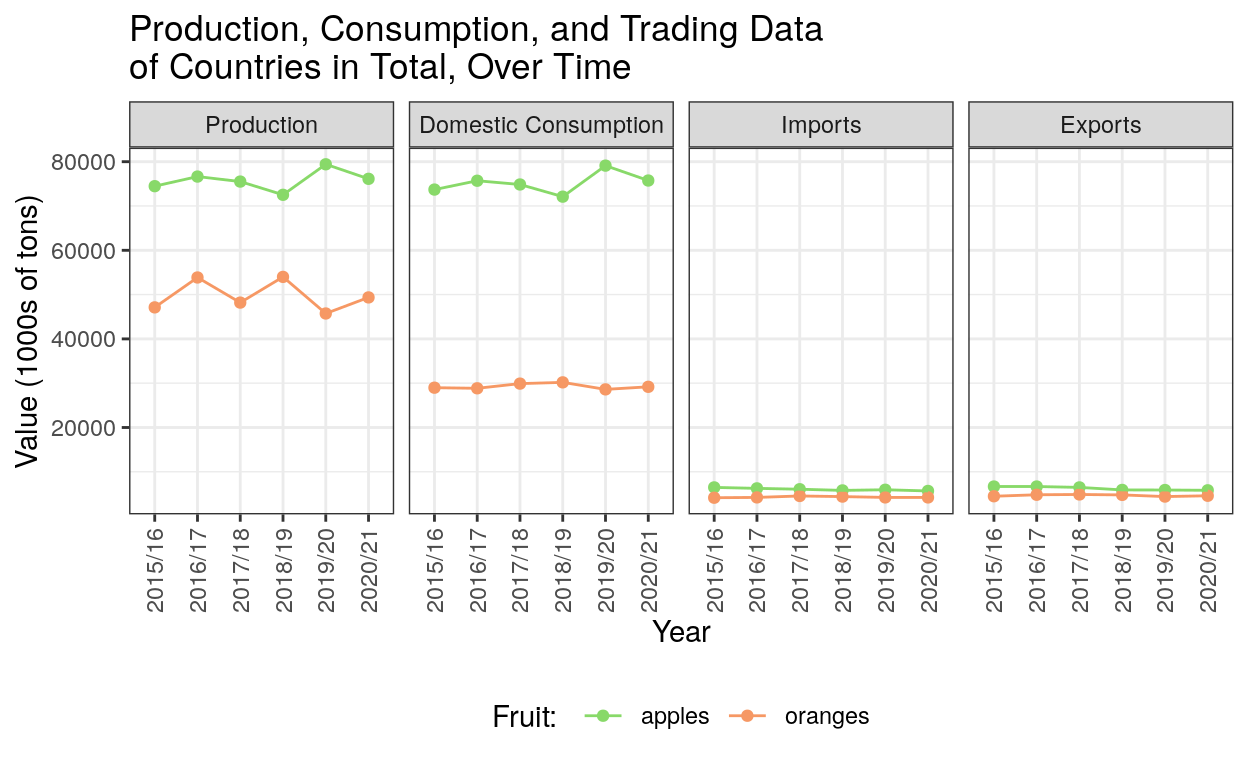
In an attempt to find larger trends across the world in each of the variables we were looking at, we used a table to quickly examine what the data looks like when not split up by country, so that the only comparisons being made were comparisons between apples and oranges over time.
Each unit here represents 1000 metric tons of fruit. That means that, while it’s not visible in this table, no, Brazil did not just export a single bag containing 8 oranges in January 2021.
Show code
| stat | fruit | 2015/16 | 2016/17 | 2017/18 | 2018/19 | 2019/20 | 2020/21 |
|---|---|---|---|---|---|---|---|
| Domestic Consumption | apples | 73706 | 75700 | 74854 | 72106 | 79110 | 75749 |
| Domestic Consumption | oranges | 28981 | 28845 | 29903 | 30186 | 28601 | 29179 |
| Exports | apples | 6672 | 6674 | 6473 | 5904 | 5884 | 5817 |
| Exports | oranges | 4477 | 4810 | 4876 | 4778 | 4402 | 4584 |
| For Processing | oranges | 17794 | 24417 | 17949 | 23424 | 16940 | 19805 |
| Imports | apples | 6474 | 6255 | 6064 | 5795 | 5943 | 5672 |
| Imports | oranges | 4141 | 4213 | 4537 | 4396 | 4211 | 4207 |
| Production | apples | 74474 | 76641 | 75512 | 72524 | 79413 | 76131 |
| Production | oranges | 47111 | 53859 | 48191 | 53992 | 45732 | 49361 |
Additionally, we visualized the information from that table in order to visually compare apples to oranges. Notably, we decided to remove the “For Processing” variable from this visualization, as data for it only exists for oranges, so no comparisons can be drawn from that graph. This is one area where apples and oranges cannot be compared, so could it be evidence for the idiom’s claims?
Interestingly, while production and domestic consumption levels are very different between the two fruits, import and export levels appear to be very similar.
Show code
# graph: data in total
fruity_long_total %>%
  filter(stat != "For Processing") %>%
  ggplot(aes(x = year, y = value, color = fruit, group = fruit)) +
  facet_wrap(vars(stat), ncol = 4) +
  geom_point() +
  geom_line() +
  labs(title = "Production, Consumption, and Trading Data\nof Countries in Total, Over Time") +
  theme_bw() +
  labs(x = "Year",
       y = "Value (1000s of tons)",
       color = "Fruit: ") +
  theme(axis.text.x = element_text(angle = 90, vjust = 0.5, hjust = 1),
        legend.position = "bottom") +
  scale_color_manual(values=c("#88d969", "#f69864"))
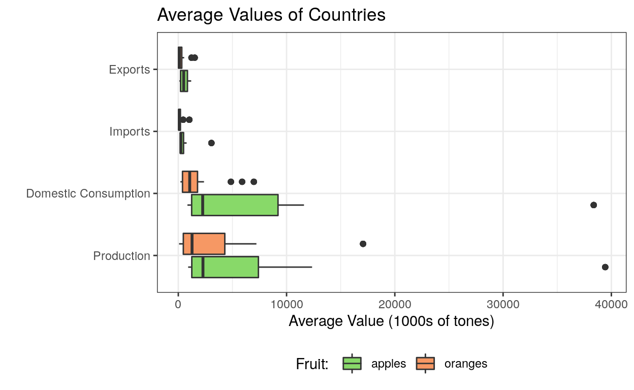
Do these trends carry over into individual countries though? In order to check this out, we graphed the average values of each individual country.
Interestingly, the median of the countries’ averages of domestic consumption and production are actually fairly similar, though apples’ upper quartiles are much longer, hence the much higher values we saw in the previous graphs, and the outliers are very far away.
Who could those be? We’ll find out about that in a bit, but for now it’s important to note that for most countries, apples and oranges are actually much closer to each other in both domestic consumption and production than the previous graph would seem to imply.
Show code
# graph: data boxplot for countries' averages
fruity_long %>%
  filter(stat != "For Processing") %>%
  ggplot(aes(x = avg, y = stat, fill = fruit)) +
  geom_boxplot() +
    labs(x = "Average Value (1000s of tones)",
         y = "",
         fill = "Fruit: ",
       title = "Average Values of Countries") +
  theme_bw() +
  scale_fill_manual(values=c("#88d969", "#f69864")) +
  theme(legend.position = "bottom")
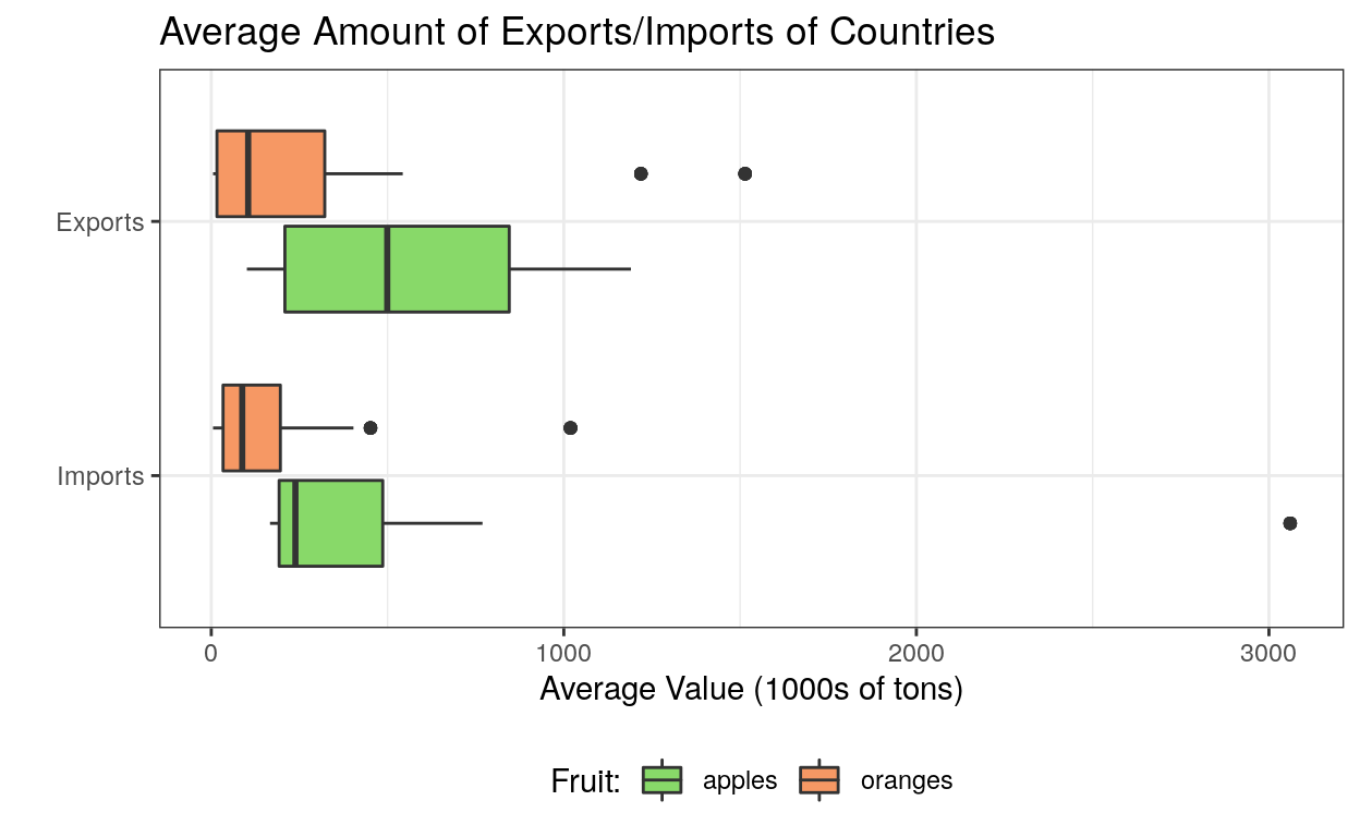
The import and export information from the previous graph is a bit hard to make out, so let’s zoom in a tad in order to better examine them. According to prior comparisons of imports and exports of apples and oranges, the differences here can be explained by the physical location of the countries, and subsequently, their ability to produce each good, but that’s beyond the scope of what we’re doing here.
Show code
# graph: exports/imports boxplot for countries' averages
fruity_long %>%
  filter(stat %in% c("Exports", "Imports")) %>%
  ggplot(aes(x = avg, y = stat, fill = fruit)) +
  geom_boxplot() +
  labs(x = "Average Value (1000s of tons)",
       y = "",
       fill = "Fruit:",
       title = "Average Amount of Exports/Imports of Countries") +
  theme_bw() +
  scale_fill_manual(values=c("#88d969", "#f69864")) +
  theme(legend.position = "bottom")
So, let’s return to looking at tables in order to find out the reasons for some of our observations from the graphs above.
The full data table of imports and exports by country is not immediately helpful, but we learn that the countries with highest values (depending on fruit and import/export) are the EU, China, Egypt, South Africa, Russia, and “Other”, so we’ll take a closer look at those countries specifically.
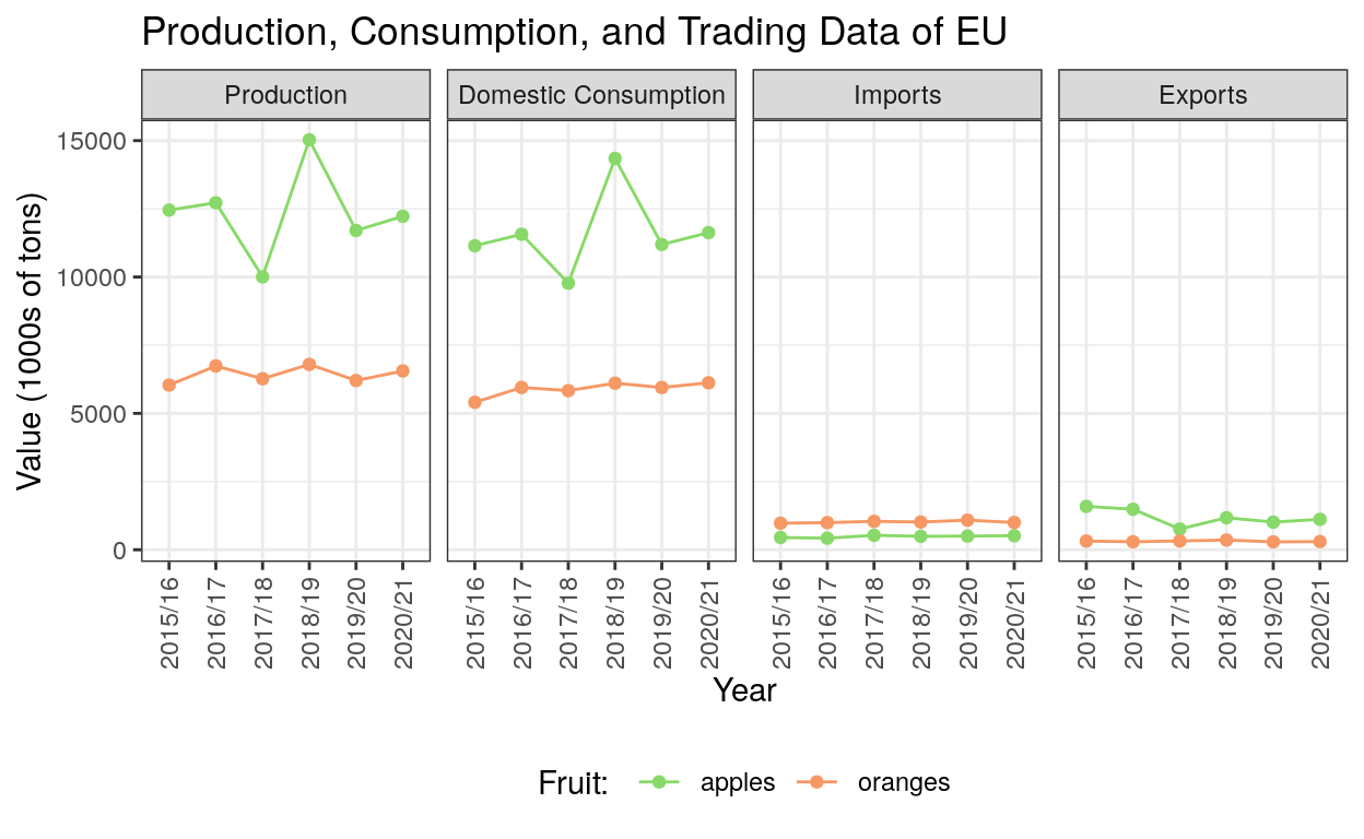
This gives a lot more context to the outliers seen in the import and export graphs. Of note, the EU is simultaneously the largest importer of oranges and the largest exporter of apples.
Show code
options(knitr.kable.NA = '')

fruity_data %>%
  filter(stat %in% c("Exports", "Imports")) %>%
  filter(country != "Total") %>%
  pivot_longer(where(is.double), names_to = "year") %>%
  group_by(country, fruit, stat) %>%
  summarize(avg = round(mean(value, na.rm = TRUE), digits = 0)) %>%
  pivot_wider(names_from = stat, values_from = avg) %>%
  pivot_wider(names_from = fruit, values_from = c(Exports, Imports)) %>%
  filter(country %in% c("European Union", "China", "Egypt", "South Africa", "Other", "Russia")) %>%
  rename(
    "Apples" = "Exports_apples",
    "Oranges" = "Exports_oranges",
    "Apple" = "Imports_apples",
    "Orange" = "Imports_oranges"
  ) %>%
  kable() %>%
  add_header_above(c(" " = 1, "Exports" = 2, "Imports" = 2))
| country | Apples | Oranges | Apple | Orange |
|---|---|---|---|---|
| China | 1145 | 60 | 330 | |
| Egypt | 1514 | 210 | ||
| European Union | 1190 | 314 | 486 | 1019 |
| Other | 739 | 8 | 3060 | 5 |
| Russia | 5 | 769 | 452 | |
| South Africa | 499 | 1219 |
So, which countries are the extreme outliers in the domestic consumption and production of apples?
As it turns out, the answer is China in both cases. China single-handedly accounts for almost half of all apple production and consumption, more than tripling the averages for the second-highest country in both variables, which is the European Union. So, what does this tell us about comparing apples to oranges?
Show code
fruity_data %>%
  filter(stat %in% c("Domestic Consumption", "Production")) %>%
  filter(country != "Total") %>%
  filter(country %in% c("European Union", "China", "Brazil", "Other")) %>%
  pivot_longer(where(is.double), names_to = "year") %>%
  group_by(country, fruit, stat) %>%
  summarize(avg = round(mean(value, na.rm = TRUE), digits = 0)) %>%
  pivot_wider(names_from = stat, values_from = avg) %>%
  pivot_wider(names_from = fruit, values_from = c(`Domestic Consumption`, Production)) %>%
  rename(
    "Apples" = `Domestic Consumption_apples`,
    "Oranges" = `Domestic Consumption_oranges`,
    "Apple" = "Production_apples",
    "Orange" = "Production_oranges"
  ) %>%
  kable() %>%
  add_header_above(c(" " = 1, "Consumption" = 2, "Production" = 2))
| country | Apples | Oranges | Apple | Orange |
|---|---|---|---|---|
| Brazil | 1234 | 4860 | 1190 | 17066 |
| China | 38371 | 6979 | 39435 | 7217 |
| European Union | 11609 | 5895 | 12357 | 6434 |
| Other | 9210 | 1577 | 7401 | 160 |
Since the EU has the greatest apple export and orange import, as well as significant consumption and production results, we are curious how this compares over time.
Show code
# data for European Union
fruity_long %>%
  filter(stat != "For Processing",
         country == "European Union") %>%
  ggplot(aes(x = year, y = value, color = fruit, group = fruit)) +
  facet_wrap(vars(stat), ncol = 4) +
  geom_line() +
  geom_point() +
  labs(
    title = "Production, Consumption, and Trading Data of EU",
    x = "Year",
    y = "Value (1000s of tons)",
    color = "Fruit: "
  ) +
  theme_bw() +
  scale_color_manual(values=c("#88d969", "#f69864")) +
  theme(axis.text.x = element_text(angle = 90, vjust = 0.5, hjust = 1),
        legend.position = "bottom")
Apples have thin skin, grow in cool climates, and are usually red or green, while oranges have thick skin, grow in warm climates, and are usually, as their name implies, Orange. These differences do not prevent them from being compared, and similarly, the differences seen in the data we explored do not prevent drawing comparisons between the two fruits. In fact, they turned out to not be nearly as dissimilar as the first few comparisons we made led us to believe, as the massive differences between apples and oranges we see in the global totals are not present when looking at the medians of the averages per country for each variable.
Differences like what we see in this data are more like the disparity in size between a navel and mandarin orange than the immense dissimilarity seen when comparing a grandmother to a machine gun.
Further reading:
https://www.economist.com/graphic-detail/2014/04/01/comparing-apples-with-oranges
https://www.ncbi.nlm.nih.gov/pmc/articles/PMC27565/
https://www.improbable.com/airchives/paperair/volume1/v1i3/air-1-3-apples.php