Addressing the Question
Portland has had a long history of gentrification that occurs along racial lines; that is, a neighborhood movement in which affluent white incomers displace the incumbent minority residents. One case study that has been pointed to substantially is the gentrification of the Alberta neighborhood in NE Portland. In the case of Alberta, low-income white artists were pushed into neighborhoods with average lower rents in order to support their livelihoods. However, this movement came at a steep cost to the Black community that had thrived on Alberta street for decades. Black businesses were eventually sidelined and pushed out in favor of newer, more hipster and art crowd-friendly white establishments. 1 Along with that, a large amount of the Black population around Alberta street was also pushed towards farther east neighborhoods of Portland.
We wanted to investigate if a similar population movement is being seen in SE Portland due to the gentrification of neighborhoods around Mt. Tabor. We’re choosing to focus on the post-recession time period of 2009-2019 as it has been suggested that Black Portlanders were largely left out of economic revitilization projects. 2
Load Required Packages
Tidy the Data
The data we use was pooled from two different neighborhoods in Portland. Montavilla located north of Mt. Tabor, and Lents located farther southeast of Mt. Tabor:
Start off by loading two data sets and take a glimpse: the unit of observation is neighborhood(census track).
Combine the two data sets and tidy the names/classes of variables
Use pivot longer to specify the unit of observation as neighborhood for a single race.
Show code
#Load necessary datasets here.
lents <-read_csv("/home/scheffeh/Labs_241/postGrpG/_posts/2021-03-07-mini-project-2-instructions/data/Lents complete data - ACS stitching.csv")
montavilla <- read_csv("/home/scheffeh/Labs_241/postGrpG/_posts/2021-03-07-mini-project-2-instructions/data/Montavilla complete data - Sheet1.csv")
Show code
#Wrangling two datasets together to put into ggplot for comparison.
lentstidy <- lents %>%
  mutate(neighborhood = "Lents")
montavillatidy <- montavilla %>%
  mutate(neighborhood = "Montavilla")

combined <- rbind(lentstidy, montavillatidy) %>%
  separate(name, c("name", "Multnomah"), sep = ", ") %>%
  select(!Multnomah) %>%
  mutate(median_rent_pct_income = as.numeric(median_rent_pct_income)) %>%
  mutate(median_value = as.numeric(median_value))
Show code
#population by race
race_pop_data <- combined %>%
  pivot_longer(cols = c(white, black, asian), names_to = "race", values_to = "race_pop") %>%
  mutate(pop_percent = race_pop/total_pop*100)
Data Analysis
- Change in Home Values
An rapid increase in home value is a good indicator of potential gentrification. So to start off, let’s make a general observation on the changes in median home value within the two neighborhoods over years, from 2009 to 2019.
Show code
home_value_byyear <- race_pop_data %>%
  filter(year >= 2009) %>%
  ggplot(mapping = aes(x = year, y = median_value)) +
  geom_point() +
  stat_smooth(method = "lm")+
  facet_wrap(.~neighborhood) +
  scale_y_continuous(labels = scales::comma) +
  scale_x_continuous(labels = scales::number_format(accuracy = 1)) +
  theme_bw() +
  labs(x = "Year", y = "Median Value of Homes in Census Tract (USD)", title = "Home Value in Portland Neighborhoods (2009-2019)")
home_value_byyear
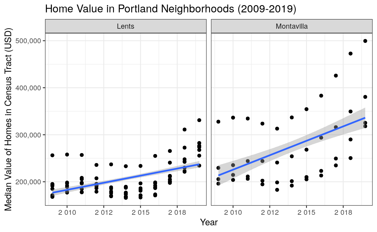
Observations: We see that home prices in Montavilla were higher on average compared to Lents in 2009. Since then, the rate of increase in price in Montavilla is much higher than Lents suggesting increased gentrification of the area. These rising home costs will increase rent prices which disproportionately affect people of color due to lack of home ownership caused by redlining.
- Change in employment rate by race
Show code
employed <- race_pop_data %>%
  pivot_longer(cols = c(white_employed, black_employed, asian_employed),
               names_to = "RACE", values_to = "race_employment")
black_employed <- employed %>%
  filter(race == 'black' & RACE == 'black_employed')
asian_employed <- employed %>%
  filter(race == 'asian' & RACE == 'asian_employed')
white_employed <- employed %>%
  filter(race == 'white' & RACE == 'white_employed')

employment_rate <- rbind(black_employed, asian_employed, white_employed) %>%
  select(!RACE) %>%
  mutate(employment_rate = race_employment/race_pop)
single_employment <- employment_rate %>%
  filter(name %in% c('Census Tract 6.01', 'Census Tract 16.01'))
ggplot(employment_rate, aes(x = year, y = employment_rate, color = race)) +
  geom_point(alpha = 0.5) +
  labs(x = "Year", y = "Employment Rate", color = "Race") +
  facet_wrap(.~neighborhood) +
  scale_y_continuous(labels = scales::comma, limits = c(-0.1, 1.1)) +
  scale_x_continuous(labels = scales::number_format(accuracy = 1)) +
  scale_color_manual(values = c("#FF00FB", "#23ECEE", "#EEB523")) +
  stat_smooth(method = "lm")
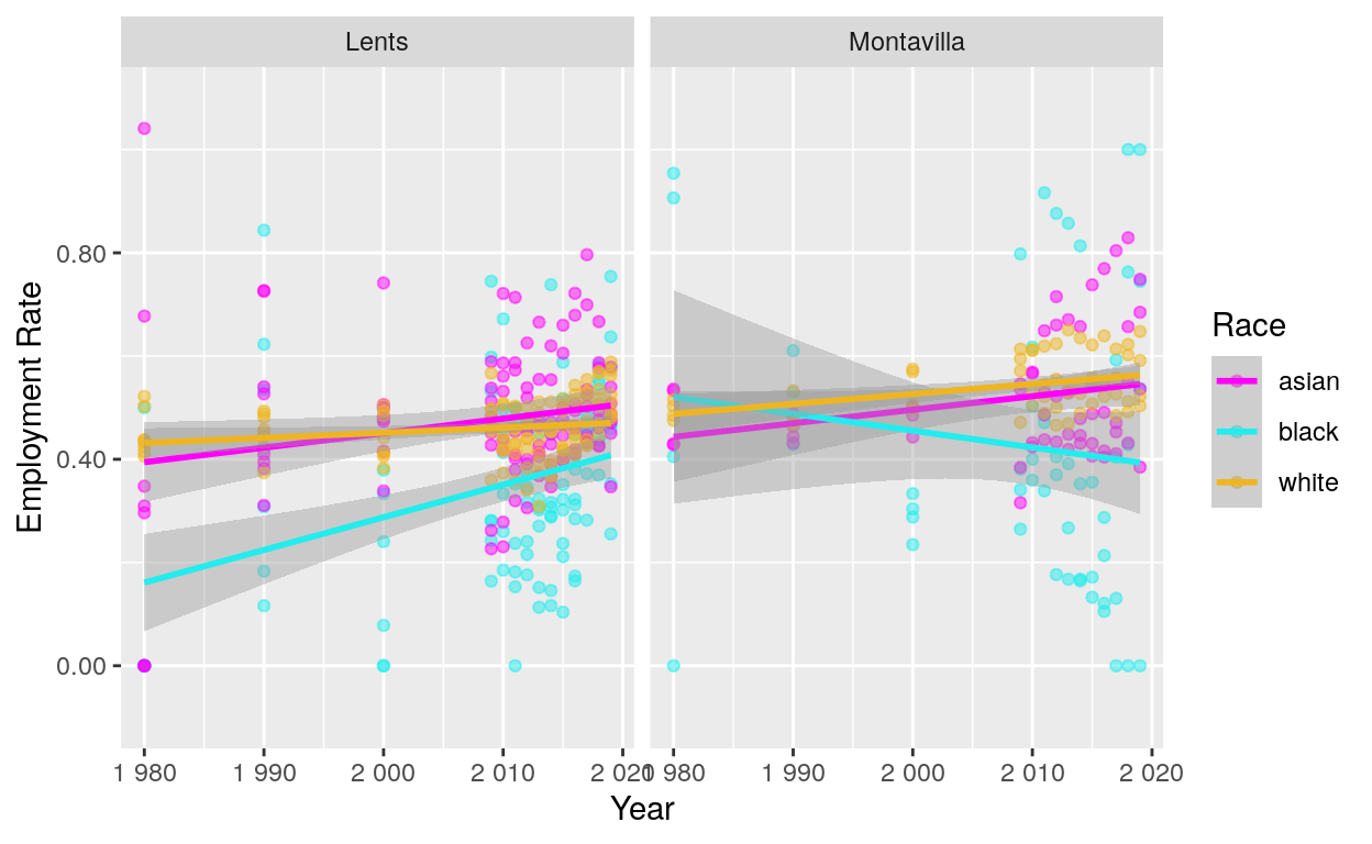
Observations: While from 1980 to 2019, the employment rates of both Asian and white Portlanders increase generally in both Lents and Montavilla, the employment rate of Black Portlanders actually decreases in Montavilla specifically. NOTE: in the first graph, the employment rate of Asian Portlanders exceeds 1 in 1980. I’ve checked the original dataset and that seems to be the case due to some error in orginal collection of data in 1980.
- Movement in population by race
Show code
#Calculating changes in racial populations through time.
race_breakdown_byyear <- race_pop_data %>%
  filter(year %in% c(2010, 2019)) %>%
  group_by(race, neighborhood, year) %>%
  summarize(mean_poppercent = (mean(pop_percent))) %>%
  arrange(neighborhood, race) %>%
  pivot_wider(names_from = race, values_from = mean_poppercent) %>%
  rename("Year" = year, "Neighborhood" = neighborhood, "Asian" = asian, "Black" = black, "White" = white) %>%
  mutate(Asian = Asian/100, Black = Black/100, White = White/100) %>%
  ungroup() %>%
  relocate(Year)

#Create gt() table for easy viewing of racial data.
race_breakdown_table <- race_breakdown_byyear %>%
  group_by(Neighborhood) %>%
  gt() %>%
  tab_header(title = md("Change in Racial Populations in Portland (2010-2019)")) %>%
  tab_spanner(label = "Race", columns = vars('Asian', 'Black', 'White')) %>%
  data_color(
    columns = vars('Asian', 'Black', 'White'),
    colors = scales::col_numeric(
      as.character(paletteer::paletteer_d("ggsci::orange_material",n = 10)),
      domain = c(.023, .76)
))%>%
  fmt_percent(
    columns = vars('Asian', 'Black', 'White'),
    decimals = 1
  )
race_breakdown_table
| Change in Racial Populations in Portland (2010-2019) | |||
|---|---|---|---|
| Year | Race | ||
| Asian | Black | White | |
| Lents | |||
| 2010 | 13.6% | 5.7% | 67.8% |
| 2019 | 19.7% | 6.6% | 62.5% |
| Montavilla | |||
| 2010 | 14.3% | 6.0% | 72.5% |
| 2019 | 13.1% | 2.3% | 76.0% |
Observatations: We expected to see that there’s been a general movement of people of color away from Montavilla and towards Lents as Montavilla continues to become increasingly gentrified at an accelerating rate. We found that the racial diversity in the Montavilla neighborhood has decreased significantly over the past decade since the recession.
From 2010 to 2019 the number of Black Portlanders in Montavilla decreased by more than 50% and the number of Asian Portlanders also declined. In the same neighborhood, the proportion of white Portlanders has increased by 3.5%. In contrast, the Lents neighborhood has seen an increase in both the number of Asian and Black Portlanders alongside a general decrease in the number of white Portlanders.
This supports the hypothesis that a classic gentrification scheme is underway in which marginalized communities are pushed farther towards the outskirts of the city. 3 The question is: what are the mechanisms at play that allow for such systematic exclusion of people of color from neighborhoods.
First of all, we can tell that the rise in housing prices in both neighborhoods is not equal. The Lents neighborhood did see a rapid increase in housing prices post-recession; however, the rise is nothing like what is seen in Montavilla. Since around 2013, we’ve seen the start of a staggering increase in housing prices year-after-year in Montavilla. Some of the highest priced census tracts do seem to grow somewhat linearly, but some of the lowest home value census tracts are starting to approach something closer to exponential growth. The steeply rising cost of housing in these lower cost census tracts are more likely to disproportionately affect people of color trying to stay in their neighborhoods as rent costs will increase along with home value. Historically, there is a large gap in home ownership between Black and white Americans, and this makes Black populations more susceptible on averae to increases in rent prices. 4 This steep rise in housing prices is an obvious answer to why people of color are more likely to be displaced farther outside the city to communities like Lents.
Secondly, it appears that large scale employment discrimination is more present in Montavilla than it is in Lents. While in Lents we see the employment rate steadily increase from 1980 to 2019, the same is not true of Montavilla. In Montavilla, while Asian and white Portlanders seem to increase in their employment rate, the employment rate of Black Portlanders has on average decreased since 1980. Oregon has a long history of racial discrimination in the workplace against both Black and Asian Portlanders, and these policies still leave scars to this day. 5
Through this data, we can see that two of the major factors contributing to gentrification and contemporary racial segregation in Portland are the steeply rising housing costs of the city as well as possible anti-Black workplace discrimination.