Introduction
Can you catch a serial killer by the type of music they listen to? According to the hit TV show Criminal Minds season 7 episode 12, “Unknown Subject”, you can! Music isn’t the only thing they use to catch the serial killer, but they used the music he listened to to narrow down his age range, because the music people listen to as teenagers is the music they tend to stick with throughout their lives.
While your parents aren’t serial killers (most likely o_o), this is also why your parents might want you to listen to the music they listened to when they were younger, and why they hate modern pop music (insert: everyone over 35 asking who Ariana Grande is after she won a Grammy).
For our blog post, we decided to look into how popular music changes over time. We took five pop artists, each from a different decade from the late 1900s and early 2000s, and compared their music.
Spotify is a familiar music streaming site. It’s free to access, and they have a lot of music data. In order to get from the information that is on the Spotify website to data we could actually use to make graphs with, we need a way to interact with the website and ask it for its data.
In order to ask Spotify for their data, we need to use something called an API. This process is different for every website you want to pull data from, but luckily, for Spotify there is already an R-package with a wrapper that will help us pull the data more easily.(https://github.com/charlie86/spotifyr) The wrapper is something that talks to the Spotify website and gets the data for us.
Everyone who uses the Spotify wrappper needs two different codes, a Spotify Client Id, and a Spotify Secret Code. You can get these by going onto the Spotify developer website and opening an app creation file. This will give you your unique codes.
Once we’ve identified ourselves to Spotify, we can start loading our data so we can manipulate it and make graphs. This process is the same for every artist and can get a little repetitive, so Josh helpfully made it into a function, so we can just put in the artist name and link to their page on Spotify to get their data.
Now that we’ve got everything all set up we can go ahead and load in some data! For our blog we’ll be looking at The Beatles for the 60s, ABBA from the 70s, Madonna from the 80s, Lady Gaga from the 2000s, and Ariana Grande for the 2010s.
Show code
pull_songs <- function(link, artist){
  spotify <- GET(link, query = list(api_key = id_key))
  get_artist_audio_features(artist) %>%
    select(-album_images ) %>%
    select(-artists) %>%
    select(-available_markets)
}

gaga_link <- "https://open.spotify.com/artist/1HY2Jd0NmPuamShAr6KMms"
abba_link <- "https://open.spotify.com/artist/0LcJLqbBmaGUft1e9Mm8HV"
beatles_link <- "https://open.spotify.com/artist/3WrFJ7ztbogyGnTHbHJFl2"
madonna_link <- "https://open.spotify.com/artist/6tbjWDEIzxoDsBA1FuhfPW"
ariana_link <- "https://open.spotify.com/artist/66CXWjxzNUsdJxJ2JdwvnR"

gaga_raw <- pull_songs(gaga_link, "Lady Gaga")
abba_raw <- pull_songs(abba_link, "ABBA")
beatles_raw <- pull_songs(beatles_link, "the beatles")
madonna_raw <- pull_songs(madonna_link, "Madonna")
ariana_raw <- pull_songs(ariana_link, "Ariana Grande")
Wrangling
When we’re wrangling, we’re changing the data that Spotify gave us so that it’s more useful when we’re making graphs and tables. The wrapper we used in the function above, “get_artist_audio_features”, is really useful when we’re doing data wrangling, because it sets up the data from the different artists in the same way, with the same variables as columns. This means that, since the data sets are set up compatibly, we can just stack the data sets on top of each other to get one large data set!
all_artists_raw <- bind_rows(gaga_raw, abba_raw, beatles_raw, madonna_raw, ariana_raw)
Spotify tries their best to get all of the songs people want, which means that in addition to all of the music we want to analyze, Spotify also includes re-released, remastered, and karaoke versions of songs.
Sometimes these re-releases are changed enough that they deserve to be in our data set, but often they are exactly identical. So, we’ll only filter out track releases that are identical in name as well as in every characteristic like danceability and loudness. That way, we get rid of exact repeats but preserve songs that are meaningfully different.
Show code
all_artists <- all_artists_raw %>%
  select(
    artist_name, track_name, album_release_date,
    album_release_year, danceability:tempo, key_name:key_mode,
    album_name, time_signature, explicit
    ) %>%
  distinct()
Another problem is that sometimes Spotify also includes live performances. We’re going to remove any live performances of a song because we feel that this would probably skew our data to show artists as having different loudness and energy on average than they actually have.
Show code
all_artists <- all_artists %>%
  filter(
    !str_detect(track_name, "Live")
    )
While the wrapper we used is helpful in most ways, one problem we have is that it only pulls the remastered versions of Beatles songs, and not the original releases. Since we really want to include the Beatles in our data set, and we would probably have the same problem with a lot of popular artists from the 60s, we’re going to work under the assumption that the remastered versions of the Beatles songs are are sufficiently similar to the original versions.
Now that we have all of the data we’re going to use, we need to decide how we want to use it to answer our question: “How has pop music changed over the last few decades?”
To do this, we’ll compare several descriptive variables which Spotify developed and uses to evaluate each track in its database. Spotify has a lot of cool variables, but the ones which seem most relevant to pop music are:
danceability, which describes how much a song makes you want to dance to it! This data is based on several musical qualities such as tempo, rhythm, beat strength, etc. Each song is given adanceabilitynumber from 0.0, which is not at all danceable to 1.0 most danceable. A good example of how this works is that “Don’t cry for me Argentina” by Madonna has a very low danceability, but “Holy Water” (also by Madonna) and “Under Attack” by ABBA both have very high danceability ratings (I can see Meryl Streep dancing now).energy, which describes how intense and active a song is. Songs with highenergywould be very fast and loud. Spans from 0.0 (least energetic) to 1.0 (most energetic). This is similar todanceability, but focuses more on how loud and active a song is (if you can imagine a toddler on a sugar rush running around to it, it probably has high energy). A lot of Lady Gaga’s songs, like “Edge of Glory” and “Americano” have very high energy, but “Mother Nature’s son” by the Beatles has pretty low energy.valence, which is a measure of how happy a song sounds, ranging from 0.0 (extremely sad) to 1.0 (extremely positive). To no one’s surprise, “Does your mother know?”, the song with the most fun dance routine in all of Mama Mia 1, has a very high valence, but Lady Gaga’s “Before I Cry” has a very low valence.
Let’s first compare the danceability of each of our artists. Notice that even though we don’t have time on one of our axes, we’ve ordered the artists based on their peak time period.
Show code
ggplot(all_artists, aes(x = artist_name, y = danceability)) +
  geom_violin() +
  stat_summary(
    fun.y = mean, colour = "darkred",
    geom = "point", shape = 20, size = 5,
    show_guide = FALSE
    ) +
  labs(
    title = "Distribution of song danceability, by artist",
    subtitle = "Ranges from 0 (least danceable) to 1 (most danceable). \n Mean represented by red dots.",
    x = "Artist name",
    y = "Danceability"
    ) +
  theme_fivethirtyeight() +
  theme(
    plot.title = element_text(hjust = 0.5),
    plot.subtitle = element_text(hjust = 0.5)
    )
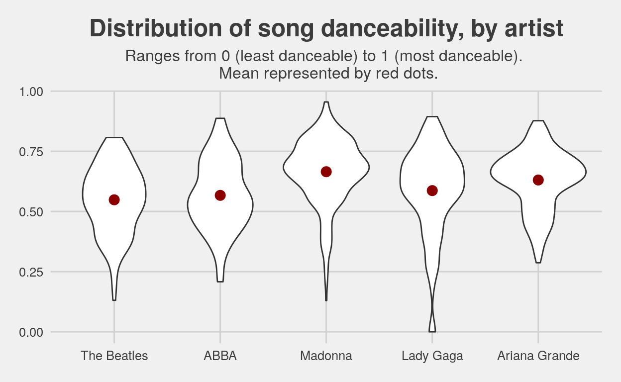
From this graph, we can see that the mean danceability has remained fairly consistent at approximately between 0.5 and 0.6. However, the older artists tend to have more variation in the distribution, implying the music of modern pop artists is more homogeneous in terms of how danceable it is. It’s also a little surprising that The Beatles, who were popular prior to the emergence of a big club or disco scene, have a very similar danceability range to ABBA, which was popular during the 70s, age of bell-bottoms and disco balls.
Another way that we can look at how the artists changed over the decades is by making a density type graph, but this time of the song valence.
Show code
meds <- all_artists %>%
  group_by(artist_name) %>%
  summarise(med = median(valence))

all_artists %>%
  ggplot(aes(x = valence)) +
  geom_density(color = "darkred")  +
  geom_linerange(
    data = meds,
    aes(x = med, ymin = 0.7, ymax = 3),
    color = "midnightblue", linetype = "dashed",
    size = 1, alpha = 0.5
  ) +
  geom_text(
    data = meds,
    aes(x = med, y = 0.3, label = round(med,2)),
  ) +
  scale_x_continuous(name = "Valence", breaks = c(0, 0.5, 1)) +
  theme_fivethirtyeight() +
  facet_wrap(~artist_name) +
  labs(title = "Distribution of song valence, by artist",
       subtitle = "Median is indicated by dashed line") +
  theme(
    plot.title = element_text(hjust = 0.5),
    plot.subtitle = element_text(hjust = 0.5)
    )
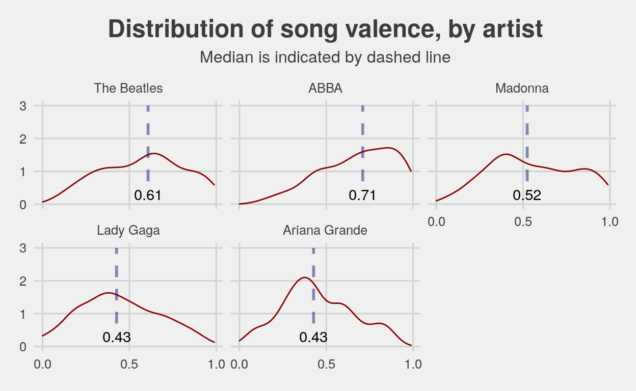
These graphs show us something different than the first set. Even though a song is danceable, that doesn’t mean it isn’t sad. A good example of this is Ariana Grande. She has a pretty high average danceability, about .60, but one of the lowest valences, .43. Lady Gaga has similar danceabilitys and valences; from this very preliminary data, this perhaps says something about Millennials and Gen-Z: even when we’re dancing, we’re sad.
Show code
ggplot(all_artists, aes(x = artist_name, y = energy)) +
  geom_boxplot() +
  stat_summary(
    fun.y = mean, colour = "darkred",
    geom = "point", shape = 20, size = 5,
    show_guide = FALSE
    ) +
  labs(
    title = "Distribution of song energy, by artist",
    subtitle = "Ranges from 0 (least energetic) to 1 (most energetic). \n Mean indicated by red dot.",
    x = "Artist name",
    y = "Danceability"
    ) +
  theme_fivethirtyeight() +
  theme(
    plot.title = element_text(hjust = 0.5),
    plot.subtitle = element_text(hjust = 0.5)
    )
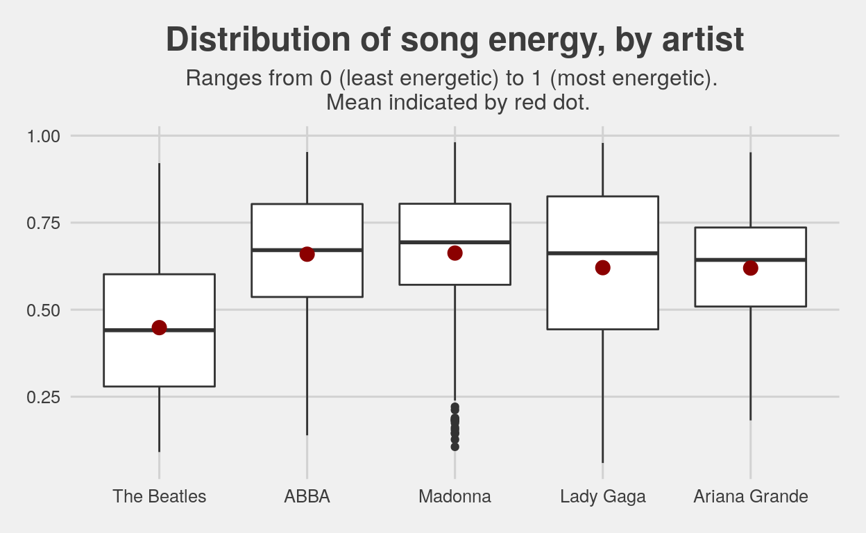
When looking at song energy, based on the artists we’ve selected, it seems that with ABBA there is a big spike in song energy, and it has remained consistent since then at about 0.65. Notably, ABBA, Madonna, and Ariana Grande have smaller spreads than Lady Gaga and the Beatles, meaning that the Beatles and Lady Gaga tend to vary considerably in their song energy, whereas the others are more uniform.
We also wanted to present the data in tabular form, so you can easily compare each variable side-by-side. In addition, we also included a few other variables which Spotify stores in its database. The table is colored so that, for each column, darker colors represent larger values, and lighter colors represent smaller values.
Show code
means <- all_artists %>%
  group_by(artist_name) %>%
  summarize_at(
    .vars = vars(danceability, energy, instrumentalness, speechiness, tempo, valence),
    .funs = mean, na.rm = TRUE
    )

means <- means %>%
 mutate_if(is.numeric, round, digits = 2)

means %>%
  gt() %>%
  cols_label(artist_name = "Artist",
             danceability = "Danceability",
             energy = "Energy",
             instrumentalness = "Instrumentalness",
             speechiness = "Speechiness",
             tempo = "Tempo",
             valence = "Valence") %>%
  tab_header(title = md("**Comparison of Spotify variables, by artist**")) %>%
  tab_spanner(label = "Mean value of each variable across discography:",
              columns = vars(danceability, energy, instrumentalness, tempo, speechiness,
                             valence)) %>%
  tab_footnote(
    footnote = "Spotify's measure of whether or not a song has vocals. 1.0 = zero vocal content; 0.5 = very little vocal content; 0.0 = definite vocal content.",
    locations = cells_column_labels(
      columns = vars(instrumentalness)
  )) %>%
   tab_footnote(
    footnote = "Spotify's measure of spoken word. >0.66 = likely entirely spoken word; <0.33 = likely music.",
    locations = cells_column_labels(
      columns = vars(speechiness)
  )) %>%
  tab_footnote(
    footnote = "In beats per minute (BPM).",
    locations = cells_column_labels(
      columns = vars(tempo)
  )) %>%
  data_color(
    columns = vars("danceability"),
    colors = scales::col_numeric(
      as.character(paletteer::paletteer_d("RColorBrewer::Reds",
                                                 n = 5)),
      domain = c(0.4, 0.7))
    ) %>%
  data_color(
    columns = vars("energy"),
    colors = scales::col_numeric(
      as.character(paletteer::paletteer_d("rcartocolor::Magenta",
                                                 n = 5)),
      domain = c(0.45, 0.75))
    ) %>%
  data_color(
    columns = vars("valence"),
    colors = scales::col_numeric(
      as.character(paletteer::paletteer_d("rcartocolor::Mint",
                                                 n = 5)),
      domain = c(0.4, 0.7))
    ) %>%
  data_color(
    columns = vars("speechiness"),
    colors = scales::col_numeric(
      as.character(paletteer::paletteer_d("RColorBrewer::Blues",
                                                 n = 5)),
      domain = c(0, 0.2))
    ) %>%
  data_color(
    columns = vars("instrumentalness"),
    colors = scales::col_numeric(
      as.character(paletteer::paletteer_d("rcartocolor::Purp",
                                                 n = 5)),
      domain = c(0, 0.15))
    ) %>%
  data_color(
    columns = vars("tempo"),
    colors = scales::col_numeric(
      as.character(paletteer::paletteer_d("ggsci::indigo_material",
                                                 n = 5)),
      domain = c(110, 130))
    )
| Comparison of Spotify variables, by artist | ||||||
|---|---|---|---|---|---|---|
| Artist | Mean value of each variable across discography: | |||||
| Danceability | Energy | Instrumentalness1 | Tempo2 | Speechiness3 | Valence | |
| The Beatles | 0.55 | 0.45 | 0.11 | 116.18 | 0.07 | 0.58 |
| ABBA | 0.57 | 0.66 | 0.03 | 125.33 | 0.04 | 0.68 |
| Madonna | 0.67 | 0.66 | 0.11 | 121.35 | 0.06 | 0.55 |
| Lady Gaga | 0.59 | 0.62 | 0.04 | 112.32 | 0.12 | 0.44 |
| Ariana Grande | 0.63 | 0.62 | 0.01 | 114.68 | 0.09 | 0.45 |
|
1
Spotify's measure of whether or not a song has vocals. 1.0 = zero vocal content; 0.5 = very little vocal content; 0.0 = definite vocal content.
2
In beats per minute (BPM).
3
Spotify's measure of spoken word. >0.66 = likely entirely spoken word; <0.33 = likely music.
|
||||||
Conclusion
The rankings for each variable go as follows (from greatest to least):
Song danceability:
Madonna
Ariana Grande
Lady Gaga
ABBA
The Beatles
Song valence:
ABBA
The Beatles
Madonna
Ariana Grande
Lady Gaga
Song energy:
ABBA & Madonna
Lady Gaga & Ariana Grande
The Beatles
We conclude that, based on these artists, song energy and danceability have remained fairly stable over the past few decades and do not show much of a trend upwards or downwards. (The Beatles are the least danceable and energetic, but they are also the group which is least likely to be classed as “pop” in the artists we have selected.) However, song valence has a clear downward trend through the decades. In other words, modern pop music is way more negative than the pop music of the 70s. (Maybe soon we won’t even have to bother making our own “songs to cry to alone at night” playlists on Spotify – we can just hit shuffle on the Top 100.)
Thank you for reading!