Show code
knitr::include_graphics("images/treelong.jpeg")

Asking Questions
Record-breaking wildfires, nationwide protests, extreme economic depression, not to mention a global pandemic - the year 2020 introduced the world to a decade of environmental, social, and economic chaos. Questions that have lingered for a long time demand answers now. In this blog post, we try to answer questions that address environmental, social, and economic issues at once: How do companies’ pollution practices affect investors’ returns? Can we make money by betting against top polluting corporations and can corporations make gains by reducing pollution production? We combined two datasets to find our answers.
The Financial Modeling Prep (FMP) API is a free data source for stocks. This data also includes historical data and point-in-time data for a wide range of asset classes. Asset classes can be thought of as different forms of investment or income. The FMP API asset types include stocks, cash and cash equivalents, and cryptocurrency. We focus on the dataset’s historical pricing data and recent point-in-time data to estimate the returns (AKA: investors’ gains) for a given basket of stocks. With this dataset, we also unpack how industry affects a stock’s returns.
This dataset features a Toxic 100 Air Index, Toxic 100 Water Index, and Greenhouse 100 Index. These indexes use data from the U.S. EPA Toxics Release Inventory, which provides the levels of toxins released by companies’ large facilities. These levels decide the rank of the U.S. industrial polluters in the indices. The dataset includes additional indices created by the Political Economy Research Institute (PERI) at the University of Massachusetts. PERI indices take into account environmental justice indicators like impacts on people below the poverty line and racial/ethnic minorities. These measures include marginalized groups’ possible toxin exposure levels and the percentages of the total at-risk population that each group makes up. We used the topPolluters CRAN data package to inform our presentation of data tables and graphs.
The Data Process
Loading Necessary Data PackagesShow code
library(tidyverse)
library(fmpapi)   # for install use: remotes::install_github('jpiburn/fmpapi')
library(BatchGetSymbols)
library(topPolluters) # for install use: devtools::install_github("Reed-Math241/topPolluters")
library(lubridate)
library(fabricatr)
library(gt)
library(paletteer)
library(extrafont)
library(grid)
- The first step is to grab a list of S&P 500 stock tickers. The S&P 500 is a market capitalization weighted index of the 500 largest US companies. In this step, we also grab the data that goes along with each stock in the ticker list.
An FMP API key can be found through this link (After selecting the “Free $0/mo” payment plan and making an account, go to your account dashboard to find your key). After we grab our api key, this first step is easy because the fmpapi package has a function just for grabbing the S&P 500 stock tickers.
The term “stock ticker” refers to a stock’s abbreviation ID. Every company that is publicly traded in any market has a unique abbreviation to identify it. A company’s abbreviation may change slightly from one market to another. For example, Vodafone’s NASDAQ stock ticker is VOD.O. Vodafone’s London Stock Exchange ticker is VOD.L.
The sp500 function only grabs a list of names. After we use the sp500 function, we need to add some variables for our list of names. We use the fmp_profile function to grab descriptive data on each company. fmp_profile provides a ton of general information and financial variables. We are interested in only a few variables: market capitalization, most recent price, and company industry, to name a few. Now that we have more than enough data, we can write our data to a csv and read the csv into the R environment. Reading csvs into the environment removes the extra step of having to talk to an API every time we run our R script. We need to repeat these csv saving steps with the topPolluters dataframe as well as the topPolluters polluter variable. In this case, there is no API to talk to. Just make sure to install the topPolluters package before loading the library.
Show code
# grabbing API data
sp500 <- GetSP500Stocks()

d <- fmp_profile(sp500$Tickers)

#writing data to csvs to load in later
write.csv(d, "data/cross_sectional_spy.csv")
write.csv(topPolluters$polluter, "data/make_recode_dict_for_these_names.csv")
write.csv(topPolluters, "data/topPol.csv")
Show code
library(here)

# load data
local_stock_date <- read_csv(here("_posts/2021-03-21-getting-green-by-betting-green/data/cross_sectional_spy.csv"))
local_pol_data <- read_csv(here("_posts/2021-03-21-getting-green-by-betting-green/data/topPol.csv"))
ticker_map <- read_csv(here("_posts/2021-03-21-getting-green-by-betting-green/data/ticker_map.csv"))
d <- read_csv(here("_posts/2021-03-21-getting-green-by-betting-green/data/cross_sectional_spy.csv"))
We now have four dataframes to work with: three slightly refined dataframes from the csvs we wrote plus a ticker (“stock abbreviation ID”) map (made from the single variable polluter dataframe). The purpose of each of these dataframes will become more clear as we go through our wrangling process!
- The data wrangling begins. We join the economic dataframes with the
topPollutersdata. Specifically, we join the basic polluter data with the S&P 500 tickers and then, the descriptive data. Then, we limit the data to the most recent measures.: January 2018 to March 2021. We end up with a cross-sectional, time-series polluter dataframe.
The joining process starts with the topPolluters and the ticker_map dataframes. ticker_map, as its name suggests, maps the names of top polluting corporations to their stock tickers. The addition of a ticker column to the topPolluters dataframe is essential for the final join. Without the ticker column, the polluter data has no common variable to join to the economic data.
To wrap up step 2, we limit the polluter data to our selected time period (January 2018 - March 2021). Once we write and read csvs, we have our cross-sectional, time-series (local_sub_prices).
Show code
suject_ticks <- (big_df_cross_section$symbol)

subject_prices_list <- vector(mode = "list")

for (ticker in suject_ticks)
{
  subject_prices_list[[ticker]] <- fmp_daily_prices(ticker, start_date = "2018-01-01")

}
Show code
#read in data
local_sub_prices <- read_csv(here("_posts/2021-03-21-getting-green-by-betting-green/data/long_sub_prices.csv"))
The Final Join and Returns Calculations
After the final join, we finish up wrangling. We drop the variables that are not of interest to us. We create the returns variables that are crucial to answering our original questions. We calculate trailing returns to account for lags in the economy. The economy takes to respond to changes in the market. Trailing returns account for this with calculations that apply a previous time period’s data to the following time period’s data.
Show code
library(lubridate)

#polluter sample
local_sub_prices <- inner_join(
  x = local_sub_prices, y = big_df_pol,
  by = c("symbol" = "ticker")
)

pct <- function(x, n) {x / lead(x - n)}

# trading calender is out of approx 252 days -- > 1 week = 5 days, 1 month = 25 days, 1 Quarter = 63, 2Q = 126, 1 Year = 252, 2Y = 500

returns_sub <- local_sub_prices %>%
  arrange(desc(date)) %>%
  group_by(symbol) %>%
  mutate(one_day_return = pct(close, 1), one_week_return = pct(close, 5),
         one_month_return = pct(close, 30), one_q_return = pct(close, 60),
         two_q_return = pct(close, 120), one_year_return = pct(close, 200),
         two_year_return = pct(close, 500)) %>%
  mutate(toxic.air.rank = 200 - toxic.air.rank, greenhouse.rank = 200 - greenhouse.rank,
         toxic.water.rank = 200 - toxic.water.rank)
- For each ticker, we decide to take the mean of returns for the various return periods. Our goal is to obtain an estimate of expected return per return period per stock. Without this data summarization, the plots are too noisy to tell a story. The tables and graphs each require some additional wrangling beyond this point, but we are finally ready to move on to our visualizations and findings!
Show code
meaned_returns_seub <- returns_sub %>%
  mutate(one_day_return = replace(one_day_return, one_day_return == Inf, NA),
         one_week_return = replace(one_week_return, one_week_return == Inf, NA),
         one_month_return = replace(one_month_return, one_month_return == Inf, NA),
         one_q_return = replace(one_q_return, one_q_return == Inf, NA),
         two_q_return = replace(two_q_return, two_q_return == Inf, NA),
         one_year_return = replace(one_year_return, one_year_return == Inf, NA),
         two_year_return = replace(two_year_return, two_year_return == Inf, NA)) %>%
  group_by(symbol) %>%
  summarise_at(vars(one_day_return, one_week_return, one_month_return, one_q_return,
                    two_q_return, one_year_return, two_year_return),
               funs(mean(., na.rm = TRUE)))
What the Data Says
Data Wrangling for TablesShow code
#Top polluters
tabledf <- returns_sub %>%
  drop_na(greenhouse.rank) %>%
  select(-X1.x, -X1.y) %>%
  select(polluter, everything()) %>%
  select(-date) %>%
  distinct(polluter, .keep_all = TRUE) %>%
  mutate(toxic.air.rank = 200 - toxic.air.rank, greenhouse.rank = 200 - greenhouse.rank,
         toxic.water.rank = 200 - toxic.water.rank) %>%
  arrange(greenhouse.rank, toxic.air.rank, toxic.water.rank)

tabledf <- tabledf %>%
  select(-c(one_day_return, one_week_return, one_q_return, two_q_return,
            one_year_return, two_year_return))

tabledf <- inner_join(
  x = tabledf, y = meaned_returns_seub,
  by = c("symbol" = "symbol"))

#Lower polluters
smol_poll <- returns_sub %>%
  filter(is.na(greenhouse.rank)) %>%
  select(-X1.x, -X1.y) %>%
  select(polluter, everything()) %>%
  select(-date) %>%
  distinct(polluter, .keep_all = TRUE) %>%
  mutate(toxic.air.rank = 200 - toxic.air.rank,
         toxic.water.rank = 200 - toxic.water.rank) %>%
  arrange(!is.na(toxic.air.rank), !is.na(toxic.water.rank),
                desc(toxic.air.rank, toxic.water.rank))

smol_poll <- smol_poll %>%
  select(-c(one_day_return, one_week_return, one_q_return, two_q_return,
            one_year_return, two_year_return))

smol_poll <- inner_join(
  x = smol_poll, y = meaned_returns_seub,
  by = c("symbol" = "symbol"))
Summary Statistics for Companies’ Stock Returns
Show code
toppolstats %>%
  gt() %>%
  tab_header(title = "Stock Returns on Top Polluters") %>%
  fmt_percent(columns = 2:4, decimals = 2, scale_values = FALSE) %>%
  tab_footnote(footnote = "Based on a 1/2/2018 purchase date",
               locations = cells_title(groups = "title")) %>%
  tab_source_note(source_note = "Stock data retrieved from the Financial Modeling Prep API on 3/18/2021.") %>%
  data_color(columns = 2:4,
             colors = scales::col_numeric(
               as.character(paletteer::paletteer_d("RColorBrewer::RdYlBu",
                                                   n = 11, direction = 1)),
               domain = c(-42, 15)))
| Stock Returns on Top Polluters1 | |||
|---|---|---|---|
| Period | Minimum | Average | Maximum |
| 1 Quarter | −17.79% | −0.33% | 11.19% |
| 2 Quarters | −16.61% | −1.67% | 3.09% |
| 1 Year | −1.43% | −0.15% | 12.52% |
| 2 Years | −0.79% | −0.16% | −0.02% |
| Stock data retrieved from the Financial Modeling Prep API on 3/18/2021. | |||
|
1
Based on a 1/2/2018 purchase date
|
|||
Show code
smolpolstats %>%
  gt() %>%
  tab_header(title = "Stock Returns on Lower Polluters") %>%
  fmt_percent(columns = 2:4, decimals = 2, scale_values = FALSE) %>%
  tab_footnote(footnote = "Based on a 1/2/2018 purchase date",
               locations = cells_title(groups = "title")) %>%
  tab_source_note(source_note = "Stock data retrieved from the Financial Modeling Prep API on 3/18/2021.") %>%
  data_color(columns = 2:4,
             colors = scales::col_numeric(
               as.character(paletteer::paletteer_d("RColorBrewer::RdYlBu",
                                                   n = 11, direction = 1)),
               domain = c(-42, 15)))
| Stock Returns on Lower Polluters1 | |||
|---|---|---|---|
| Period | Minimum | Average | Maximum |
| 1 Quarter | −11.53% | 0.62% | 6.99% |
| 2 Quarters | −26.03% | 0.05% | 14.80% |
| 1 Year | −41.50% | −1.98% | 6.77% |
| 2 Years | −2.59% | −0.41% | −0.03% |
| Stock data retrieved from the Financial Modeling Prep API on 3/18/2021. | |||
|
1
Based on a 1/2/2018 purchase date
|
|||
It definitely appears as though big polluters tend to have better stock returns to their investors. As aspiring green investors, this is not the data we were hoping for, but the information is still valuable!
Individual Companies’ Stock Returns
Below we present two tables: stock returns on top polluters and lower polluters, respectively.
Show code
tabledf %>%
  ungroup() %>%
  select(polluter, greenhouse.rank, toxic.air.rank, toxic.water.rank,
         one_q_return, two_q_return) %>%
  gt() %>%
  cols_label(polluter = "Company",
             greenhouse.rank = "Greenhouse Rank",
             toxic.air.rank = "Toxic Air Rank",
             toxic.water.rank = "Toxic Water Rank",
             one_q_return = "One Quarter",
             two_q_return = "Two Quarter") %>%
  tab_spanner(label = "Stock Return",
              columns = 5:6) %>%
  tab_header(title = "Stock Returns on Top Polluters") %>%
  fmt_percent(columns = 5:6, decimals = 3, scale_values = FALSE) %>%
  fmt_missing(columns = 2:4) %>%
  tab_footnote(footnote = md("*Source*: Political Economy Research Institute (PERI) at the University of Massachusetts Amherst"),
               locations = cells_column_labels(columns = 2:4))%>%
  tab_footnote(footnote = "Based on a 1/2/2018 purchase date",
               locations = cells_column_spanners(spanners = 1)) %>%
  tab_source_note(source_note = "Stock data retrieved from the Financial Modeling Prep API on 3/18/2021.") %>%
  data_color(columns = 5:6,
             colors = scales::col_numeric(
               as.character(paletteer::paletteer_d("RColorBrewer::RdYlBu",
                                                   n = 11, direction = 1)),
               domain = c(-12, 12))) %>%
  tab_style(style = cell_fill(color = 'tomato4'),
            locations = list(cells_body(columns = 5,
                                        rows = 2),
                             cells_body(columns = 6,
                                        rows = 18))) %>%
  tab_style(style = cell_fill(color = 'tomato3'),
            locations = cells_body(columns = 5,
                                   rows = 37))
| Stock Returns on Top Polluters | |||||
|---|---|---|---|---|---|
| Company | Greenhouse Rank2 | Toxic Air Rank2 | Toxic Water Rank2 | Stock Return1 | |
| One Quarter | Two Quarter | ||||
| Duke Energy | 2 | 118 | 9 | 3.460% | −2.682% |
| Southern Company | 3 | 166 | 12 | −17.794% | −0.824% |
| American Electric Power | 5 | 55 | 17 | 4.804% | −2.313% |
| Xcel Energy | 7 | — | — | 11.190% | −0.968% |
| NRG Energy | 8 | — | 96 | −1.511% | −0.421% |
| Dominion Energy | 10 | 159 | 38 | 5.519% | −1.750% |
| Exxon Mobil | 11 | 21 | 35 | −3.315% | −1.380% |
| NextEra Energy | 12 | — | — | 0.189% | −0.933% |
| Entergy | 13 | — | 174 | 2.931% | −8.201% |
| DTE Energy | 14 | 129 | 11 | 2.115% | −5.427% |
| FirstEnergy | 15 | 141 | 46 | −2.077% | −0.478% |
| Marathon Petroleum | 16 | 32 | 19 | 4.888% | −0.998% |
| Evergy Inc. | 17 | — | 184 | −10.967% | −0.944% |
| PPL Corp. | 18 | 167 | 24 | −0.989% | −0.328% |
| Ameren | 19 | — | — | 0.169% | −1.516% |
| Phillips 66 | 20 | 36 | 39 | 5.057% | −4.137% |
| WEC Energy Group | 22 | — | 97 | 8.355% | −2.534% |
| Valero Energy | 24 | 33 | 58 | 0.543% | −16.606% |
| AES Corp. | 28 | 194 | 20 | −0.389% | −0.160% |
| Chevron | 29 | 39 | 50 | 2.371% | −4.531% |
| CF Industries | 32 | 124 | 86 | −2.697% | −0.530% |
| CMS Energy | 38 | — | 164 | −6.684% | −0.885% |
| Waste Management | 41 | — | — | 2.559% | −2.051% |
| Dow Inc. | 44 | 5 | 4 | −1.818% | −0.687% |
| Occidental Petroleum | 48 | 28 | 80 | −0.343% | −0.879% |
| Air Products & Chemicals | 54 | — | — | 1.431% | 2.716% |
| Archer Daniels Midland | 56 | 114 | 59 | −3.593% | −0.588% |
| NiSource | 57 | — | 37 | −0.756% | −0.273% |
| Pinnacle West Capital | 63 | — | — | 3.798% | −2.563% |
| Linde | 65 | 35 | — | 1.484% | 3.092% |
| Alliant Energy | 68 | — | — | −6.422% | −0.674% |
| Kinder Morgan | 70 | — | — | −0.411% | −0.169% |
| CenterPoint Energy | 71 | — | 161 | −0.755% | −0.270% |
| Williams Companies | 74 | — | — | −0.694% | −0.254% |
| Republic Services | 75 | — | — | 4.808% | −2.374% |
| Exelon | 85 | — | — | −2.766% | −0.561% |
| Public Service Enterprise | 86 | — | — | −15.283% | −0.854% |
| WestRock | 103 | 116 | 16 | −1.865% | −0.598% |
| Eastman Chemical | 105 | 9 | 6 | 5.716% | −3.549% |
| General Electric | 107 | 7 | 88 | −0.209% | −0.094% |
| International Paper | 116 | 82 | 25 | −4.108% | −0.628% |
| Nucor | 118 | 62 | 98 | 1.594% | −0.869% |
| HollyFrontier | 128 | 112 | 78 | −1.172% | −0.698% |
| DuPont de Nemours | 161 | 123 | 45 | −1.061% | −2.099% |
| Stock data retrieved from the Financial Modeling Prep API on 3/18/2021. | |||||
|
1
Based on a 1/2/2018 purchase date
2
Source: Political Economy Research Institute (PERI) at the University of Massachusetts Amherst
|
|||||
Show code
smol_poll %>%
  ungroup() %>%
  select(polluter, greenhouse.rank, toxic.air.rank, toxic.water.rank,
         one_q_return, two_q_return) %>%
  gt() %>%
  cols_label(polluter = "Company",
             greenhouse.rank = "Greenhouse Rank",
             toxic.air.rank = "Toxic Air Rank",
             toxic.water.rank = "Toxic Water Rank",
             one_q_return = "One Quarter",
             two_q_return = "Two Quarter") %>%
  tab_spanner(label = "Stock Return",
              columns = 5:6) %>%
  tab_header(title = "Stock Returns on Smaller Polluters") %>%
  fmt_percent(columns = 5:6, decimals = 3, scale_values = FALSE) %>%
  fmt_missing(columns = 2:4) %>%
  tab_footnote(footnote = md("*Source*: Political Economy Research Institute (PERI) at the University of Massachusetts Amherst"),
               locations = cells_column_labels(columns = 2:4))%>%
  tab_footnote(footnote = "Based on a 1/2/2018 purchase date",
               locations = cells_column_spanners(spanners = 1)) %>%
  tab_source_note(source_note = "Stock data retrieved from the Financial Modeling Prep API on 3/18/2021.") %>%
  data_color(columns = 5:6,
             colors = scales::col_numeric(
               as.character(paletteer::paletteer_d("RColorBrewer::RdYlBu",
                                                   n = 11, direction = 1)),
               domain = c(-15, 15))) %>%
  tab_style(style = cell_fill(color = 'tomato4'),
            locations = (cells_body(columns = 6,
                                    rows = 12)))
| Stock Returns on Smaller Polluters | |||||
|---|---|---|---|---|---|
| Company | Greenhouse Rank2 | Toxic Air Rank2 | Toxic Water Rank2 | Stock Return1 | |
| One Quarter | Two Quarter | ||||
| Abbott Laboratories | — | — | 75 | 1.411% | −2.381% |
| ConAgra Brands | — | — | 89 | −1.246% | −0.377% |
| Intel | — | — | 44 | −11.527% | −0.784% |
| Newmont Corp. | — | — | 72 | −1.551% | −0.636% |
| Packaging Corporation of America | — | — | 22 | 2.381% | −1.720% |
| Pfizer | — | — | 69 | −1.609% | −0.441% |
| Roper Technologies | — | — | 79 | 1.222% | 1.577% |
| BAE Systems | — | 89 | — | 1.319% | 2.604% |
| Leggett & Platt | — | 80 | — | −2.617% | −0.537% |
| Johnson & Johnson | — | 76 | — | 1.768% | 8.350% |
| Illinois Tool Works | — | 68 | — | 1.613% | 4.045% |
| Medtronic | — | 66 | — | 2.746% | −26.028% |
| Baxter International | — | 53 | — | 5.520% | −1.951% |
| Parker-Hannifin | — | 49 | — | 1.505% | 3.044% |
| Emerson Electric | — | 43 | — | 5.864% | −1.411% |
| Ametek | — | 38 | — | 3.895% | −4.319% |
| Edwards Lifesciences | — | 34 | — | −1.363% | −1.337% |
| National Oilwell Varco | — | 12 | — | −0.965% | −0.280% |
| Boston Scientific | — | 198 | 18 | −1.677% | −0.445% |
| Masco | — | 188 | 81 | −6.003% | −0.582% |
| Honeywell International | — | 132 | 7 | 1.619% | 3.961% |
| Delta Air Lines | — | 131 | 99 | 6.990% | −0.703% |
| General Motors | — | 110 | 92 | −0.589% | −0.445% |
| 3M Company | — | 103 | 73 | 1.509% | 3.249% |
| Eaton | — | 86 | 177 | 3.653% | 14.804% |
| Cardinal Health | — | 85 | 67 | −4.799% | −0.795% |
| Huntington Ingalls Industries | — | 79 | 91 | 1.424% | 2.647% |
| Zimmer Biomet | — | 78 | 165 | 1.932% | 1.361% |
| Whirlpool | — | 74 | 140 | 1.796% | 3.739% |
| Deere | — | 60 | 84 | 1.580% | 7.027% |
| PPG Industries | — | 58 | 68 | 2.175% | −9.775% |
| Pentair | — | 45 | 186 | −4.688% | −0.570% |
| Freeport-McMoRan | — | 31 | 83 | −0.358% | −0.144% |
| Becton Dickinson | — | 25 | 103 | 1.328% | 1.982% |
| Howmet Aerospace | — | 22 | 87 | −0.621% | −0.231% |
| Albemarle | — | 19 | 94 | 5.459% | −2.399% |
| Northrop Grumman | — | 18 | 1 | 1.236% | 1.623% |
| Ecolab | — | 11 | 90 | 1.539% | 3.970% |
| Celanese | — | 6 | 5 | 2.417% | −3.768% |
| Stock data retrieved from the Financial Modeling Prep API on 3/18/2021. | |||||
|
1
Based on a 1/2/2018 purchase date
2
Source: Political Economy Research Institute (PERI) at the University of Massachusetts Amherst
|
|||||
The more granular data sadly does not paint a different picture than our summary stats did. Let’s see if some graphs can provide us with better news. We use the tables to guide our plot creation decisions.
Data Wrangling for GraphsShow code
#graph data exploration

topindustrycheck <- big_df_cross_section %>%
  count(industry) %>%
  arrange(n)

topindustryquantcheck <- big_df_cross_section %>%
  select(industry, company_name, toxic.air.rank, greenhouse.rank, toxic.water.rank) %>%
  arrange(industry)

topindustryrankcheck <- aggregate(topindustryquantcheck,
                                  list(industries = topindustryquantcheck$industry),
                                  mean) %>%
  select(!c(industry, company_name)) %>%
  arrange(greenhouse.rank)
#the lower the mean the higher ranked for pollution!
Show code
#graph data wrangling
graph_df <- inner_join(meaned_returns_seub, d, by = c("symbol" = "symbol")) %>%
  select(one_day_return, one_week_return, one_month_return,
         one_q_return, two_q_return, one_year_return,
         two_year_return, symbol, industry) %>%
  relocate(symbol, industry) %>%
  pivot_longer(cols = ends_with("return"),
               names_to = "return_period",
               values_to = "return",
               names_repair = "minimal") %>%
  mutate(industry = fct_infreq(industry))
Show code
#blog post bar graph
ggplot(graph_df, aes(symbol, return, fill = return_period)) +
geom_col() +
theme_minimal() +
labs(x = "Corporation Industries",
y = "Polluting Corporations' Returns",
fill = "Return Period") +
scale_fill_brewer(limits = c("one_day_return", "one_week_return",
"one_month_return", "one_q_return",
"two_q_return", "one_year_return",
"two_year_return"),
labels = c("1D", "1W", "1M", "1Q",
"2Q", "1Y", "2Y"),
palette = "Dark2") +
theme(axis.text.x = element_blank(),
axis.title.x = element_text(angle = 180),
axis.ticks = element_blank(),
axis.title.y = element_text(size = 16, hjust = -0.05),
axis.text.y = element_text(angle = 90),
text = element_text(family = "Roboto Condensed Light"),
title = element_text(face = "bold"),
legend.title = element_text(angle = 90),
legend.text = element_text(angle = 90, hjust = 0.5)) +
facet_grid(~industry, scales = "free", switch = "x", space = "free_x") +
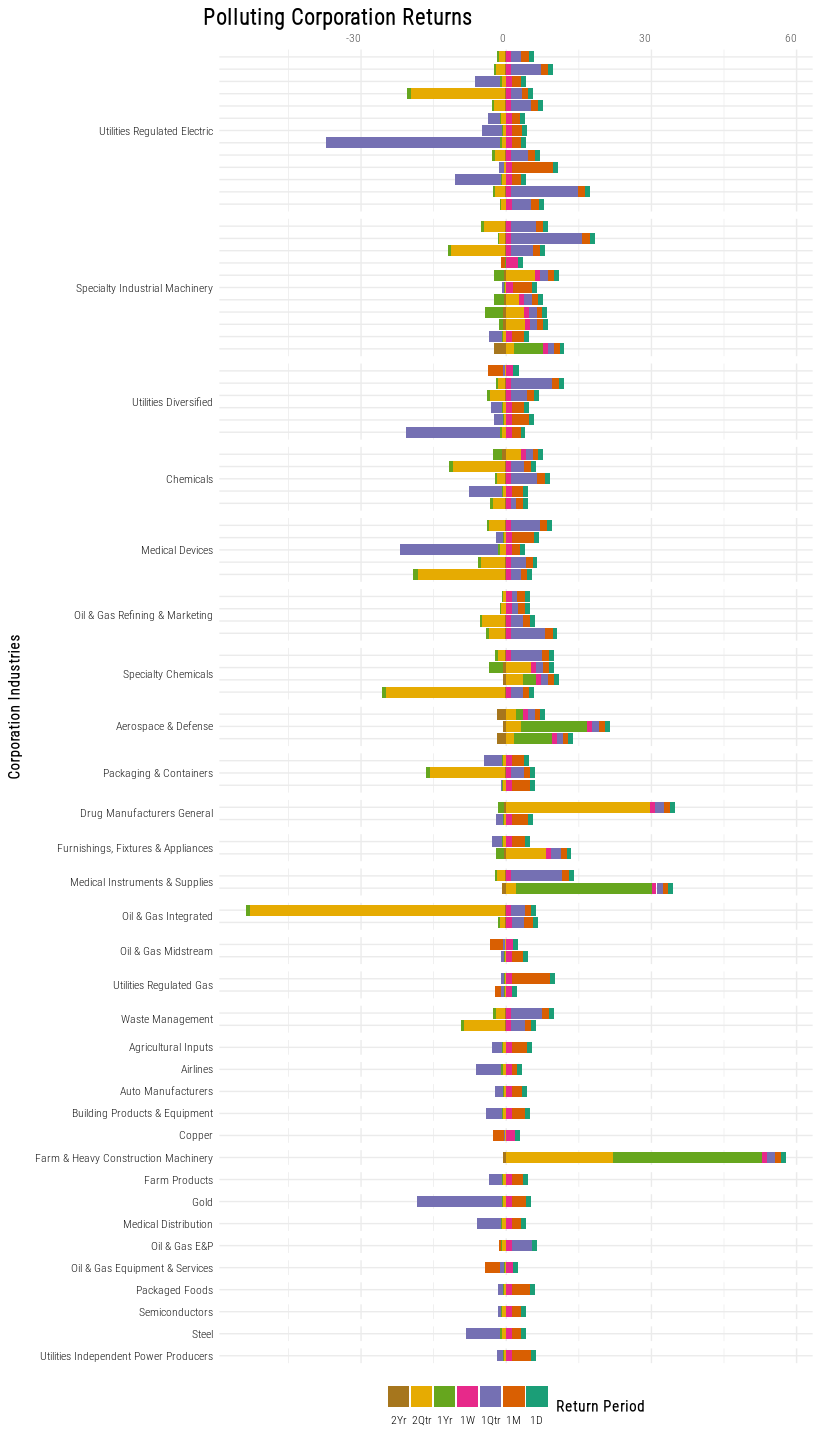
theme(strip.text.x = element_text(angle = 90, hjust = 1))
#working code: print(assigned_plot_object, vp = viewport(angle = -90))
#cuts off the extra height added by rotation
#alternative option: export plot as image and rotate manually for blog
Show code
#upload manually rotated image
#this chunk doesn't run but it knits!
knitr::include_graphics("images/bar.png")
Show code
#blog post line graph
graph_df_top <- graph_df %>%
  filter(industry %in% c("Utilities Regulated Electric",
                         "Specialty Industrial Machinery",
                         "Utilities Diversified",
                         "Medical Devices",
                         "Chemicals"))

ggplot(graph_df_top) +
  geom_point(aes(return_period, return, alpha = 0.8), color = "grey") +
  geom_violin(inherit.aes = FALSE, aes(return_period, return, fill = industry, color = industry)) +
  scale_alpha_continuous(labels = c("Not Grouped by Industry")) +
  scale_color_brewer(palette = "Dark2") +
  scale_fill_brewer(palette = "Dark2") +
  scale_x_discrete(labels = c("1D", "1M", "1Qtr", "1W", "1Yr", "2Qtr", "2Yr")) +
  labs(y = "Returns",
       x = "Return Period",
       title = "Distribution of Returns",
       subtitle = "in the Top 5 Industries Most Represented
among Highest Ranking Polluters",
       color = "Industry",
       fill = "Industry",
       alpha = "Overall Returns Distribution") +
  theme(text = element_text(family = "Roboto Condensed Light"),
        title = element_text(face = "bold"))
Show code
#this chunk doesn't run but it knits!
knitr::include_graphics("images/linedots.png")
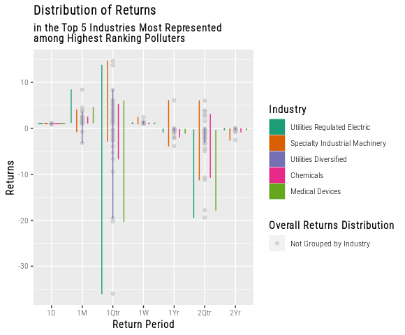
These graphs combine the overall distribution of returns with the industry-grouped returns. The first graph identifies single firms as outliers within their industry. The second graph reveals which industries contribute to the distribution outliers (if any). Knowledge of the outliers, particularly knowledge of negative outliers, is the key to determining which polluting industries are and are not good candidates to bet against. According to this graph, in the long term, “utilities regulated electric”, “specialty industrial machinery”, and “medical devices” are all good candidates for short selling.
Short Selling is the act of betting against a company or asset because you believe there will be a decline in the value. In reality, there are lots of ways that short selling plays out, but for modelling purposes, we assume our gains are 1 to 1 an inverse of the underlying assets losses. So, if we bet against a stock with negative returns, we assume we would recieve the absolute value of the stocks’s returns.
Investors who short sell corporations in the medical device industry could receive profit in as little as one quarter. Specialty Industrial Machinery is the riskiest of the three bets. Profits in all three industries are most promising at the two quarter mark.
Concluding Thoughts
We understand that economic impacts and investment activities take place over a much longer time period than what our data captures. This data story holds value as a model for green investment decision-making processes. A realistic and comprehensive model would include much more historical data than graphs can present. Therefore, our decision to limit the dataset’s time period reflects our priority to clearly communicate methods for cross-sectional pollution and stock analysis.