Do health statistics like the body mass index (BMI) and calorific intake for different countries have predictive power on how these countries’ atheletic teams perform in the Olympics?
The Summer Olympics are one of the most significant international sporting competitions in the world! Every four years, athletes from almost every single country come together to compete in front of a global audience. In its hundred year history, the Olympics has seen the teams from certain nations do consistently better than other. There are a number of reasons this might happen including the populations of the countries in question or the quality of their sports programs (often strongly related to the wealth) to name a few.
In this blog post, we consider the following question: how does a country’s nutrition demographics effect it’s performance at the Olympics, if at all? The question boils down to determining how representative the nutritional intake of olympic athletes is from the country’s greater population. On one hand, a country’s olympic performance could be independent from their country’s aggregate nutrition stats because their athletes eat or have grown up eating, variable diets. On the other, it’s more than reasonable to imagine that a healthier population would lead to a better roster of top athletes than if the population was worse off.
To explore this question, we’ll draw from three sources of data.
Kaggle user rgriffin has conveniently scraped data on olympic athletes going back to 1896 to 2016 from the site www.sports-reference.com. Taken in full, this dataset contains the athletes name, ID, and gender; the athlete’s weight, age, and height; their team, the National Olympic Committee that team falls under the year, the season, and the game; and the sport, event, and medal won if any.
Max Roser and Hannah Ritchie of Our World in Data have compiled some excellent country food supply data. We’ll be using their calorie information data, which tracks the average number of calories per capital per day of a country from year to year, starting in 1960.
The World Health Organization has some awesome data on mean BMI estimated per country from 1975 to 2016 that we’ll be using to round off our analysis.
DataWrangling
Loading In Packages and Data
First things first, we need to load in our packages and our data. In the code chunk below we load in our packages, a pre-filtered dataframe for our athletes data (because of how large the original data is) alongside the BMI and calories data. Our wrangling will show the filtering of the athletes data, but the respective code chunk isn’t set up to run.
library(tidyverse)
library(ggthemes)
library(scales)
library(here)
library(gt)
library(countrycode)

athletes_location <- "_posts/Olympic-Final/data/athletes_filtered.csv"
cal_location <- "_posts/Olympic-Final/data/food-supply-kcal.csv"
BMI_location <- "_posts/Olympic-Final/data/BMI_data.csv"

athletes_filtered <- read_csv(here(athletes_location))
calories <- read_csv(here(cal_location))
BMI <- read_csv(here(BMI_location))
Now, a country’s event-wise performance, while used in our data wrangling, won’t be included in our analysis for simplicity. Concerns over some events having different weight classes, which could have stronger ties to BMI and health data than other events, are legitimate and any takeaways from our more general discussion will keep this lack of specificity in mind.
Filtering Athletes
Let’s restrict the scope of our analysis to just the summer games for the sake of larger country representation in our data. These decisions prompt us remove the Seasons variable after filtering our data, which in turn makes Games, a variable combining information from Season and Year, redundant, prompting us to remove it as well. We’ll also remove the City variable, as we are not specifically interested in which city the Olympics were held in a certain year.
We’re restricting our focus to games after 1975, as our BMI data only contains observations from 1975 onward. This filtering is sketched out in the code-chunk below.
athletes_filtered <- athletes %>%
          filter(Season %in% "Summer", Year >= 1975) %>%
          select(-Season, -Games, -City)
Wrangling Athletes-Level Data
We lack a unique identifier variable for an athlete’s country - our two closest variables, NOC and Teams, underrepresent and overrepresent the number of distinct countries, as NOCs can overlook multiple countries, while a country can have multiple teams. Fortunately, the Teams entry for a country with multiple teams contains the country information, as the entries are of the form Country-n or Country (Region), so we can convert Teams into a bonafied Country variable by processing the Teams entries into only containing their country substring. However, the same country can have different names across our dataset (“United States” in the athletes data versus “United States of America”), so we’ll also construct a country code variable via the countrycode package. This double country information isn’t redundant, as some participants in the Olympics aren’t fully recognized countries and so won’t be assigned a country code. as we’ll be using the country code variable along with year when we join the datasets, we’ll also populate NA country codes with the string “None”.
Moving past the wrangling for country identification, let’s also reformate the Medals variable into three indicator variables so we can count how many medals of each type a country earns.
(The loading of athletes_filtered here is because the original athletes file is a bit large for immediate processing)
athletes_wrangled <- athletes_filtered %>%
          mutate(Medal = ifelse(is.na(Medal), "None", Medal)) %>%
           mutate(Gold = ifelse(Medal == "Gold", 1, 0),
                 Silver = ifelse(Medal == "Silver", 1, 0),
                 Bronze = ifelse(Medal == "Bronze", 1, 0)) %>%
           mutate(Team = str_replace(Team, "-[:digit:]", "")) %>%
           mutate(Team = str_replace(Team, " \\([:alnum:]+\\)", "")) %>%
           mutate(CC = countryname(Team, "iso3c")) %>%
           mutate(CC = ifelse(is.na(CC), "None", CC))
Wrangling Athletes Level Data into Country Level Data
Now that our athlete-centric data is cleaned up, we can now compress it into country-level data. To do so, we compact the data into summary statistics for the athletes, constructing variables for the average values of the athlete’s health metrics, total number of medals won for a game, number of medals of each type won in a game, and the number of athletes a country sent in a game. There are a fair amount of NAs in the age, weight, and height variables. To deal with them, we’ll make the assumption that the NAs are distributed randomly, and so presumably our calculations of the means of the health variables won’t be unfairly skewed. Whether this assumption is warranted or not, we’re not sure, but we’ll take it for granted for the sake of simple analysis. We’ll also convert the units of the height and weight measurements to pounds and feet.
c_time <- athletes_wrangled %>%
          group_by(Team, CC, Year) %>%
          summarise(athletes = n(),
                    aggGold = sum(Gold),
                    aggSilver = sum(Silver),
                    aggBronze = sum(Bronze),
                    totalMedals = aggGold + aggSilver + aggBronze,
                    avgAge = mean(Age, na.rm = T),
                    avgHeight = mean(Height, na.rm = T) * 0.0328084,
                    avgWeight = mean(Weight, na.rm = T) * 2.20462)
Filtering and Wrangling Calories and BMI
While working with the athletes data was a bit messy, our other two data sources are far friendlier. We wrangle the calories data by constructing a country code variable, removing unnecessary country name and alternative code variables, and renaming the kcal per capita per day variables into the variables calories.
calories <- calories %>%
            mutate(CC = countryname(Entity, "iso3c")) %>%
            select(-Entity, -Code) %>%
            rename(calorie = "Food supply (kcal/capita/day) (FAO, 2020)")
Similarly, for the BMI data, we filter down to the rows that concern both sexes in the region, as we’re not making gender distinctions in the olympic data, construct a country code variable, select the variables of interest, and rename the value of interest to BMI.
BMI <- BMI %>%
       filter(sex == "Both sexes") %>%
       mutate(CC = countryname(country, "iso3c")) %>%
       select(CC, value, year) %>%
       rename(BMI = value)
Combining Country Time-Series Data with BMI and Calories Data
Now that all three datasets are in the same format, we can join them all together via the country codes variable and the year.
Success Metric Discussion and Construction
One approach to evaluating a country’s performance in the olympics could be to examine the total number of medals earned in the game. Let’s take a look at the distribution of the total medals earned across all games.
Show code
c_agg <- c_time %>%
         group_by(Team) %>%
         summarise(totalMedals = sum(totalMedals)) %>%
         mutate(division = case_when(totalMedals > 1000 ~ "Upper",
                                     totalMedals > 100 ~ "UpperMid",
                                     totalMedals > 10 ~ "Mid",
                                     totalMedals > 0 ~ "LowerMid",
                                     totalMedals == 0 ~ "Lower"))
c_agg %>%
  count(division) %>%
  mutate(prop = round(n/sum(n), digits = 2)) %>%
  arrange(n) %>%
  gt()
| division | n | prop |
|---|---|---|
| Upper | 4 | 0.01 |
| UpperMid | 33 | 0.08 |
| Mid | 49 | 0.11 |
| LowerMid | 89 | 0.21 |
| Lower | 253 | 0.59 |
The distribution of total medals earned is incredibly skewed, with ~40% of countries failing to win a medal for any event and only ~34% of countries getting more than ten medals across their olympic career from 1978 to 2016. There are a few reasons why this might the case:
- The number of country’s competing in a given game varies, due to country’s reconstituting themselves, boycotting some games, and falling in and out being placed under an NOC, all of which effect the medals distribution.
- The number of events a given country participates in and the number of athletes a country send into an event vary, so a country can earn more medals while maintaining the same base level of athletic ability.
- The number of total medals available in a game varies based on the game, so comparing medals to rank countries would unfairly punish earlier performances. 1
Thus, we should consider alternative success metrics. As it turns out, many success metrics for a country’s olympic performance, such as the total number of medals won, number of medals won weighted by quality, number of gold medals won, and general rank against other countries, all have high correlation with one-another with regards to ranking countries, at least when considering a ranking for a single Olympic Game, as discussed by De Bosscher et al. in this article.
However, since we’re working with time-series data, we have to account for varying numbers of medals being available and varying number of countries competing, and so one method of constructing a success metric could be ranking countries on how many medals they acquired out of the total amount available. This might be our best simple option, but it could give us some results that some may disagree with, as it fails to balance the breadth and depth of a country’s performance. For example, when ranking a country who earns gold in all of the few events it competes in and another country that earns all bronze and competes in just one more event, this metric undeservedly favors the latter over the former. Nevertheless, this measure’s simplicity is a virtue, and so we will use it as our metric for determining how successful a country is in an olympic game.
Using the dataframe that contained the number of medals available per game, we can construct a penultimate dataframe containing our new success metric.
To better cluster our data, let’s try to label countries into divisions of success. One way to do that might be to sort countries by the quantile performance.
quantile(c_time_joined$success)
         0%         25%         50%         75%        100%
0.000000000 0.000000000 0.000000000 0.004219409 0.725779967
Classifying countries based on where they fall in the quantiles of success metric isn’t very useful for because of success’s extreme skew. Instead, we can partition countries into performance classes by dividing up our success metric with a logarithmic scale, with the upper division of countries taking more than 10% of the total available medals, the upper-middle countries taking between 1 and 10% of the available medals, etc… Constructing this division variable division gives us our final dataframe.
c_time_joined <- c_time_joined %>%
                 mutate(division = as.factor(case_when(success > 0.1 ~ "Upper",
                 success > 0.01 ~ "UpperMid",
                 success > 0.001 ~ "Mid",
                 success == 0 ~ "Lower")))
Analysis
After all that wrangling, let’s check out some graphs!
The code chunk below constructs a division-centric dataframe that we’ll use for plotting.
c_time_plot <- c_time_joined %>%
          group_by(Year, division) %>%
          summarise(avgHeight = mean(avgHeight, na.rm = T),
                    avgWeight = mean(avgWeight, na.rm = T),
                    avgAge = mean(avgAge, na.rm = T),
                    averageTotalMedals = mean(totalMedals, na.rm = T),
                    averageSuccess = mean(success),
                    avgBMI = mean(BMI, na.rm = T),
                    avgCalorie = mean(calorie, na.rm = T))
BMI and Calories over Time
Let’s first take a look at how BMI and avgCalorie intake individually effect country’s division over time.
Show code
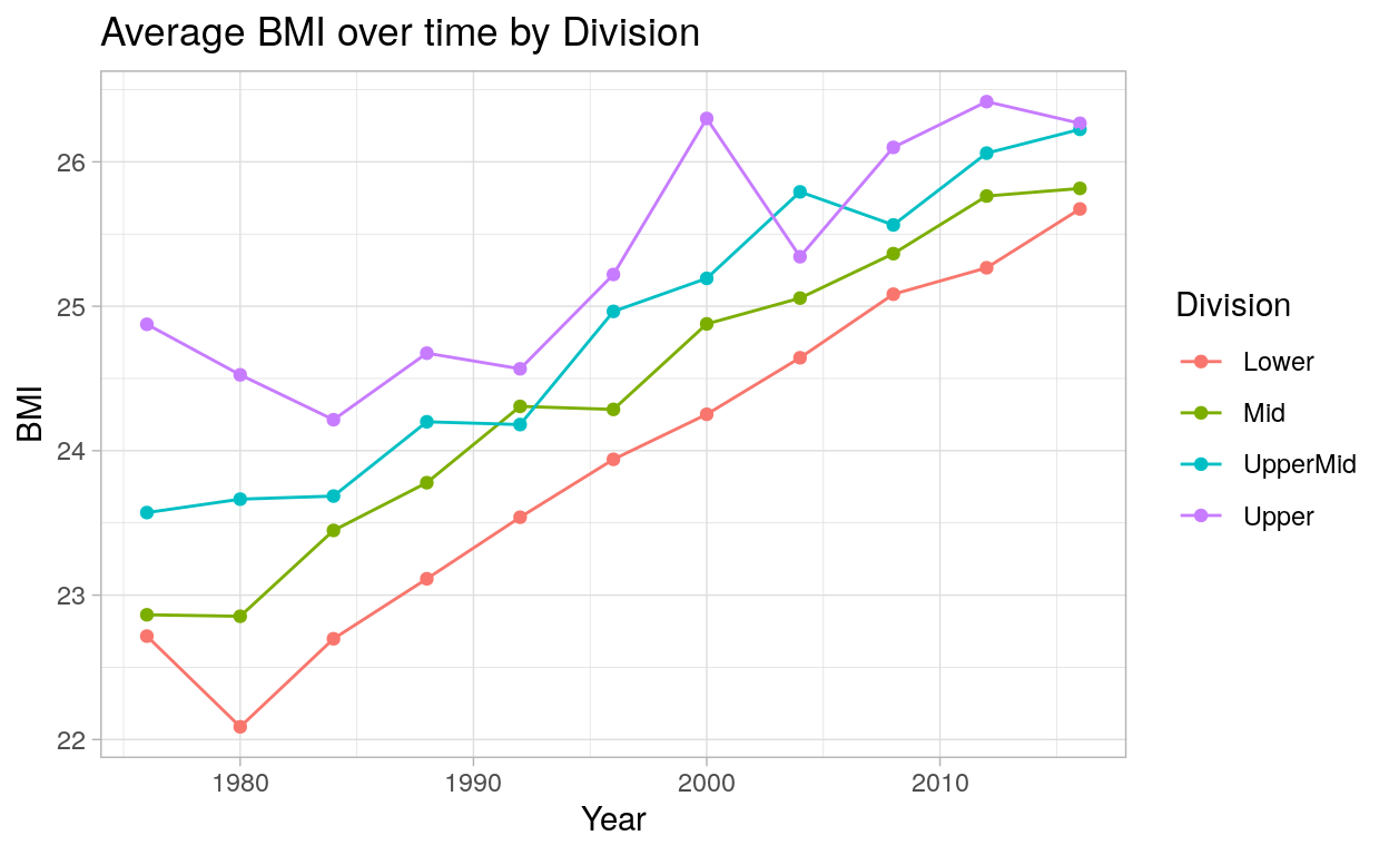
ggplot(c_time_plot %>% filter(Year >= 1976), aes(x = Year, y = avgBMI, color = division)) +
  geom_point() +
  geom_line() +
  labs(x = "Year",
       y = "BMI",
       title = "Average BMI over time by Division",
       color = "Division") +
  theme_light()
Show code
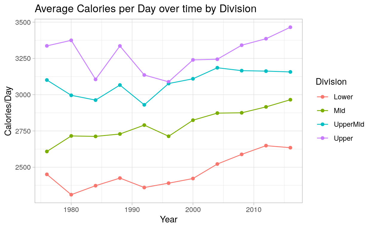
ggplot(c_time_plot %>% filter(Year >= 1976), aes(x = Year, y = avgCalorie, color = division)) +
  geom_point() + geom_line() +
  labs(x = "Year",
       y = "Calories/Day",
       title = "Average Calories per Day over time by Division",
       color = "Division") +
  theme_light()
In the above plots, we can see some distinct trends. Gigher division countries have higher BMI values, and the ordering of lower through upper is almost constant throughout the timeline except for two games: in 1994, mid-division countries had a slightly higher BMI value than upper-mid-division countries, and in 2004, upper-mid-division countries had a higher BMI than upper-division countries. Nevertheless, there appears to be a general heuristic that higher BMI is related to better olympic performance. Interestingly, BMI treands upwards throughout the time series. The reasons for why this might be the case are beyond the scope of this blogpost, but the trend is nevertheless certainly worth noting.
In the plot showing calorie consumption over time, we see similar phenomena as with the previous graphic. Countries in higher divisions consistently had higher calories per capita per day values throughout the games. The hierarchy of the divisions is more pronounced than with BMI, as the calorie division lines don’t even cross. We do see a slight upwards trend in calories per capita per day values over time, although not to the extend as with BMI.
Taking the above graphics into account, it looks like both the BMI and calorie variables have a positive relationship with division, and subsiqeuntly sucess. With this time-series information in mind, let’s take a look at a table of our division’s information in aggregate, examining the general characteristics of the different divisions.
Show code
c_division_count <- c_time_joined %>%
                    group_by(division, Year)%>%
                    summarise(n = n()) %>%
                    group_by(division) %>%
                    summarise(avgn = mean(n))

c_time_table <- c_time_plot %>%
                ungroup() %>%
                group_by(division) %>%
                summarise(avgHeight = mean(avgHeight, na.rm = T),
                    avgWeight = mean(avgWeight, na.rm = T),
                    avgAge = mean(avgAge, na.rm = T),
                    avgBMI = mean(avgBMI, na.rm = T),
                    avgCalorie = mean(avgCalorie, na.rm = T),
                    averageTotalMedals = mean(averageTotalMedals, na.rm = T),
                    averageSuccess = mean(averageSuccess)) %>%
                arrange(desc(averageSuccess)) %>%
                right_join(c_division_count, by = c("division" = "division")) %>%
                mutate_if(is.numeric, round, digits = 3)

c_time_table %>%
gt() %>%
tab_header(title = "Aggregate Country Division Stats",
           subtitle = "Averaged values of athlete attributes and country statistics per olympic game") %>%
cols_label(
    division = "Division",
    avgHeight = "Height (feet)",
    avgWeight = "Weight  (pounds)",
    avgBMI = "BMI (kg/m^2)",
    avgCalorie = " Calories (kcal/capita/day)",
    avgAge = "Age (years)",
    averageTotalMedals = "Medals Earned",
    averageSuccess = "Prop of Medals Earned",
    avgn = "Count")
| Aggregate Country Division Stats | ||||||||
|---|---|---|---|---|---|---|---|---|
| Averaged values of athlete attributes and country statistics per olympic game | ||||||||
| Division | Height (feet) | Weight (pounds) | Age (years) | BMI (kg/m^2) | Calories (kcal/capita/day) | Medals Earned | Prop of Medals Earned | Count |
| Upper | 5.773 | 156.664 | 24.690 | 25.318 | 3231.862 | 147.907 | 0.212 | 5.533 |
| UpperMid | 5.779 | 157.618 | 25.028 | 24.827 | 3048.555 | 27.475 | 0.038 | 23.867 |
| Mid | 5.729 | 154.055 | 25.461 | 24.401 | 2724.951 | 2.622 | 0.004 | 33.067 |
| Lower | 5.680 | 151.750 | 25.653 | 23.910 | 2429.407 | 0.000 | 0.000 | 102.467 |
We need to emphasize that the table is discussing the characteristics of the average divisioning of an olympic game drawn from 1976 to 2016. As such, the total expected number of counties participating in a game is lower than what it would be today. Moreover, the values in each column are averages of averages, with the BMI and Calories column being averages of division characteristics over different games, where each division characteristic is an average of country nutrition stats . Likewise, the values occupying the Height, Weight, and Age columns are triple averages, as they’re averages over an athlete’s country, division, and year. With that said, the table does afford us some greater scope in how we view these trends at large. the table shows a positive relationship with the BMI and calories variable as we had predicted. Moreover, the table shows just how dominant countries with higher BMI and calorie intake are in the olympics: upper division countries account for a distinctly large number of medals won out of the available pool, with the average upper division country winning about one fifth of the available medals.
BMI and Calorie Visualizations
Show code
ggplot(c_time_joined, aes(x = calorie, y = BMI, color = division)) +
  geom_point(alpha = .7) +
  scale_color_viridis_d() +
  geom_point(c_time_joined %>% filter(division == "Upper"),
             mapping = aes(x = calorie, y = BMI, color = division),
             inherit.aes = FALSE) +
  labs(x = "Average Caloric Intake",
       y = "Average BMI",
       title = "Caloric Intake and BMI by Division",
       color = "Division") +
  theme_light()
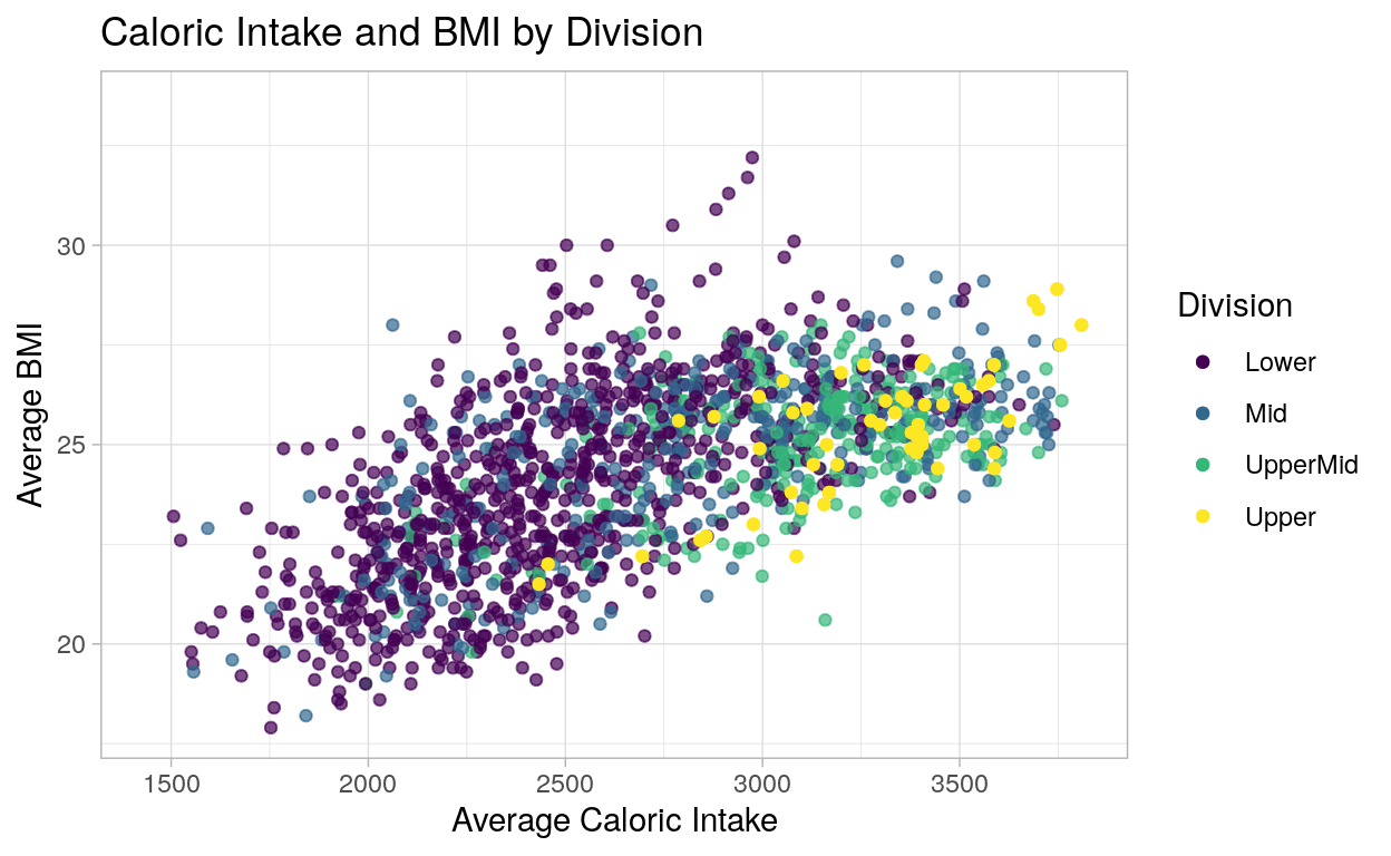
The story presented by this graph serves to combine the previous BMI and Calorie data, but without a time component. As one can clearly see from this graphic, better performing countries tend to eat more and have higher BMIs on average.
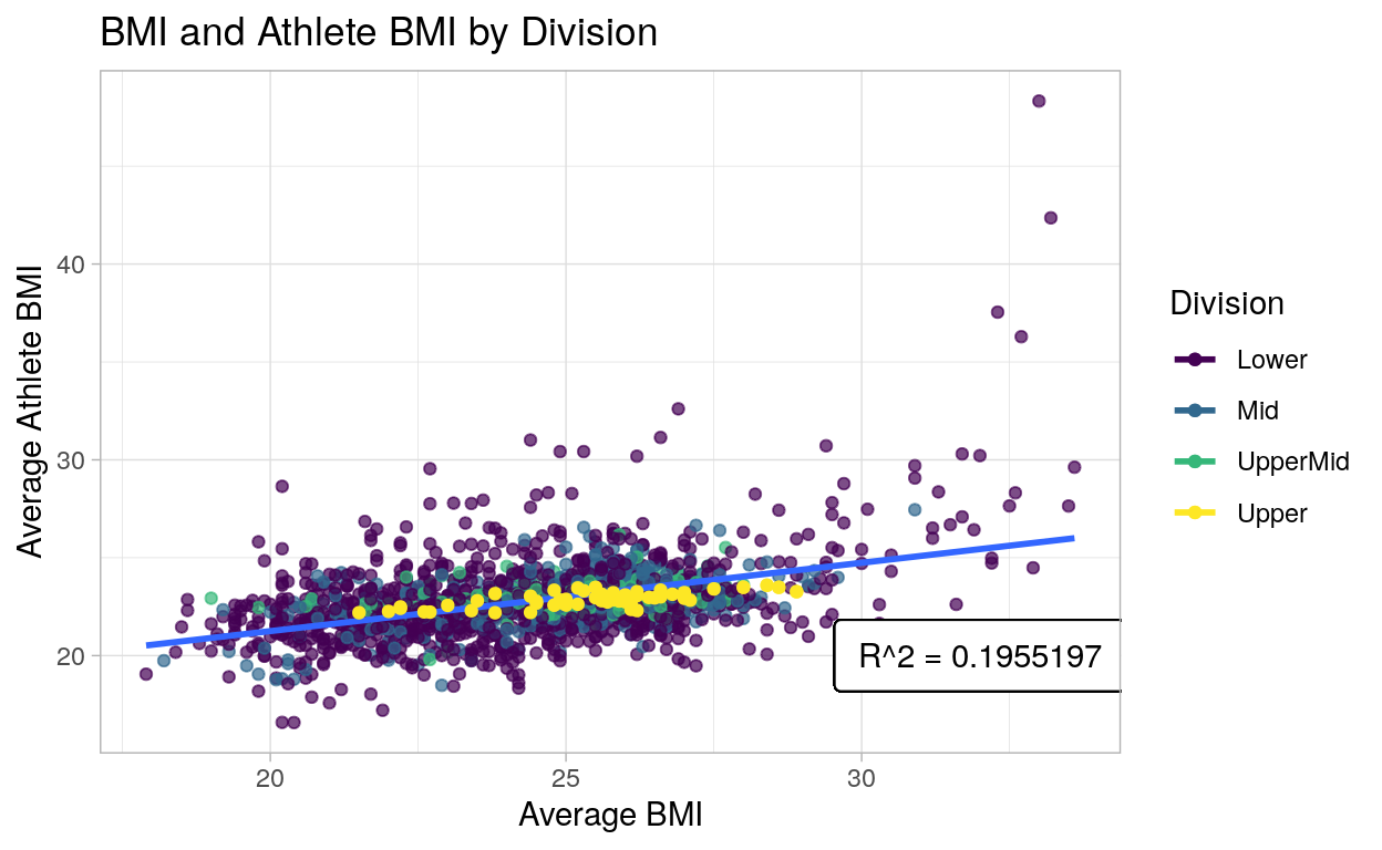
The following visualization serves to briefly investigate if Athlete BMI is meaningfully correlated with their home country’s BMI. To do this, we needed to create a simple new variable for Athlete BMI by using average heights and weights for teams. From this we were able to run a simple linear regression to obtain an R-squared statistic of 0.1955, indicating a positive linear relationship between country BMI and Athlete BMI, albeit relatively small. So, while athletes are relatively homogeneous as their sports demand high levels of physical fitness, they are still affected by the countries from which they originate.
Show code
[1] 0.1955197Show code
ggplot(c_time_joined, aes(x = BMI, y = athleteBMI, color = division)) +
  geom_point(alpha = .7) +
  geom_smooth(se = FALSE, method = "lm", aes(group = 1)) +
  scale_color_viridis_d() +
  geom_label(
    label = "R^2 = 0.1955197",
    x = 32,
    y = 20,
    label.padding = unit(0.55, "lines"),
    label.size = 0.32,
    color = "black") +
  geom_point(c_time_joined %>% filter(division == "Upper"),
             mapping = aes(x = BMI, y = athleteBMI, color = division),
             inherit.aes = FALSE) +
  labs(x = "Average BMI",
       y = "Average Athlete BMI",
       title = "BMI and Athlete BMI by Division",
       color = "Division") +
  theme_light()
Parting Thoughts
Our data exploration suggests a positive relationship between both a country’s BMI and calorie intake and it’s performance in the Olympics. However, these findings are preliminary at best, and more could certainly be done to expand on the work laid out here. For example, one could conduct more exhaustive statistical practices to make more definitive statements, such as conducting a chi-squared test on goodness of fit between the athlete’s BMI distribution and their country’s population’s BMI distribution to see how distinct the two distributions really are. Additionally, one could consider more variables in the analysis; possible variables of significance we didn’t examine include a country’s GDP, happiness index, and the number of games a country had participated in before a game and their successive placement over time.
Number of medals is calculated by multiplying the number of events for a game by three because there are always three medals available for each event↩︎