Background
In “Circles”, the 2nd hottest song of 2020 according to Billboard, the artist, Post Malone, sadly exclaims that “seasons change and our love went cold” and recognizes that “I got a feeling that it’s time to let go”. In contrast, “Party Rock Anthem”, the song that occupied the same spot nine years ago in 2011, commands everybody to “just have a good time”. While comparing the lyrics of these two songs certainly does not prove a trend, considering the changes to society, work, and relationships have changed over the past decade, is there a corresponding change in the types of music that we enjoy? The rise in popularity of folk music and the popularity of artists, such as Billie Ellish, who are open about their struggles with mental health suggest a shift towards sadder, softer, more emotional songs as opposed to the upbeat dance music from earlier in the decade. In this post we take you through trends in popular music throughout the decade as well as what these changes in musical taste reflect about us.
Collecting the Data
First, we had to assemble the necessary data. We used Billboard’s year-end hot 100 list as our method of choosing the most listened-to songs due to Billboard’s popularity. One issue that we anticipated was that the full list of 100 songs would be too long and songs that were, relatively speaking, not that popular would muddle the trends of those that were more popular. As a result, we selected the top 10 songs for each year in order to focus our analysis on the most popular music.
Next, to actually understand the qualities of these songs, we turned to Spotify, which very conveniently has a database of music attributes that range from its tempo to its positivity. Unfortunately, the algorithms Spotify uses to calculate these attributes are confidential, so we will have to trust their calculations. Details about what each variable represents about a song will be discussed in detail later. We compiled the year-end songs into a single playlist on Spotify, and then used the SpotifyR api to pull song attributes.
To clean the data, we manually edited some observations (e.g. fixing song title typos), selected the appropriate variables from the Spotify data, and renamed some variables. We also performed a “title check” before merging the two datasets - Billboard and Spotify had different titles for the same song (for example, 2015’s #1 song on Billboard is written “Uptown Funk”, and on Spotify “Uptown Funk (feat. Bruno Mars)”). We made sure that after removing special characters and spaces, that the Spotify titles contained the Billboard titles. Each row represents a Billboard top-ten song at the end of the year (100 rows, 18 variables).
Show code
#getting billboard data
get_top_10 <- function(link, that_year) {
  url <- link


  hot <- xml2::read_html(url)


  rank <- hot %>%
    rvest::html_nodes('.ye-chart-item__rank') %>%
    rvest::html_text()


  title <- hot %>%
    rvest::html_nodes('.ye-chart-item__title') %>%
    rvest::html_text()


  hot_df <- data.frame(rank, title)

  hot_df <- hot_df %>%
    mutate(rank = str_replace_all(rank, "\n", "")) %>%
    mutate(title = str_replace_all(title, "\n", "")) %>%
    mutate(year = that_year)

  hot_df <- hot_df[1:10, ]

  return(hot_df)
}

top_2020 <- get_top_10("https://www.billboard.com/charts/year-end/2020/hot-100-songs",
                        2020)
top_2019 <- get_top_10("https://www.billboard.com/charts/year-end/2019/hot-100-songs",
                        2019)
top_2018 <- get_top_10("https://www.billboard.com/charts/year-end/2018/hot-100-songs",
                        2018)
top_2017 <- get_top_10("https://www.billboard.com/charts/year-end/2017/hot-100-songs",
                        2017)
top_2016 <- get_top_10("https://www.billboard.com/charts/year-end/2016/hot-100-songs",
                        2016)
top_2015 <- get_top_10("https://www.billboard.com/charts/year-end/2015/hot-100-songs",
                        2015)
top_2014 <- get_top_10("https://www.billboard.com/charts/year-end/2014/hot-100-songs",
                        2014)
top_2013 <- get_top_10("https://www.billboard.com/charts/year-end/2013/hot-100-songs",
                        2013)
top_2012 <- get_top_10("https://www.billboard.com/charts/year-end/2012/hot-100-songs",
                        2012)
top_2011 <- get_top_10("https://www.billboard.com/charts/year-end/2011/hot-100-songs",
                        2011)

top_10s <- bind_rows(top_2011, top_2012, top_2013, top_2014, top_2015,
                     top_2016, top_2017, top_2018, top_2019, top_2020)

#some manual fixing it (unnecessary spaces + fixing rank)
top_10s[7:10,1] <- 7:10
top_10s[11, 2] <- "Somebody That I Used To Know"
top_10s[39, 2] <- "Problem"
top_10s[94, 2] <- "Don't Start Now"


#snagging the spotify data
Sys.setenv(SPOTIFY_CLIENT_ID = 'd025cf071e034469a82d078ddf4dd1a7')
Sys.setenv(SPOTIFY_CLIENT_SECRET = '6378efdde578444cb7379a6a0c889fbb')


access_token <- get_spotify_access_token(client_id = Sys.getenv('SPOTIFY_CLIENT_ID'), client_secret = Sys.getenv('SPOTIFY_CLIENT_SECRET'))
#Pulling data for top 10
top_ten <- get_playlist_audio_features(paulh_nguyen,"55WixKfiIWlcpzdsabhlyU?si=b0a337ef717f4b15",
  authorization = get_spotify_access_token())[-c(60, 68),]
#selecting and reordering columns
top_ten <- top_ten[,-c(1:5, 17:35, 37:43,45:49, 50:58)]
top_ten <- top_ten[, c(12:13, 1:11, 14:16)]


#going to use titles from the billboard.. takes out ft, other non-essential info
track_name <- top_10s$title

for (i in 1:length(top_ten$track.name)) {
  #removing special characters, spaces
  track_name[i] <- str_replace_all(tolower(track_name[i]), "[^[:alnum:]]", "")
  top_ten$track.name[i] <- str_replace_all(tolower(top_ten$track.name[i]), "[^[:alnum:]]", "")

  #tests to see if track_name in track.name
  top_ten[i,17] <- grepl(track_name[i], tolower(top_ten$track.name[i]), fixed = TRUE)

  #adding unique id if tracknames match
  if (top_ten[i, 17] == TRUE) {
      top_ten[i,18] <- i
      top_10s[i,4] <- i
  }
}

colnames(top_10s)[4] <-  "id"
colnames(top_ten)[17:18] <- c("Match", "id")
sum(top_ten$Match)
#all match up yay


big_data <- full_join(top_10s, top_ten, by = "id") %>%
  #dropping extraneous name and "matching" variables now that we have table
  select(-c(track.name, Match, id))

#snagging artist from spotify "artists"
for (i in 1:length(big_data$track.album.artists)) {
  big_data[i, 4] <- as.character(big_data[i,]$track.album.artists[[1]][[3]][[1]])
}

big_data <- big_data %>%
  mutate(track.album.artists = as.character(track.album.artists)) %>%
  rename(artist = track.album.artists)
Data Exploration
In order to track happiness, we focused on the musical quality of “valence”, which describes how happy a certain song is. Spotify says that “tracks with high valence sound more positive (e.g. happy, cheerful, euphoric), while tracks with low valence sound more negative (e.g. sad, depressed, angry)”. In order to better understand the types of music we were working with, we looked at both the valence and the energy of these songs. Energy represents a measure of “intensity and activity”1 and these two qualities were chosen because, together, they give us a good understanding of how the song makes us feel. For example, high energy low valence songs might be suitable for an intense workout while low energy high valence songs would be appropriate for a leisurely summer stroll2.
Show code
#Loading the necessary libraries
library(tidyverse)
library(readr)
library(here)
library(ggplot2)
library(ggrepel)
library(here)


#Reading the data with help from the here function

big_data <- read_csv(here("_posts/2021-03-07-sadboi-hours-are-we-listening-to-sadder-music-now-than-a-decade-ago/data/big_data"))


select_songs <- big_data %>%
  filter(title %in% c("All Of Me", "Cruise", "Radioactive", "Memories"))

ggplot(big_data, mapping = aes(x = valence, y = energy, color = as.factor(year))) +
  geom_point() +
  theme_minimal() +
  xlim(0, 1) +
  ylim(0, 1) +
  geom_hline(yintercept = 0.5, alpha = .7) +
  geom_vline(xintercept = 0.5, alpha = .7) +
  geom_label(aes(x = .9, y = 0, label = "Chill/Peaceful"), color = "black") +
  geom_label(aes(x = .9, y = 1, label = "Happy/Joyful"), color = "black") +
  geom_label(aes(x = .1, y = 1, label = "Turbulent/Angry"), color = "black") +
  geom_label(aes(x = .1, y = 0, label = "Sad/Depressing"), color = "black") +
  labs(color = "Year", x = "Valence", y = "Energy") +
  geom_text_repel(data = select_songs, mapping = aes(x = valence,
                                                     y = energy,
                                                     label = title),
                  show.legend = FALSE)
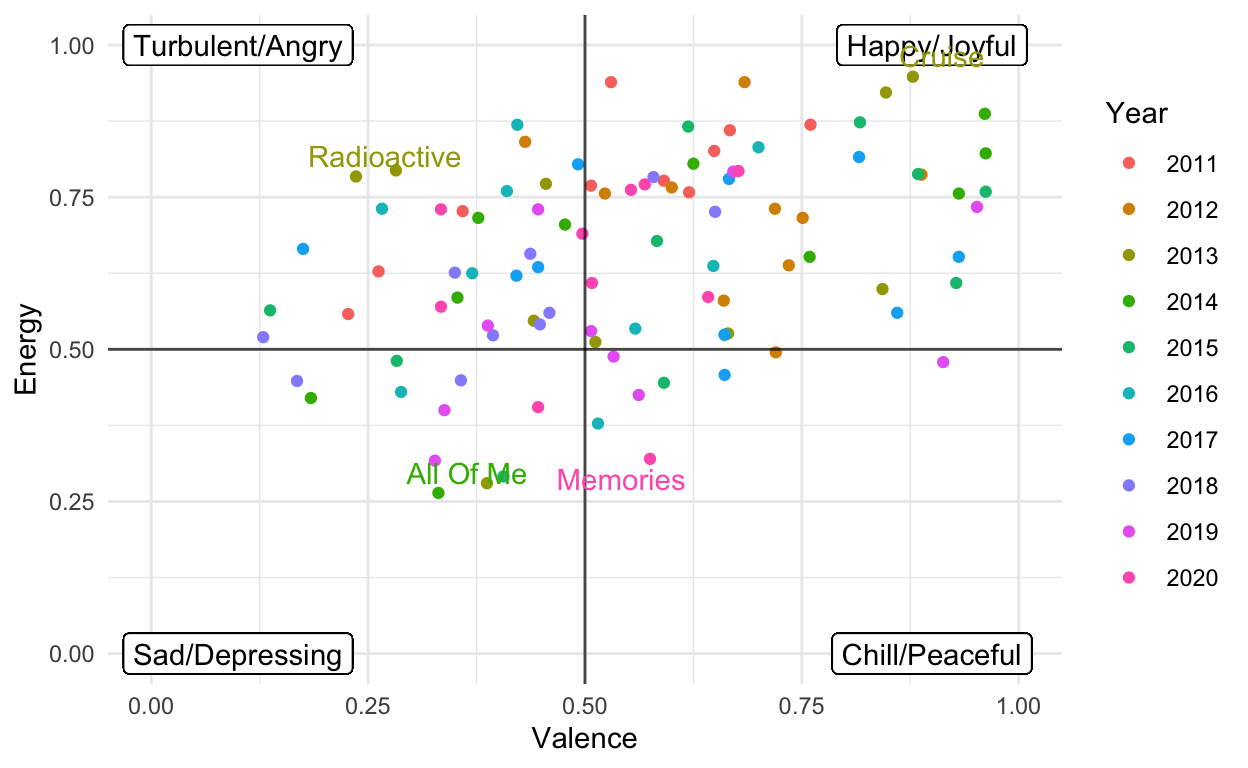
As seen in the graph above, the majority of the songs at the top of the chart can be classified as happy or joyful. Angry music is the second most common and both sad and peaceful songs are far less likely to make the top of these hot 100 lists. This trend is not unexpected, it makes sense that we like music that makes us feel happier.
To attempt to answer our question of if we are collectively listening to sadder and sadder music, we focused on three key musical qualities. In addition to valence and energy, which were discussed previously, we also tracked the “danceability”, which, as its name suggests, uses tempo, rhythm, beat and regularity to describe how suitable a song is for dancing to. We thought that high valence, energy, and danceability would suggest joyful, up-tempo music while the opposite describes sadder, tear-jerking ballads. We then averaged the values of these qualities for the top 10 songs in each year and plotted them below.
Show code
summary_stats <- big_data %>%
  select(year, 5:8, 10:15) %>%
  group_by(year) %>%
  summarize_all(.funs = mean,
               na.rm = TRUE)

colors <- c("Danceability" = "slateblue", "Energy" = "darkorchid4", "Valence" = "orange2")

ggplot(summary_stats, mapping = aes(x = year)) +
    geom_line(mapping = aes(y = danceability, color = "Danceability")) +
    geom_line(mapping = aes(y = energy, color = "Energy")) +
    geom_line(mapping = aes(y = valence, color = "Valence")) +
    scale_color_manual(values = colors) +
    ylab("Spotify Metric [0,1]") +
    labs (color = "Song Attribute")+
    scale_x_continuous("Year", breaks=seq(2010,2020,1)) +
    ylim(0.25, 0.85) +
    theme_minimal()
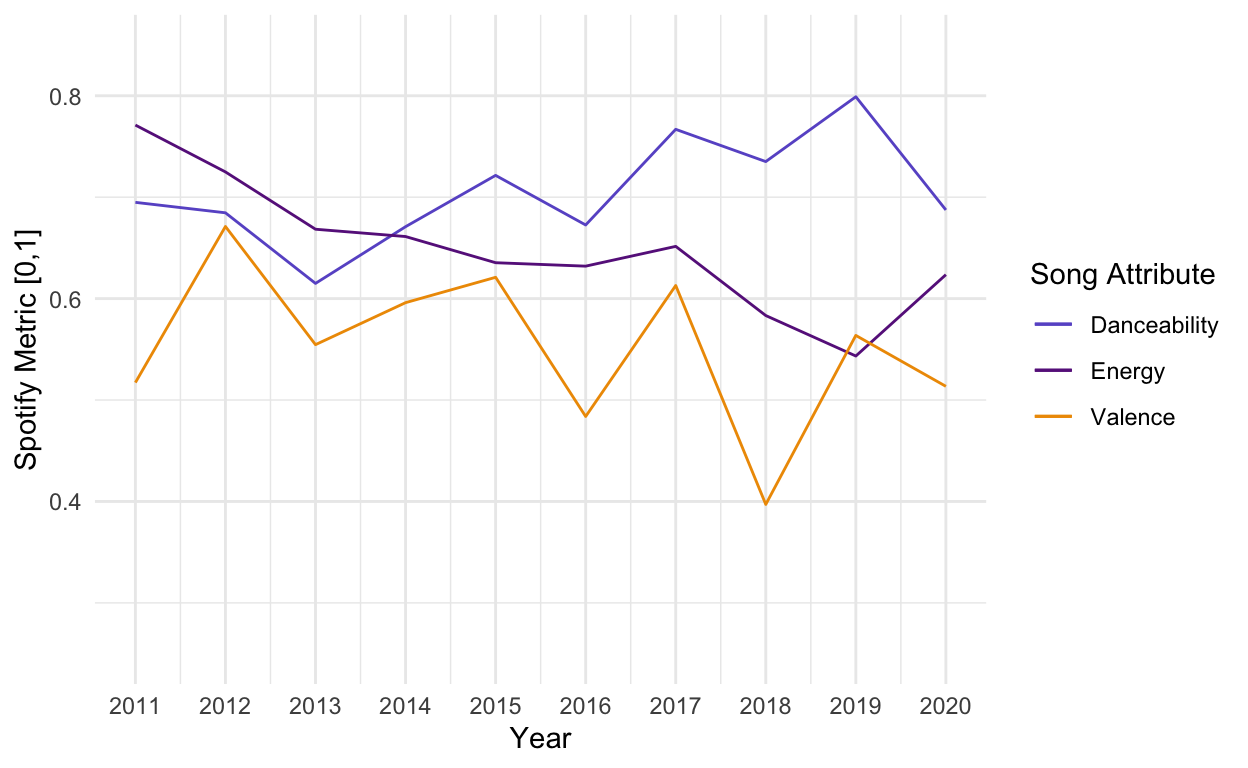
From the graph above, we can see that, in contrast to what we expected, the average positivity or valence of the most popular songs has not changed much over the decade. Despite the two dips of 2016 and 2018, the overall trend does not appear to be towards more depressing music. Interestingly, there seems to be a slightly positive trend towards more danceable music over time. The noticeable dropoff in 2020 could be a result of the global pandemic making dancing with others a thing of the past. The slight downward trend seen in energy is especially interesting considering that danceability is rising while average energy is decreasing. The two musical qualities are not always linked, but the idea of a low energy but very danceable song is still quite an odd idea3.
While the music we listen to now might not be sadder than it was a decade ago, the decrease in energy, on average, of the most popular songs led us to consider the types of songs that are now popular as opposed to a decade ago. Many of the artists who appear repeatedly in the recent hot 100 list, such as Billie Eilish, The Weeknd, and Ed Sheeran, are known for soft, sentimental ballads usually about losing or falling in love. In contrast, artists like Katy Perry and Nicki Minaj who dominated the lists in the first half of the decade produce music that is much more upbeat and high-tempo, often dealing more with the electrifying feeling of being in love than the pain following falling out of it.
Thinking about the type of music that has recently become more popular led us to look at the values for acousticness. Both folk music and tender love songs prefer acoustic instruments and we expected to see a rise in the average acousticness of the top songs as we began to consume more of such music.
Show code
ggplot(data = summary_stats, mapping = aes(x = year)) +
    geom_line( mapping = aes(y = acousticness), color = "Purple") +
    ylab("Acousticness") +
    scale_x_continuous("Year", breaks=seq(2010,2020,1)) +
    theme_minimal()
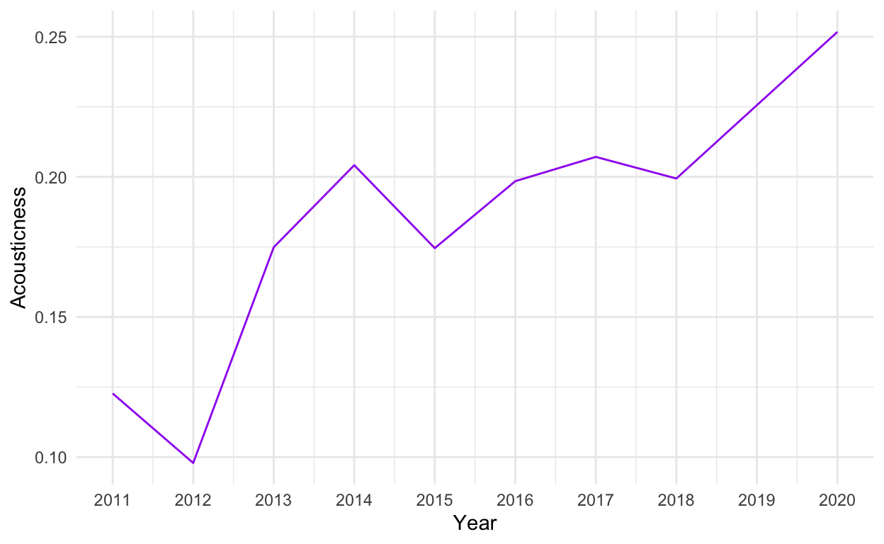
As seen above, the data bears out this prediction as we see a very consistent increase in average acousticness. This increase has been especially dramatic in the past two years. 2020 reached record highs in terms of average acousticness, in particular, Maroon 5’s “Memories” and Lewis Capaldi’s “Somebody You Loved” score extremely high on this category. Both songs deal with the sorrow of a lost love, so perhaps 2020 and its quarantines truly is the year of breakups.
Conclusion
Show code
#Loading the gt package in order to make the table
library(gt)

summary_stats %>%
  select (year, energy, acousticness) %>%
  gt() %>%
  cols_label(
year = "Year",
energy = "Average Energy",
acousticness = "Average Acousticness") %>%
  data_color(
    columns = vars(energy),
    colors = scales::col_numeric(
    as.character(paletteer::paletteer_d("ggsci::red_material",
    n = 10)),
    domain = c(0.5, 0.8)
  )) %>%
  data_color(
    columns = vars(acousticness),
    colors = scales::col_numeric(
    as.character(paletteer::paletteer_d("ggsci::blue_material",
    n = 10)),
    domain = c(0.08, 0.26)
  ))
| Year | Average Energy | Average Acousticness |
|---|---|---|
| 2011 | 0.7711 | 0.1227100 |
| 2012 | 0.7249 | 0.0979100 |
| 2013 | 0.6684 | 0.1748810 |
| 2014 | 0.6612 | 0.2041540 |
| 2015 | 0.6354 | 0.1745620 |
| 2016 | 0.6320 | 0.1984660 |
| 2017 | 0.6515 | 0.2071282 |
| 2018 | 0.5833 | 0.1994100 |
| 2019 | 0.5434 | 0.2255730 |
| 2020 | 0.6236 | 0.2517260 |
As can be seen in the table above, the two trends that appear consistently over the course of the decade is that we are beginning to enjoy more acoustic and less energetic music. This shift can be understood by comparing the upbeat, high-spirited songs of Katy Perry with the more reserved and serious, but still catchy, works of the Weeknd. Perhaps this change in music consumption reflects an overall, societal shift towards being more in tune with our feelings rather than constantly projecting a demeanor of happiness. Perhaps this observations means nothing because the 10 most listening to songs each year does not reflect society at large. Regardless, we hope that this post has led you to think more analytically about the music you listen to and what its musical qualities and attributes reflects about you.
Bonus
Just for fun: the recently listened to songs of the post’s 3 authors: